Viewing entries tagged
Deliscript

Alphabet Soup Font Guides and Manuals – Free Downloads

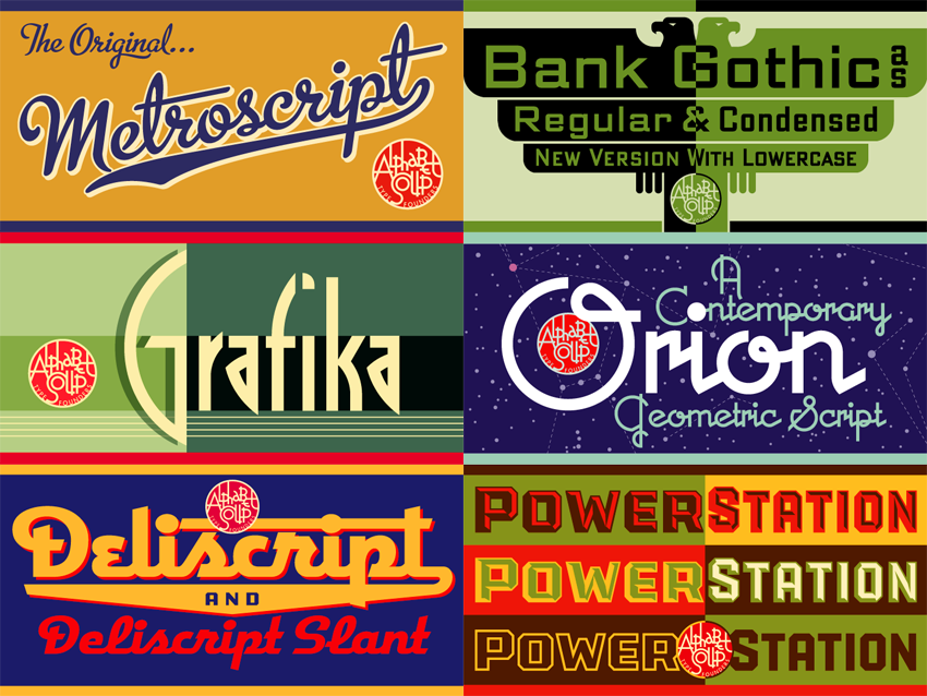
Many people have asked why I have only 9 fonts available for purchase. Part of the anwswer is that I’m sort of a perfectionist, and it takes me quite a long time to design, execute, and test a font to make sure it’s working properly. Also, all that work must be sandwiched in between design and lettering assignments—which must always take precedence. But there’s another reason why, at best, I can only turn out maybe one font design a year—and that is for me there’s a bit more to releasing a font than just having the font itself ready to go. There are a ton of supporting graphics that need to be created, and each font reseller has different requirements.

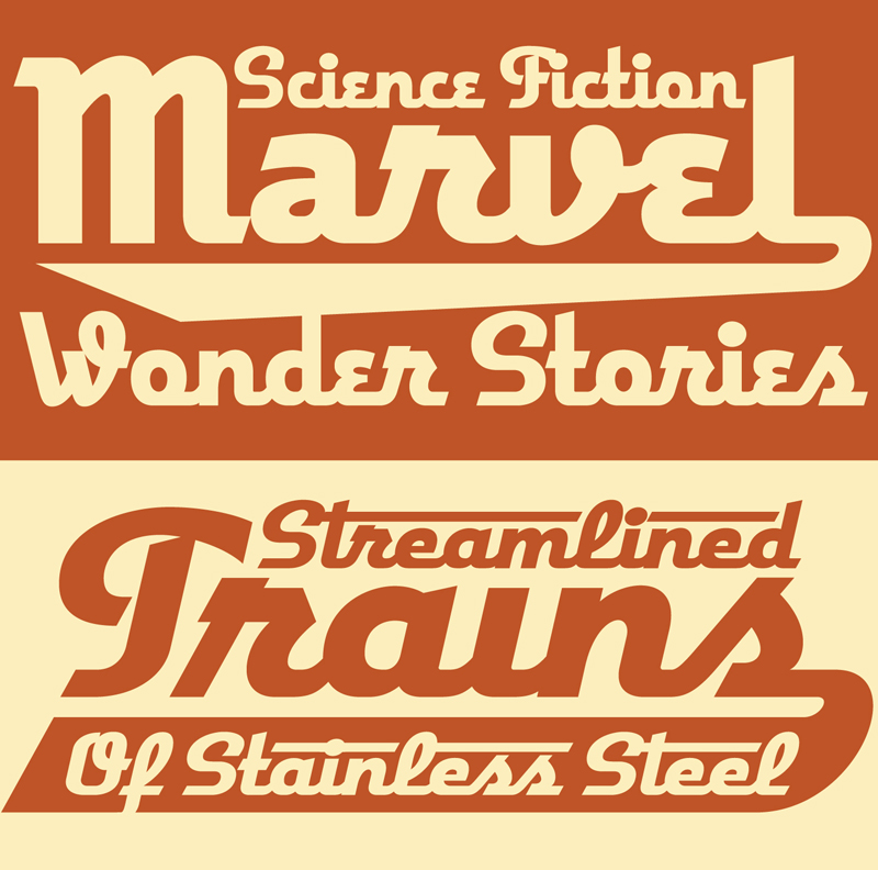
But more importantly, I decided early on that included with each font I would supply a full color PDF Guide or Manual (all 9 pictured above). From these multi-page PDFs one can get a very good idea of what these fonts look like in use, and gain an understanding their special features and how to access them. For example, the PowerStation Manual explains how to set layered copy in 2 or three colors, and in the Deliscript Manual you’ll find out how to access the special “t-crossbar” feature (among others). You’ll also learn some important “Do’s” and “Don’ts” for each font and (if you’re interested) read about how these fonts came to be.

Originally these manuals were only intended to be included with the font download at purchase, but I realized that they should also be available for prospective buyers as well as others—they might help with a decision, or just serve as inspiration. I’ve put links for all 9 PDF downloads together on one page, together with several case studies of some of my design work. So feel free to go the DOWNLOAD page and click on 1, 2 or all 9 of them.

COMMENTS WELCOME!


The Dyna-Fonts Winners at Applied Arts

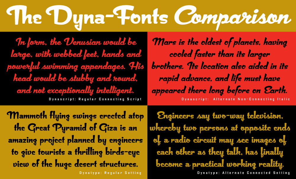
The judges at this year's Applied Arts Design Competition, in their first ever Typeface Design category, selected both Dynascript and Dynatype as winners. They were selected as The Dyna-Fonts—a typeface family.

I'm very proud of these fonts, and am pleased that they've begun to get the recognition I think they deserve. They work extremely well both together and separately, and in both display and in smaller settings, as you can see from the comparison below (click to enlarge).

I've begun to make both Dynascript and Dynatype available together at a reduced price. They can be found under the name "The Dyna-Font Collection" which can be purchased at MyFonts.

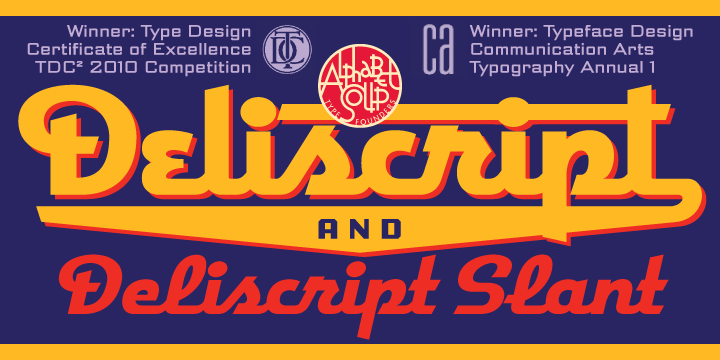
The Dyna-Fonts are now following in the footsteps of some of my other recent fonts that have garnered industry acclaim—most notably Deliscript, which was lauded by the Type Directors Club in their TDC² 2010 competition and also in 2011 by CA's Typography Annual 1, (the page excerpt of which can be seen HERE), and  Steinweiss Script—also recognized in this year's Typography Annual 2, (the page excerpt of which can be seen HERE). After being named a "Rising Star" Metroscript became "MyFonts’ Brush Script Font of the Year" and was subsequently named as #5 in Smashing Magazine’s “30 Brilliant Typefaces For Corporate Design“. The magazine went on to say about Metroscript: "lettering artist Michael Doret has adapted his trademark hand-lettering style to the computer, creating one of the most sophisticated suites of script fonts on the market.”

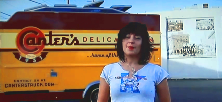
Canter's Truck Design Co-Stars with Bonnie Bloomgarden On Channel 4

http://www.youtube.com/watch?v=sirQx_KSnkI

Watch for it – it's about halfway through, and then again at the end. Ain't she a cutie...I mean the truck.

Bonnie is the great-granddaughter of Ben Canter, founder of Canter's Deli. Bonnie, along with her sister Dena, conceived the truck idea, found me, and worked together with me to come up with a great design.

To see and read more about Deliscript and the Canter's Truck design, click HERE.

A Second Distinction for Deliscript

I was very pleased to learn that my Deliscript fonts in addition to having been lauded by the Type Directors Club, have also been included as winners in the Typeface Design category in Communication Arts just released Typography Annual 1.

I am also happy to have added one more reseller to the roster of type houses that sell Alphabet Soup's fonts: YouWorkForThem. They currently sell Deliscript, Metroscript and PowerStation, and I will be adding more fonts to their list soon.

Talk at the Type Directors Club

If you're going to be anywhere in the vicinity of New York City in late July, then I'd love to invite you to the talk I've been asked to give by the Type Directors Club. I'll be talking about my work, both new and old—and more specifically about all the influences I've had over the years that helped form my aesthetic sensibility, especially those that worked on me as kid growing up on the streets of Brooklyn. So is it "Nature or Nurture"? You be the judge!

I'll be in New York to attend the opening night festivities at Cooper Union on July 20th for TDC² 2010 – the show which honored my Deliscript fonts.

My talk will be held on Thursday, July 22nd, 6:00–8:00 PM at the Type Directors Club: 347 W. 36th St, #603, NYC.

Please RSVP to the TDC by Email or call them at (212) 633-8943 to reserve your spot.

The Alphabet Soup Collection: on Sale at Veer

Just up on Veer, this all-inclusive collection of my fonts is on sale at 30% off the total of what they would cost if purchased individually. Veer's special promotion will be ongoing until the middle of May.

Coming Soon . . . Canter’s Truck Post #3 of 3

Due to my inability of being able to get good photographs of the completed Canter's truck, I'm holding up posting the final chapter in this saga. I hope to be able to get some better shots by the end of this week. If not I'll just post what I've got.Thanks for your patience!

Above: Careful placement of my credit below the trash receptacle.

Deliscript Critique on FontFeed

Belgian designer and writer Yves Peters has been posting his comments and critiques about the winners of the TDC² 2010 Typeface Design Competition, and has finally reached the Display Type category—the one in which Deliscript was selected. While Yves' comments are considered and thoughtful—and with regard to Deliscript were for the most part on target—I feel as if I would like to comment on a couple of his remarks.

Yves mentioned the "Word Logos" I have thrown in, and mentions that they're only in English and that there aren't that many. I agree with this. I probably shouldn't have put them in at all. I had literally been working for months on Deliscript, and really wanted to get it out for release, so I guess I rushed through their creation, thinking of them as just a small extra feature to include. They probably don't add that much to the font, and I should have thought of the European market as well. The next time I do a feature like that I'll definitely try to do it in a much more expansive manner.

Yves also mentions that he is "unsure about the finer details in the character shapes", citing that "some curves and joins seem rather stiff, and the weight distribution and contrast in the character strokes appear a little off in some parts". I'm not sure, but I think this perception on his part may stem from cultural differences that we share, and from a possible misunderstanding of what I'm referencing. What I'm going for is not really in the lexicon of classical font design—rather it is from the American pop culture vernacular—from all the (traditionally) untrained eyes that created all the wonderful signage and ephemera that I grew up with.

Coming to font design from that background, I can totally understand how what I'm trying to do can seem foreign to those who are trained to look at fonts from a traditional perspective. While I'm sure we all share some of the same font heroes (such as Morris Fuller Benton) I also celebrate those whose work joyously displayed a flagrant lack of regard for what some would consider to be "the formal rules of design". It is to these designers whose names we'll probably never know—and to their typographic "mistakes" and flourishes that I find so engaging—that I try to pay homage to in my lettering and font design work.

Art Imitates Life...Imitates Art (Canter's Truck #2 of 3)

Although most of the food trucks are similar in appearance, many contain details that slightly alter some of their proportions. So it became necessary for me to visit the Road Stoves truck depot and to take pictures of the truck that would be closest to the one that Bonnie would be getting, and to use those photos as templates for my design—I'd also have to Photoshop out the existing graphics, making the truck as clean as I could to act as a blank canvas for my new design:

I set about to create the elements for the truck wrap, basing the graphics on the look of the Canter's neon sign and my font Deliscript. I felt I needed to modify Deliscript a bit to make this a strong graphic statement—kind of like a logo for the truck. So I began by creating a large, circular initial "C" in Canter's—and that became the basis for the look:

I also settled on a palette of colors that I felt would be attractive and reflect what I thought of as a Deli aesthetic. The unique double "SS" in "DELICATESSEN" was borrowed from the neon sign—one of many small details that I felt would help keep continuity between the restaurant and the truck. I added some other elements such as "Since 1931" that Bonnie wanted. In my first iteration for the truck my feeling was that I'd try it as a white truck—a good clean look— and adjust the graphics accordingly.

I might've had the Good Humor truck from my youth in Brooklyn in mind:

Nevertheless, a white truck wasn't exactly what Bonnie had planned on. I have to admit that I'm glad she pushed me to do a more colorful truck. Even though the truck was to be treated as a "vehicle wrap" by SignQuest, a process that is being more and more widely used, I decided to treat the truck as if I was designing a paint job in order to give it a look that was more in keeping with its mid-century heritage. Keeping the color palette that I had first come up with I created some mock ups that I thought would work even better for Canter's than my all white version:

We also decided that it would be a good idea to have a slogan and, after much deliberation, settled on "...home of the Kibitz Room". The Kibitz Room is the dive bar/cocktail lounge that's off in a corner of Canter's Deli. Like Canter's, it's an LA institution that just seems to keep going and going.

I had envisioned that we would somehow use my very graphic take on the neon baker sign on the service side of the truck. So I put him on the door and let the steam from his platter trail back along the length of the truck towards the menu. Along the top of the truck yet another version of the Deliscript/Canter's logo:

In “Art Imitates Life…Imitates Art #3″ I’ll post photos of the actual truck wrapping, and also of the finished truck.

Art Imitates Life...Imitates Art (Canter's Truck #1 of 3)

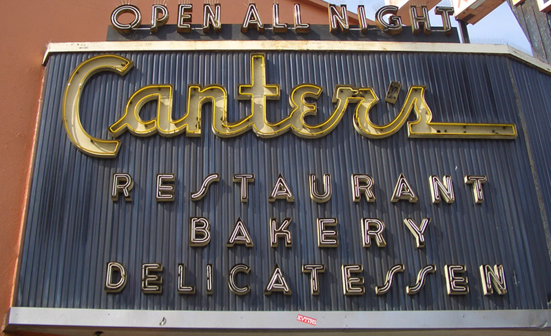
Recently I had a strange (and kind of wonderful) confluence of circumstance—combined with a smattering of coincidence and random luck. It all started right here in this blog over a year ago when I started sharing my thoughts about creating my new font Deliscript. In the posting I mentioned how the design was "loosely inspired by one of the signs at Canter’s Deli", a Los Angeles staple for almost 80 years:

At any rate my good fortune with Deliscript began about two months ago when I learned that it been selected by the Type Directors Club in NYC for inclusion in their annual show. About a month later I got a call from Bonnie Bloomgarden, the great-granddaughter of Ben Canter—one of the original Canter Bros. She and her sister Dena were trying to do a few things to gently update the Deli, while still respecting its heritage. One of their ideas was to create a "Canter's Truck" and take advantage of the recent mobile gourmet food trucks craze. A lot of the newer trucks have been completely "wrapped" with colorful graphics using fairly new printing technology.

She told me that they had started looking for fonts to design the wrap for the truck themselves, but then realized it might be a little difficult for them without having a lot of graphic design experience. Then fortune smiled on Bonnie and Dena when they did a web search Googling "Deli" and "Font" and ran smack into Deliscript (probably because of the Canter's mention in this blog) and then in turn found, and contacted me.

It has been a real pleasure working with Bonnie, a young person with good entrepreneurial instincts that are combined with a keen sense of what is worth keeping in the Canter's visual vocabulary, and what perhaps should be let go. We both concurred that the truck identity should be based on that neon sign, and that I should use Deliscript as the starting point. I also suggested that we somehow should try to incorporate into the truck design their famous neon chef, who for years has been carrying that platter of freshly baked bread:

At first I tried to graphicallyt recreate him pretty much as he was for the side of the truck. I soon realized that my rendition seemed far too literal for the look I was going for. Then, in an old matchbook catalog, I found a cut of a little round chef carrying a platter of turkey, and decided to use that as the basis for creating my updated baker (a little slimmed down) for the door of the truck:

In "Art Imitates Life...Imitates Art #2" I'll discuss how we created the design for the truck.

Deliscript Lauded by Type Directors Club

I was extremely excited to learn recently that my Deliscript font family (Alphabet Soup's major font project of 2009) was chosen by the Type Directors Club to receive their prestigious "Certificate of Excellence in Type Design" in the display fonts category for their TDC² 2010 Typeface Design Competition`. Deliscript was one of only 16 designs chosen from the many typefaces entered from 29 countries.

Deliscript will be showcased in TDC² 2010, will be on display in New York City throughout the summer of 2010, and will be published in TDC's Typography 31, the Annual of the Type Directors Club. The exhibition will then go on tour traveling throughout North and South America, Europe, and East Asia.

Once again I'd like to extend my thanks to the very talented Patrick Griffin of CanadaType for his invaluable help with Deliscript's OpenType programming.