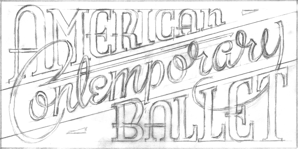
 In Part 1 of this post I outlined this project from inception until completion of the finished art. But the part that was the most fun for me was when that artwork was finally placed in the client’s hands—a client who himself is a master signmaker, and who had ideas about how to take the design to the next level. I had never worked with someone like that, and was anxious to see how my art would be interpreted by such a craftsman. Because I was unable to be up there in Canada to see the fabrication first-hand, I asked Blaine Casson to photographically document the different stages of his project. In the end the final photos of the finished signs were taken by Blaine’s good friend, photographer Bryn Gladding. Following are Blaine’s notes on how he translated my 2D art into 3D signage.
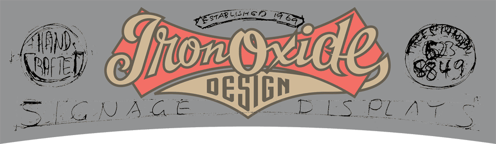
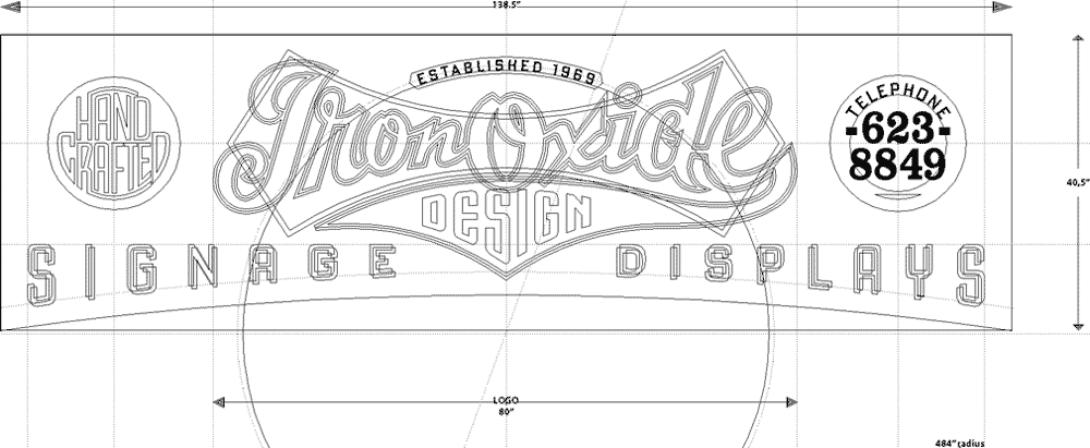
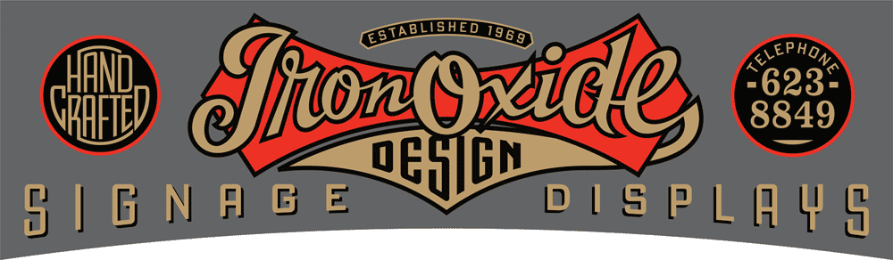
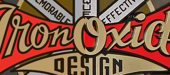
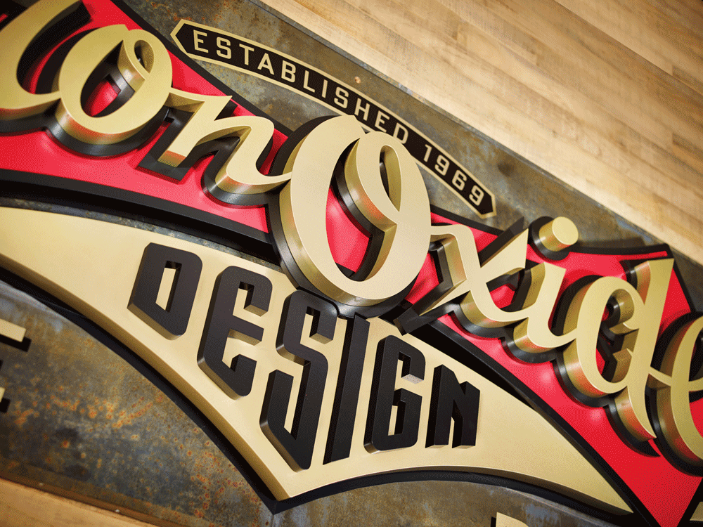
The Making of the IRON OXIDE DESIGN Sign. Three-Dimensional. 40 1/2" high x 138" wide x 5 1/2" thick
“With no available drawings of the 105 year old building I began by photographing the destined sign location below one section of my third floor windows. I then scaled that photograph up, made a full size card pattern and checked it in the installation area to prove out the dimensions and arch shape.
“It was decided that the full version of the logo would not work well in this space so I made a scale model of the sign blank for Michael. I sent him vector art of the sign blank shape and dictated the background of the sign would be oxidized metal sheets and that his Iron Oxide script was already committed to be 80" wide. Michael took over the design from there and I began to plot out full size paper patterns of the script and it's background shield.

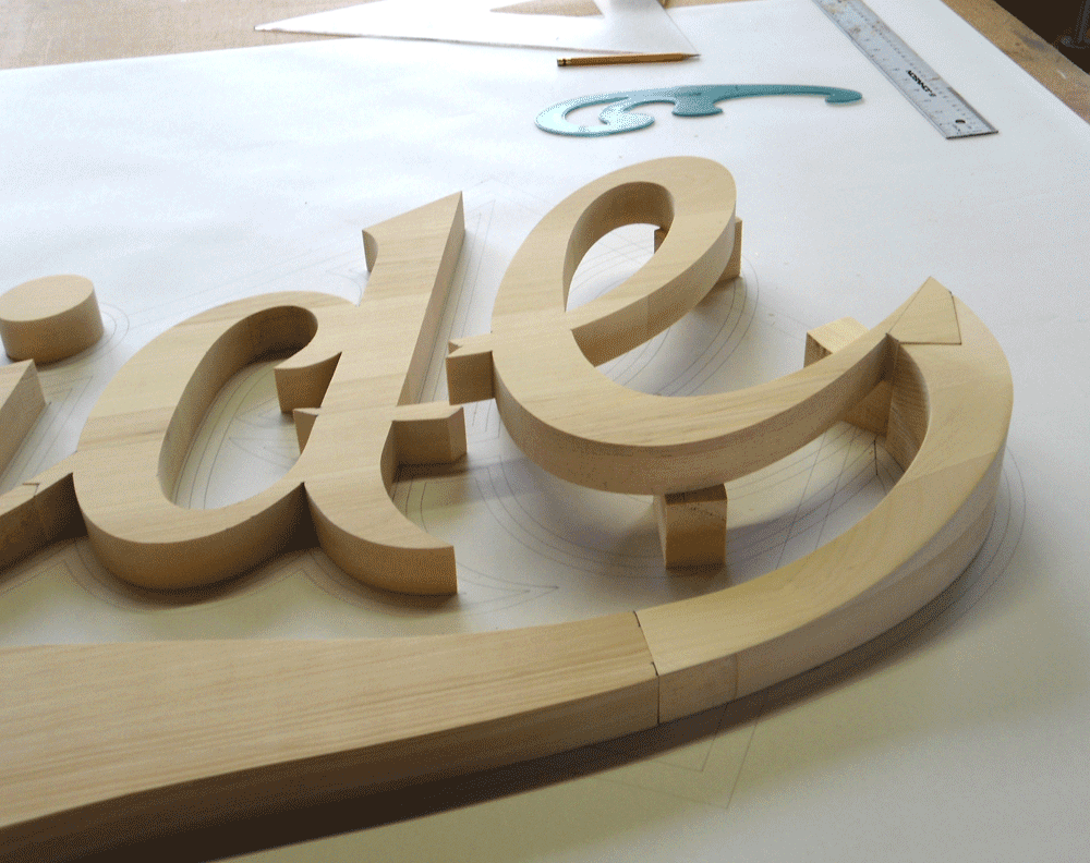
“I milled rough cut select Pine, glued and clamped it up into oversize blanks for the different layers that I had decided to use in the multi-layered three-dimensional logo script. As my sign was on a third floor in height and to be viewed from about 150 feet away I thought that to really convey the three-dimensional effect I was after I would have to be aggressive and chose to over compensate in layers and thickness. I assigned the first layer to the metal clad sign blank then broke Michael's vector art up into the red shield and the gold tail of the "e". These were on the same plane but of different thicknesses. Next layer would yield the black outline of the Iron Oxide script and finally the actual cut out script characters. The pending design copy from Michael would be painted directly onto the oxidized metal background.
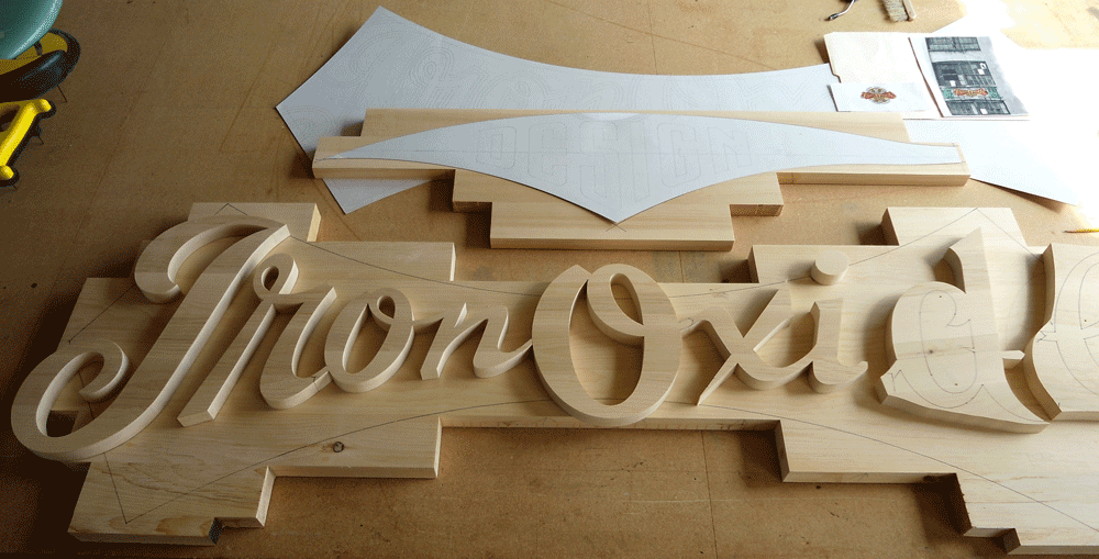
“Patterns now generated, I transfered them to my Pine blanks and cut out all the individual letters and logo elements using either my 50 year old Oliver pattern makers scroll saw or my slightly more modern Hegner scroll saw. Vector art was flawless, so it was just a matter of splitting that pencil line as I cut.
“Translating Michael's logo design into the three-dimensional realm was simple enough but proved a little time consuming at the stage where I had to descend the tail of the "e" by 2" from the script layer to the metal sign blank layer. As well, it had to pass under and through the red shield. I built up wood on the end of the "e" and between the band saw, chisels and plenty of hand sanding I was able to fashion the profile. I routed a path in the underside of the red shield to accommodate the tail.

“All wood characters were then primed and sanded three times and sprayed with two coats of exterior paint."


 Et voila! The finished sign finally emerges. The following photos were taken indoors by Bryn Gladding, prior to exterior installation.


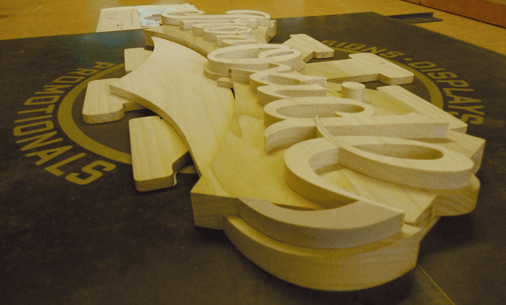
The making of the IRON OXIDE DESIGN interior door sign. Three-dimensional. 28" wide x 40 1/2" high x 3" thick.
The interior sign was scaled down considerably from the exterior one, and utilized the full logo as designed. Blaine Casson writes about its fabrication:
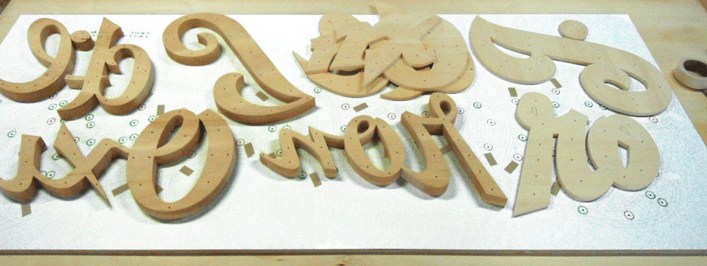
“Working in Poplar wood this time, the production of my interior door sign was basically a downsizing of the exterior fascia sign project.

“I changed things a little bit given that this time I was reproducing the full "as designed" version of my logo. I eliminated the separate cut out layer for the script's black outline and made it integral with the cut out shield layer, differentiated by painting the outline profile. I also painted "DESIGN" rather than individually cutting out the characters as I had on the fascia sign.

“I routed out the back of the shield to accommodate the "X" element as in the logo design it peeks through the area between the shield and the underlying tail from the "e". This guaranteed alignment over the other option of cutting up the "X" and butt jointing the sections against the shield."
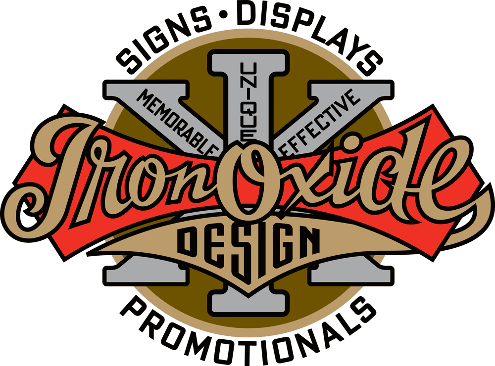
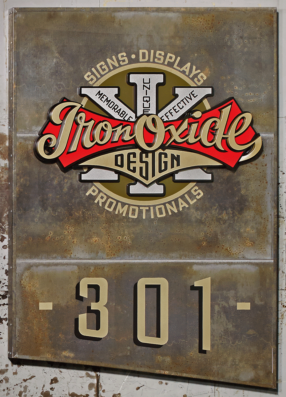
 Finally, below is the full version of the logo as used for interior signage in Blaine’s loft building.
Client, Signage Fabrication, Progress Photography: Blaine Casson – Iron Oxide Design
Photography–Finished Signage: Bryn Gladding