Viewing entries tagged
hand lettering

12 Years in the Making — Fruit & Vegetable Stamps for the USPS — Part 2 of 2

BlogOpener[600px]

BlogOpener[600px]

Ten years had slipped by since I completed my work on the Fruit and Vegetable stamp series for the USPS back in 2002 (read Part 1). But then in May of 2012, when I was contacted by Art Director Antonio Alcalá of Studio A in Washington DC about another stamp project, I started thinking about the ill-fated Fruit and Vegetable stamps that I had done a decade earlier. To make a long story short Antonio agreed to re-present my original Fruit and Vegetable stamp comps at his next meeting with the USPS. It didn’t take long for him to get back to me with an emphatic “Yes”—the Post Office was indeed interested in reviving this theme for a new set of stamps!

Of course I was hoping that the USPS would pick up the designs I had done without any changes—but that was not to be! Of the six different fruits and vegetables that we had chosen in the first go round the only one to survive was Sweet Corn. The new list was this: Cantaloupes, Squash, Sweet Corn, Tomatoes, and Watermelons, and the series was to be called “Summer Harvest”. One thing that worked in my favor was that we kept the same overall size for the new stamps.

When I started working on this new project I wanted to differentiate the stamps from each other as much as possible. I started by trying to have fun with different elements such as the “USA” and the denominations, and by choosing different color palettes. You’ll see that in many of the earlier stages I was trying to design these graphic elements differently from one another. While the earlier stamp designs held together because they all shared my aesthetic vision, it became clear that the new stamps were going to need to be much more uniform in approach, sharing similar design elements and color palettes. This made the challenge a little more difficult than the first series, but I decided that despite the uniformity challenge, I would still want to differentiate them as much as possible. So one thing I did was to give each of them their own distinct lettering style.

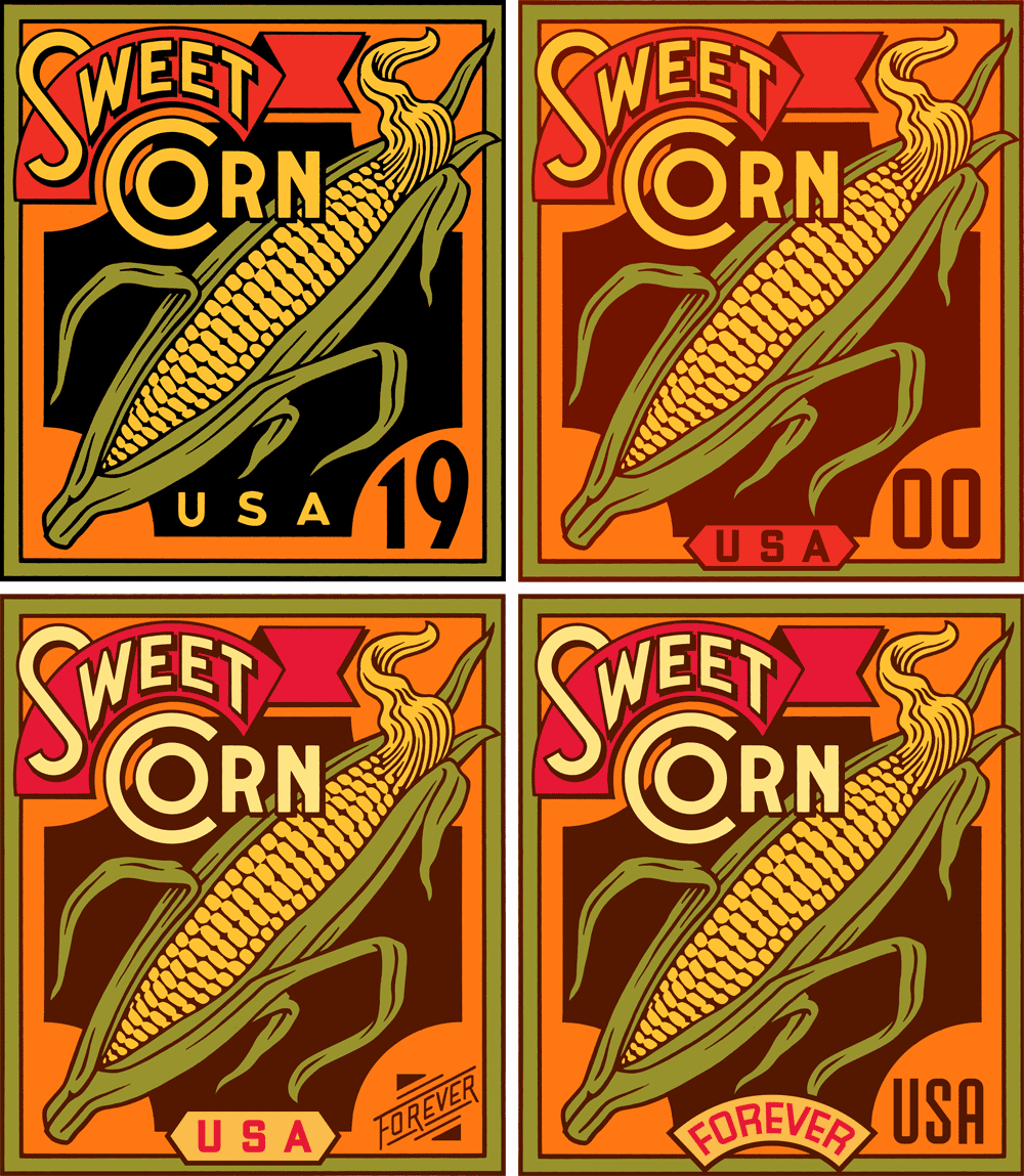
Sweet Corn—4 Preliminaries

Sweet Corn—4 Preliminaries

Sweet Corn/Final

Sweet Corn/Final

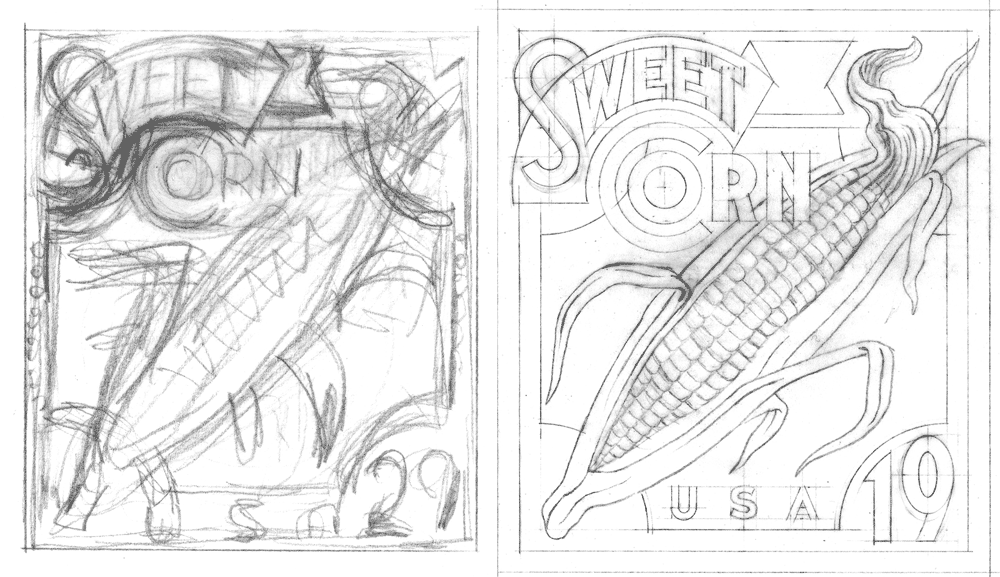
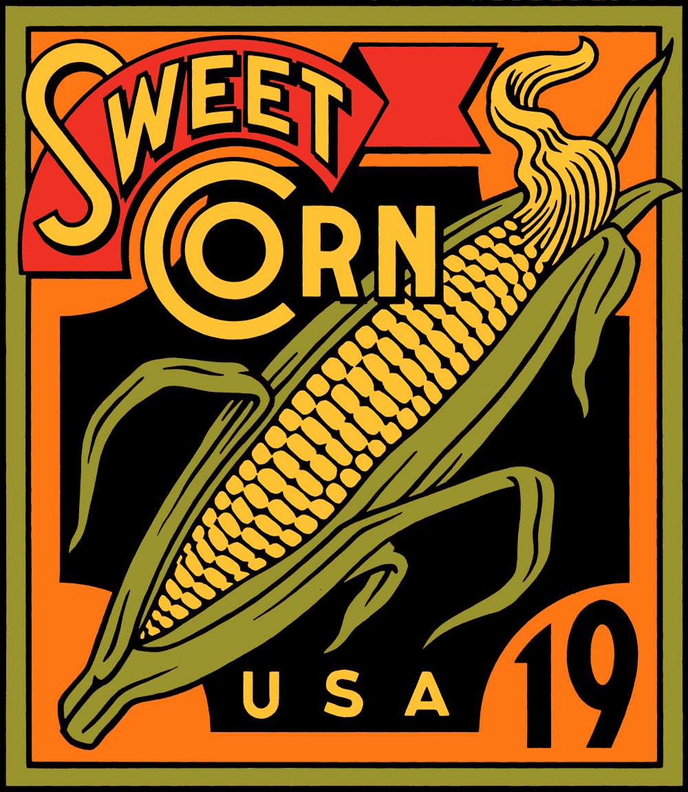
It turned out that because we were keeping the basic design for Sweet Corn, that design also served as a template for the others as well. Starting with the original Sweet Corn design from 2002 (below at upper left), here are a sampling of a few of the iterations as they progressed—with the final approved design at the bottom. In the end the palette changed to one which could be applied to all the stamp designs. Also, note that the Sweet Corn lettering is a bit bolder on the final design (below), making it a bit more legible at the stamp's small reproduction size.

Squash Roughs

Squash Roughs

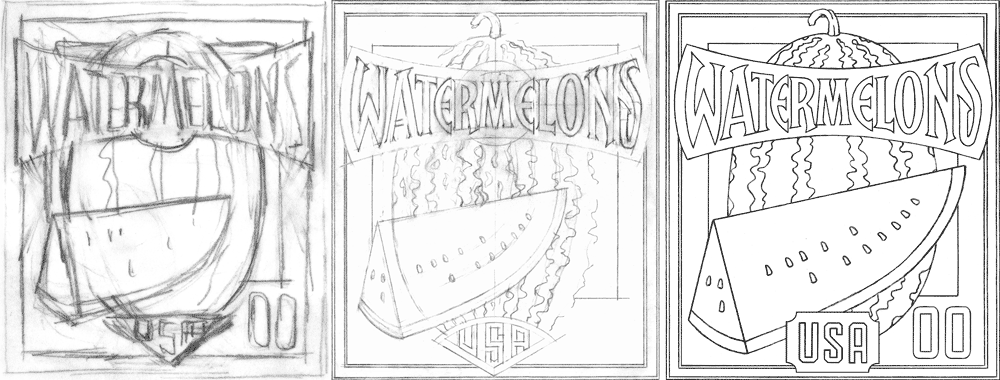
Watermelon Roughs 1

Watermelon Roughs 1

WatermelonRoughs2_X_3

WatermelonRoughs2_X_3

Watermelon Color Comps

Watermelon Color Comps

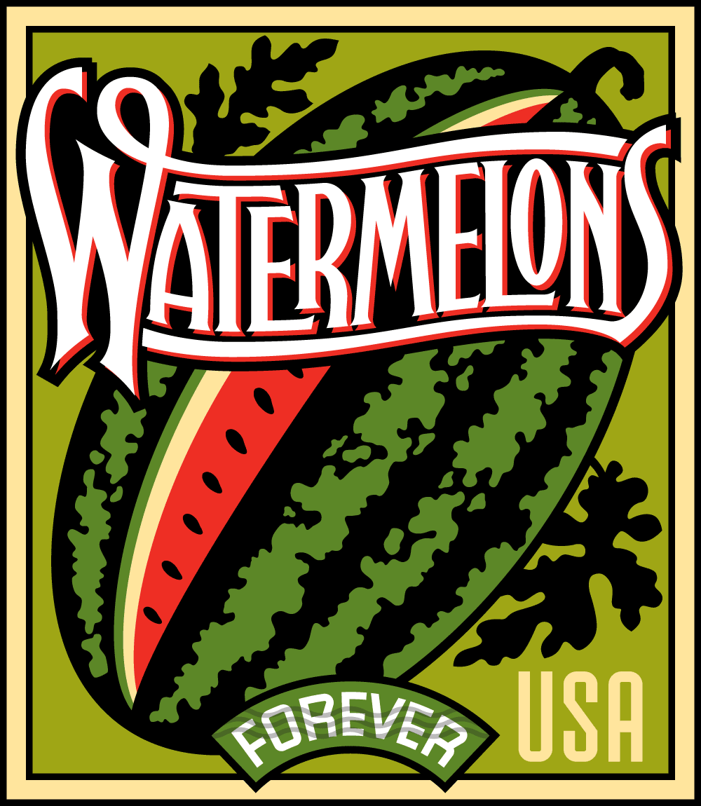
Watermelon Final Version

Watermelon Final Version

Before I had gone that far with it, the stamp depicting Squash was (pun intended) squashed. This was as far as I got before Squash was eliminated from the group. The Watermelons design was a bit more problematic than the others. For some reason the layout depicting a vertically oriented watermelon with a slice in front did not meet with USPS approval. So I opted for the more traditional approach with the watermelon leaning at an angle. Another problem was the length of the word “Watermelons”: I needed to really condense and overlap the letters so that they would be legible at the tiny size they would reproduce. Also, it was felt that in the earlier iterations the letters were a bit too pointy, and so you can see those modifications in the later stages.

Cantaloupes Roughs

Cantaloupes Roughs

Cantaloupes Comps

Cantaloupes Comps

Cantaloupes_Final

Cantaloupes_Final

The biggest stumbling block for Cantaloupes was how to render it—what to do about its textured skin. You’ll notice that the texture went from fairly realistic and finely detailed earlier on to a much, much simpler depiction by the time we got to the final approved design.

Tomatoes Roughs

Tomatoes Roughs

Tomatoes Color Roughs

Tomatoes Color Roughs

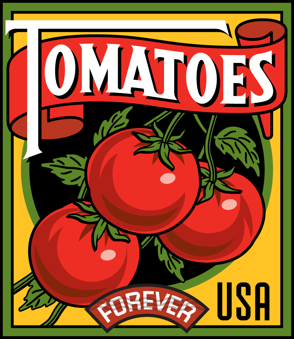
Tomatoes Final

Tomatoes Final

In addition to re-using the Sweet Corn design from the ill-fated 2002 set I also saw the opportunity to recycle the earlier design for Persimmon. It seemed perfectly suited to adapt for Tomatoes. This design then came together fairly quickly. The two smaller color versions (below at lower right) may seem quite similar, but they have several important differences: 1) the background color on the later design is brighter, to be more in line with Sweet Corn, 2) the shading on the two tomoatoes on the right changes a bit, and 3) I re-did the leaves with more detail where the branches meet the tomatoes. A significant difference in the final version of Tomatoes is that I reversed the colors of the type so that now all four of the stamps had white type (for consitency).

Summer Harvest Roughs

Summer Harvest Roughs

Summer HarvestTight Pencils

Summer HarvestTight Pencils

Summer Harvest Label

Summer Harvest Label

Finally we needed a label for the booklets that the stamps would be in. Working with the title “Summer Harvest”, here’s how I worked that out.

I think the similar palettes, the bold white lettering, and the consistent nature of the borders and the other design elements create a group whose individual members stand out as unique. But they all seem to work together as a family as well.

Summer Harvest Complete Set

Summer Harvest Complete Set

Here’s the series together in their booklet form—which will be available in June 2015 (just in time for Summer), and will be sold in booklets of 20.

Summer Harvest Booklet

Summer Harvest Booklet

You can also see these stamps on the USPS website. If you happened to miss Part 1 of this article, you can read it HERE.

Award Winning Alphabet Soup Fonts

Award Winning Alphabet Soup Fonts

.

12 Years in the Making: Fruit & Vegetable Stamps for the USPS — Part 1 of 2

BlogOpener[600]

BlogOpener[600]

Reference-1

Reference-1

Reference-2

Reference-2

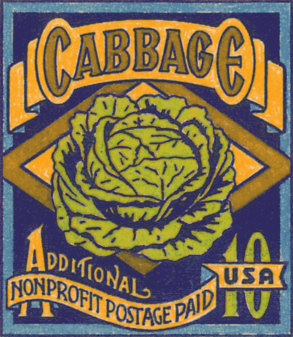
We all know that some projects can take a bit of time to come to fruition (no pun intended!). It’s not uncommon for some projects to even take months to see the light of day. But with these stamps for the USPS I never anticipated that the approval process would span over 12 years! I was first contacted by Art Director and design consultant to the Citizens Stamp Advisory Committee Richard Sheaff back in 2002 to work on a series of stamps celebrating American fruits and vegetables. There were to be six different designs in the set. We had a list of possibilities to choose from including Avocado, Cherry, Grape, Persimmon, Pineapple, Plum, Prickly Pear, and Strawberry. The final selection was Cabbage, Grape Lemon, Persimmon, Pineapple and Sweet Corn. We decided that as a point of departure I would reference vintage seed packets, catalogs and fruit crate labels. Here are a few choice pieces of vintage reference that served to help inspire my designs: What I gleaned from all the reference was not so much layout and design, but more the attitude of these graphics—and how the various fruits and vegetables were represented.

I was not trying so much to do faithful renditions of seed packets or fruit crate labels, but to create graphics that might be seen as contemporary versions of their earlier cousins. So I never borrowed any of the elements from the earlier graphics verbatim, but attempted to update them to a more current sensibility. Also the small size and scale of these stamps prohibited using the reference in a very literal manner: reducing any one of them to the size of one of these stamps would have rendered much of their fine detail unreadable. So I needed to play loosely with the idea of referencing these graphics, making them much bolder and simpler than one might have imagined.

Grape Roughs

Grape Roughs

Grape Color Comp

Grape Color Comp

CabbageRoughs

CabbageRoughs

Cabbage Color Comp

Cabbage Color Comp

LemonRoughs

LemonRoughs

Lemon Color Comp

Lemon Color Comp

Pineapple Roughs

Pineapple Roughs

Pineapple Digital Comp

Pineapple Digital Comp

Sweet Corn Roughs

Sweet Corn Roughs

Sweet Corn Digital Rough

Sweet Corn Digital Rough

Persimmon Roughs

Persimmon Roughs

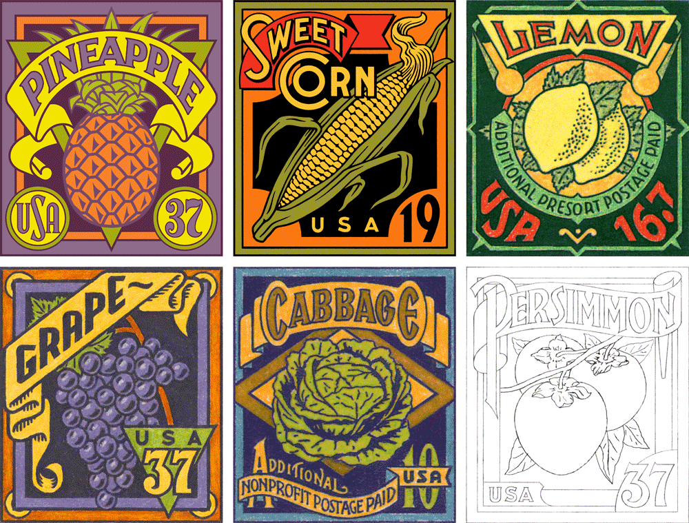
Here are the six stamp designs I created in 2002 preceded in each instance by a couple of the pencil drawings created in their development. Of the six, these first three—Grape, Cabbage and Lemon only made it to the colored pencil comp stage (yes, back in 2002 I still occasionally did color comps the old-fashioned way—by hand!). The following two designs—Pineapple and Sweet Corn—were developed to a more finished, digital stage, and so were more refined and worked out than the preceding three designs. Finally, the sixth subject Persimmon, which was the last to be developed never made it past the rough pencil stage. If memory serves, the project at that point was kept to the previous five designs .

6 Color Comps

6 Color Comps

Below, the entire series as we left it back in 2002: But things don’t always turn out as you would imagine. I never felt that I should have given up hope for these designs . . . so in 2012 an opportunity presented itself with regard to these designs that I couldn’t ignore. If you’d like to know what happened, please check out Part 2 of this post.

Alphabet Soup Type Founders

Alphabet Soup Type Founders

An Interview With “Posting and Toasting”–Pt. 2

Yesterday I presented Part 1 of  Seth Rosenthal‘s interview from his blog (Posting and Toasting) with me about my experience in creating the identity for the NY Knicks. So without further adieu, reproduced below is Seth's second installment:

Star-divide

Behind the Knicks Logo with Michael Doret: Part 2

In Part 1 of our conversation with Knicks logo designer Michael Doret, we talked to Michael about the initial assignment he received in 1991 and got to see a few of his sketches and logo concepts that didn't end up getting picked. It was a prolonged back-and-forth process between Michael and the league, and today we'll look back at the steps of that process leading up to the Knicks logo that's been in place for 20 year sand counting.

Before we take a look at some more sketches, I should mention that, out of sheer coincidence, ESPN's Jared Zwerling has an interview up today with Tom O'Grady, who was-- at the time-- a representative of the league office that contracted Michael's work for this project. Though this conversation has been more about turning up old sketches than it's been about the stories surrounding them, I invite you to check out Jared's piece for another perspective on the logo's history.

Star-divide

Here's more from Michael:

"The development of this logo lasted about six months, and during that time there was a lot of back-and-forth in terms of which designs were developed further and which designs were shelved. I was hired by NBA Creative Director Tom O'Grady, who was great to work with. He was very open to all the ideas I presented to the league. In the one idea they ended up selecting, I had pretty much taken many of my design cues from their old Knicks logo. I had thought "I know they're telling me to shoot for the moon on this, but I know that the way these things work—they'll get scared and won't want to make a big change". So, I gave them that one as a sketch, which was kind of like an updated, contemporized and cleaned up version of the old logo."

With that in mind, here's a look at the metamorphosis of the logo with which we're familiar today:


A couple of things:

1. You can see in that third-to-last sketch where Michael started experimenting with the color scheme (which is different from the final one).

2. Recall from Part 1 that one of the initial design requests was the inclusion of the Empire State Building, so some of these look just like the familiar logo, but wearing a building hat. Obviously, that element got cut from the final logo.

Ultimately, this was the design of Michael's that the Knicks chose heading into the 1992 season. A few years later, Michael was asked to design and integrate the "New York" line above the "Knicks". Recently the logo has undergone a minor color makeover, but it's otherwise the same as it was back in '92, not unlike my voice.

Now, that wasn't the only thing Michael was working on for the Knicks project. He also presented them with a series of monogram sketches-- more compact, initial-based logos that could be used for other purposes. Here are some of those sketches:

The league ended up setting for just the main logo and none of Michael's monogram designs. But wait-- that last one looks familiar, doesn't it? Indeed, it's the token insignia the Knicks have been using as a secondary logo in 1995. It's graced equipment and merchandise since then, and was featured on the back of the uniform until recently. Michael's design drew its inspiration from the old MTA subway tokens, and, if you look back at yesterday's post, elements of it crept into early concepts of the main logo. New York's adoption of the design has a bit of a story behind it:

"Being a New Yorker and growing up riding the subways, I always had that image of the subway token with the Y cut out of it somewhere in the back of my head. I just saw an opportunity to somehow use that iconic NY image for an iconic NY team. Using it for a secondary Knicks logo was something I wanted to push for. When we started discussing a secondary logo—"a monogram or something". I gave them quite a few different ideas, but at the time, they decided not to use any of them. I thought "okay, that's fine"-- I was being paid fairly for the logo development work that I was doing. That whole secondary logo/monogram thing was dropped, and I got paid for the work I had done on it (but not for finished art or usage). Then, several years later, after this whole project was done, an old friend of mine called and said "did you know the Knicks are using that token logo you did for them in your sketches?". I had had no idea-and more importantly, I had not been paid for any usage fees for that design. No one from the organization had informed me, so I contacted the people at the NBA. I don't think Tom O'Grady was there anymore, or maybe he wasn't in the same position—at any rate I don't remember speaking to him about this. I tried to discuss it with some people there, and they informed me that no, the token monogram was their idea—they had created it, and I had had nothing to do with it.

A couple of years had gone by before I found out about this infringement, and In the meantime some of my work had been published in a book called "Design In Progress - What Happens Behind the Scenes", which was about how design projects are developed. I had picked the Knicks logo as a case study of how I develop a logo design, and so in the book were printed many of the sketches seen in this blog. It was just one or two pages in the book, but among the material published was one of the sketches that had included the NYK token monogram. This book was published just after I had completed the Knicks project, and well before the Knicks had started using the token logo. So when they said to me "well, you didn't do it, and if you're going to insist on this and say you did, you're going to need to prove it", I just pointed them towards the book, which had a copyright date of 1992. Realizing they were caught with their pants down and wanting to avoid any kind of legal entanglements, they begrudgingly told me "well, okay we'll pay you for this", and then to punish me said "but you'll never work for the NBA again". That, of course, has been borne out by history.

I felt like I was there at the beginning helping to create a look that a lot of sports teams have picked up on, and from which a lot of other designers really benefited. After that debacle it wasn't me that was being consulted for my design expertise—but other designers who took their cues from what I had begun—and you can see that in a lot of the team logos these days. I feel like I should have been part of that. But if I had to do it all over, I would still stick to my guns and fight for what's right."

Cool. Thus concludes our journey through the history of the Knicks logo(s). Huge thanks to Michael for sharing all this with us, and to P&T's normanhathaway for helping to set it up. Once again, I encourage you to check out Michael's website and blog, and to read the ESPN interview with Tom O'Grady for more logo history.


An Interview With "Posting and Toasting"

My good friend Norman Hathaway is an avid New York Knicks fan, and follower of Seth Rosenthal's humorous Knicks blog Posting and Toasting which boasts one of the biggest communities of Knicks fans on the internet. Apparently Norman spoke or wrote to Seth about my involvement with the NBA, and specifically about how I created the current identity for the Knicks. So Seth contacted me, and we talked about how that whole thing went down. I dug up a ton of my old sketches and comps for this project and sent them to Seth who put them all together, interviewed me and is now posting the story in two parts over two days on his blog. Today, I've reproduced verbatim (below) Seth's first post, and tomorrow will do so again with the second:

Star-divide

Behind the Knicks Logo with Michael Doret: Part 1

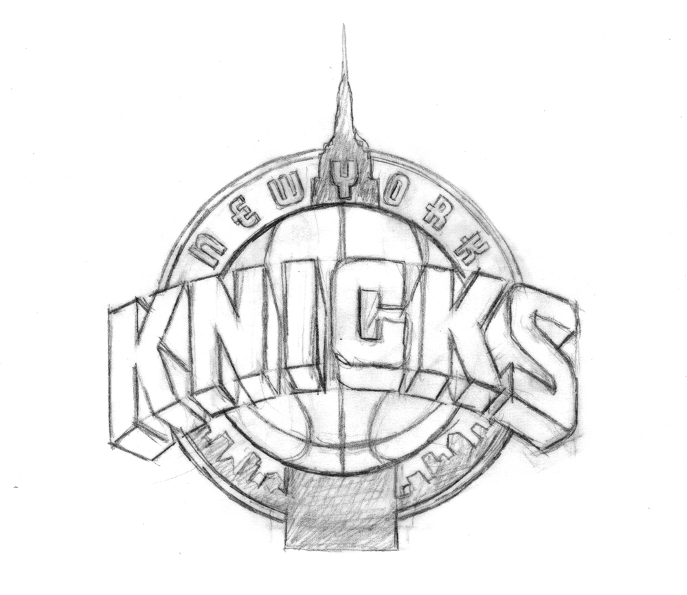
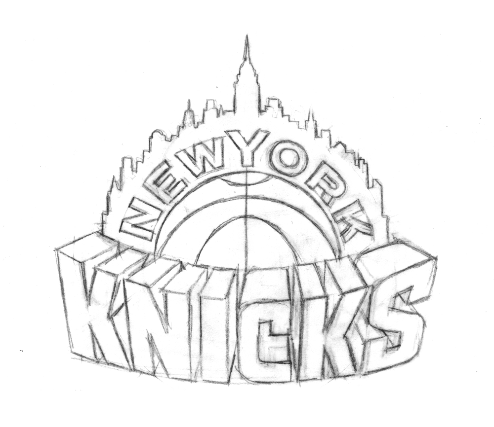
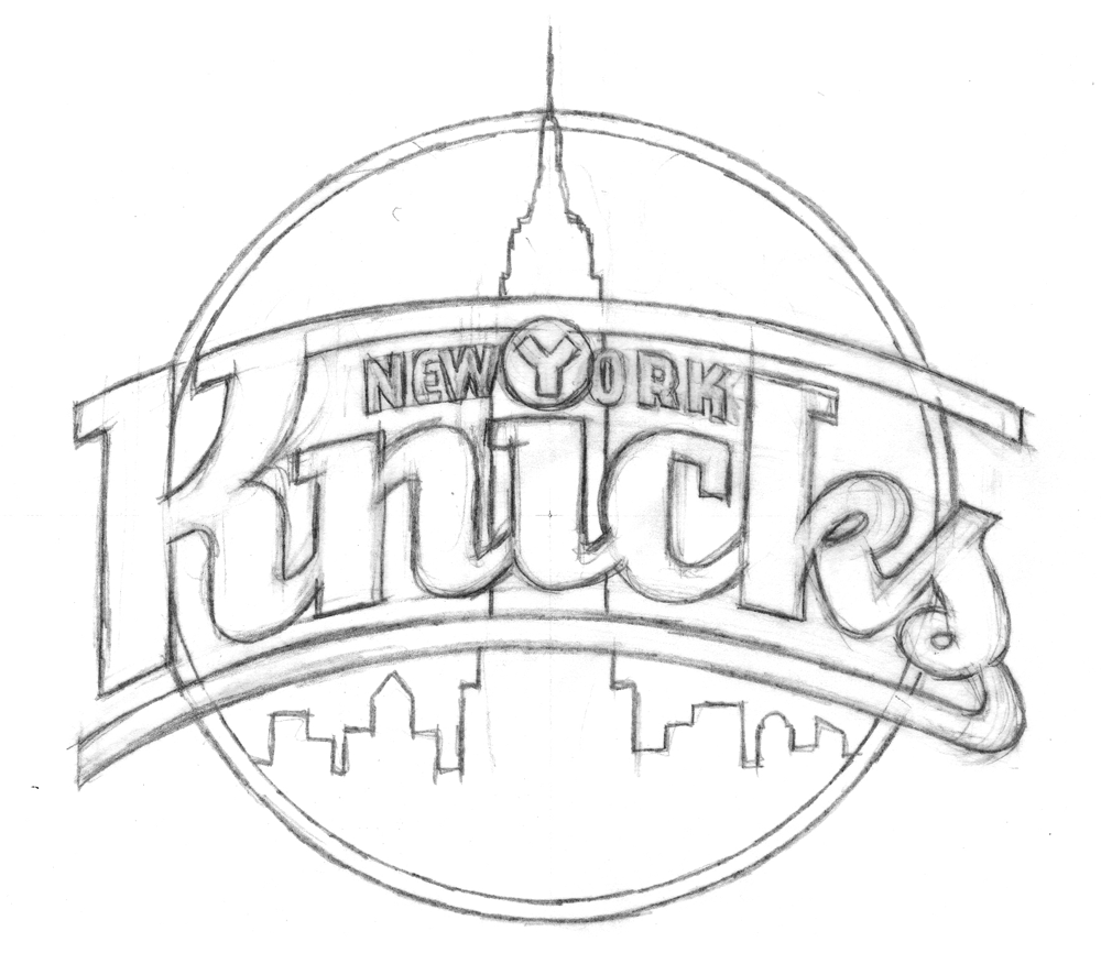
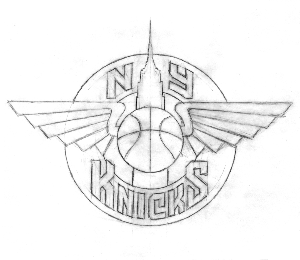
This is the current Knicks logo. This is what the Knicks logo looked like in 1992. Little has changed, y'all. They added a little "New York" and modified the colors recently, but have done nothing else to alter a design that's been the primary logo for over twenty years. That emblem has been a constant symbol of the team, and its distinctive big, block lettering echoed throughout several other teams' redesigns in the '90s, some of which are still in place today. So, where did this logo-- which has persisted through multiple Knicks regimes-- come from? With the help of P&T citizen normanhathaway, I had the pleasure of corresponding with Michael Doret, the man who made the Knicks logo.

Doret is a New York-raised, Los Angeles-based designer and lettering artist with a rather extensive resume. When the NBA approached him in Spring of 1991, he'd already done some work for the league, as well as designs and design ideas for the MLB, the NFL, TIME Magazine, the band Kiss(!), and a lot more. So, the league felt pretty confident in his abilities and gave him pretty much free reign to try out different logos and letterforms:

"Before starting on this design project I didn't receive that much input from the NBA other than the directive that they wanted to have something symbolic of New York CIty incorporated into the logo. After discussion we eliminated several options (such as the Statue of Liberty), and settled on the iconic Empire State Building as the only viable alternative that might work in the new logo. So in the beginning stages that was the given which, as we all know, they ended up deciding against as the logo development progressed. I think other than keeping the original blue and orange from the old logo, there wasn't that much else given me in terms of requirements. The directions I took were mostly left up to me."

It was a fairly open-ended task and, as Michael notes, the only specific request made of him didn't even make it to the final product. So, with that dearth of instruction in mind, he set about producing a variety of design concepts. In Part 1 of our magical journey through Michael's old files, he'll show us some of the concepts that didn't make it.

Star-divide

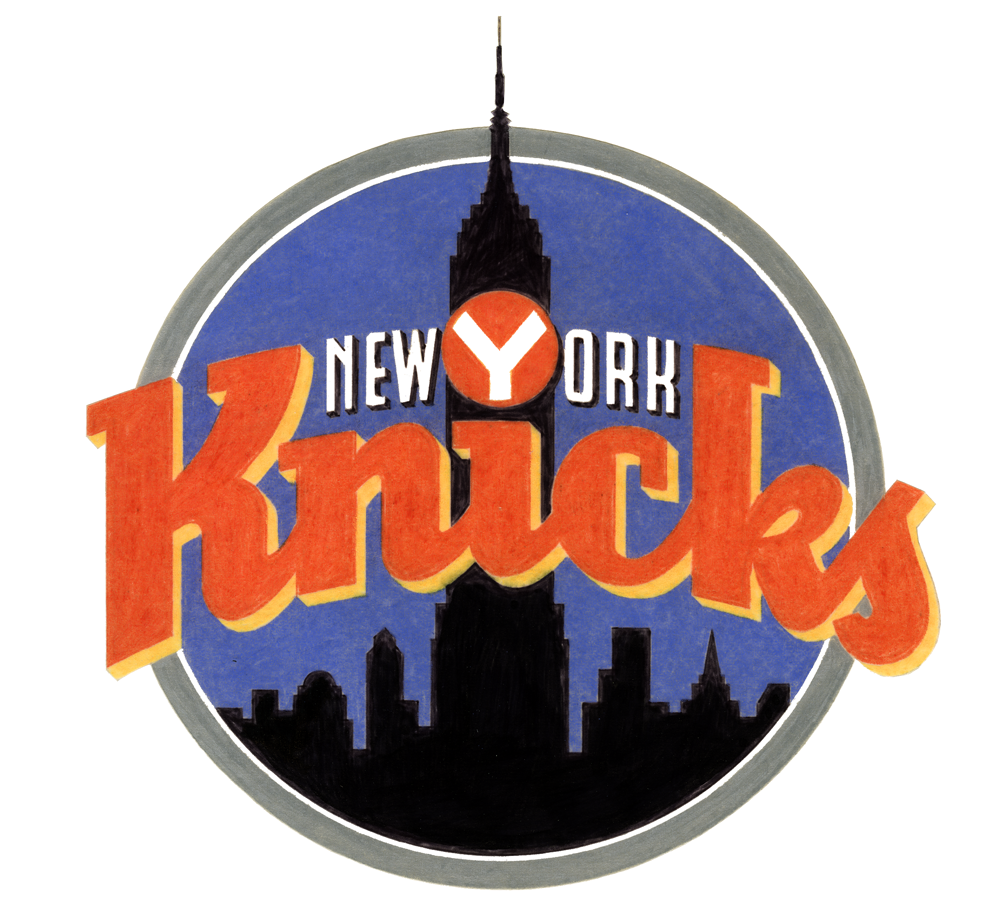
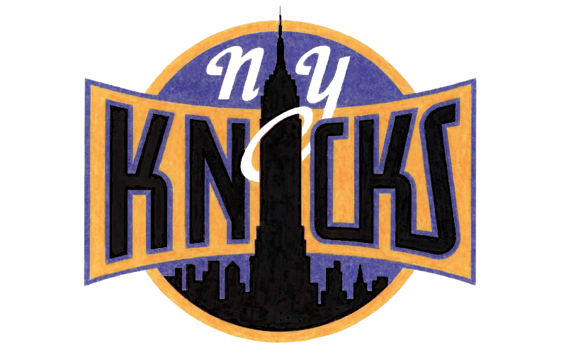
To generate ideas, Michael began with some rough sketches, examples of which are below.

With the Empire State Building icon relatively unchangeable, Michael focused his imagination on the lettering:

"At that time (and even still) my work was all very lettering-oriented. I was trying to open up new areas of letterform design that, up until that point, had tended to be a bit stodgy and traditional. I was just trying to do something different for the time. In actuality I was picking up a lot of cues from bygone eras, from when lettering was really in its heyday-like in the 1930s and '40s-only this time around with a slight twist."
Some of the sketches and elements of others eventually made it into color concepts which, before the widespread use of computer design programs, Michael rendered in colored pencil (the '90s were a dark time).

Any of these could have ended up as the Knicks' primary logo (and, incidentally, Michael loves all his logo babies, but told me the first of those color logos was his favorite), but alas, they could only pick one

In Part 2 (tomorrow, perhaps) we'll look at the process behind the logo of Michael's that the Knicks did choose, and learn about how another familiar piece of Knicks iconography also comes from Michael's desk.


Fun With Type!

Last year I became a beta-tester for Astute Graphics’ Adobe Illustrator plugin “VectorScribe”. Those who know me know that I’m not really a very tech-savvy person. I get quite comfortable just sticking with doing things the way I usually do them. Over the years I’ve become very adept at using Illustrator, and was not overly excited at the thought of having to learn some new tools. I’d heard of Illustrator plugin tools, but I’d never really thought of using them before. So, to my surprise, I almost immediately embraced the new tools in VectorScribe. They work really well, ironing out a lot of the inherent flaws in Illustrator. I’d learned to live with a lot of those flaws, but once I learned I didn’t need to live with them anymore, those “flaws” started to look more and more like gaping wounds. VectorScribe is great—now I don’t know how I ever got along without it! You can download a little Case Study we did about VectorScribe here. I would definitely encourage all serious Adobe Illustrator users to at least try the 14 day free trial version. It will change your life!

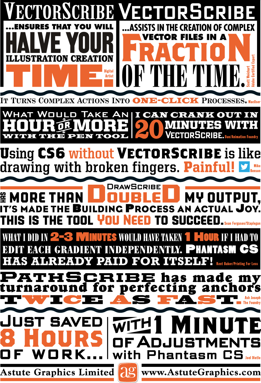
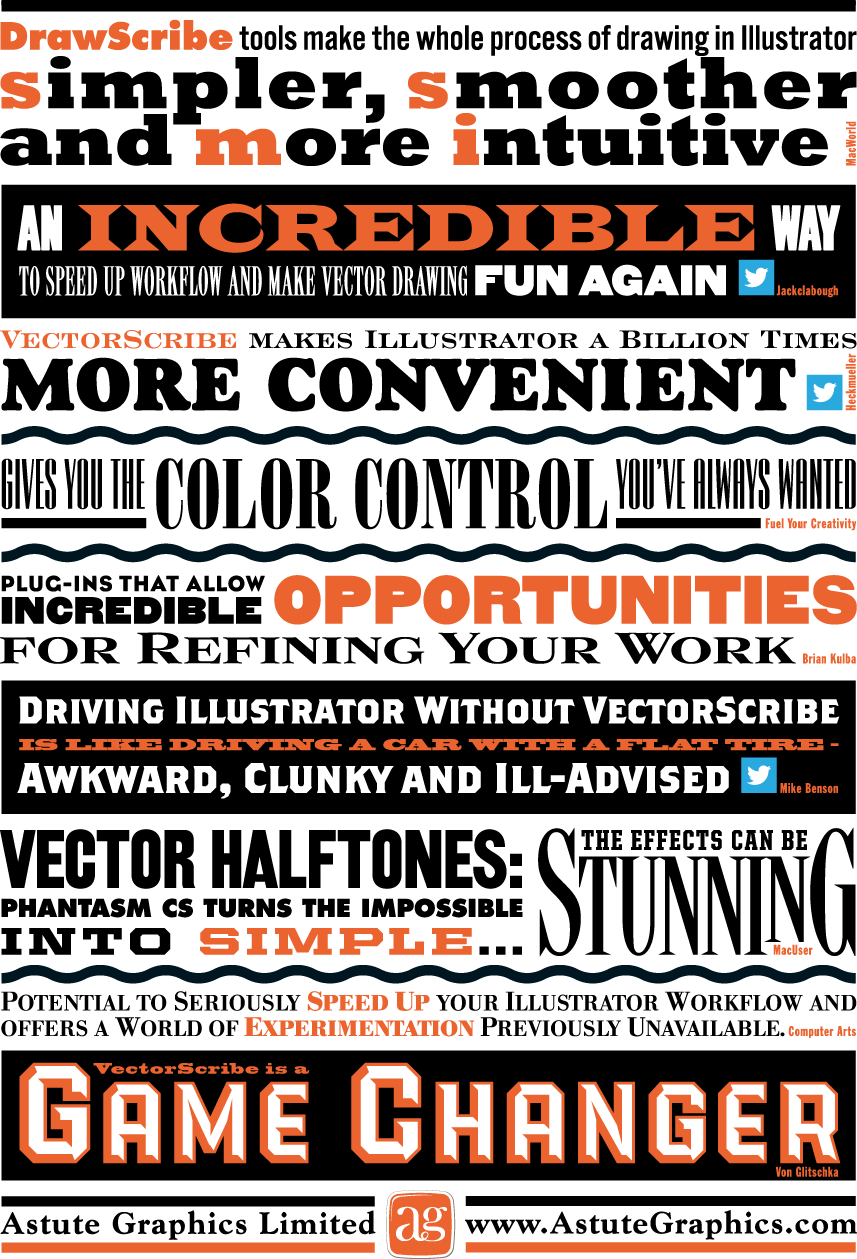
So when the good folks at Astute Graphics asked me if I’d work on a little printed promo for them I thought “Well, why not? I really believe in their products”. The front and back covers of the piece were to be covered with testimonial quotes about their plugins from other users. The challenge was to make this list of quotes visually exciting. Most of my work is lettering-centric, but with this project the challenge was to only use set type and limited color—something a little different for me. I did use two of my own fonts, PowerStation (currently on sale) and DeLuxe Gothic: see if you can find them. Anyway, I think you can see that it’s possible to create a lot of visual fun by just using the basics, and combining them in imaginative ways. This is real Alphabet Soup!

Above is how the front cover turned out...

...and the back cover below:

Le Train Bleu #2

Two years ago I visited Bloomingdale's in NYC, and specifically their Le Train Bleu restaurant for which "back in the day" I had originally designed many of the original elements. In my visit to NY last month I revisited the restaurant—and this time dined there. If I was surprised the last time to see that my signage and monograms were apparently still in use, dining in the restaurant this time allowed me to see the full extent to which everything I had done was still there—just as it was the day it opened back in the '80s. I hadn't known that they were still using the menu design I had done for them, or to the extent that they were using the emblematic monogram I had done at the same time. After years and years of use I would have imagined that the menu would have been a bit dog-eared, but apparently they've been printing and reprinting it all this time.

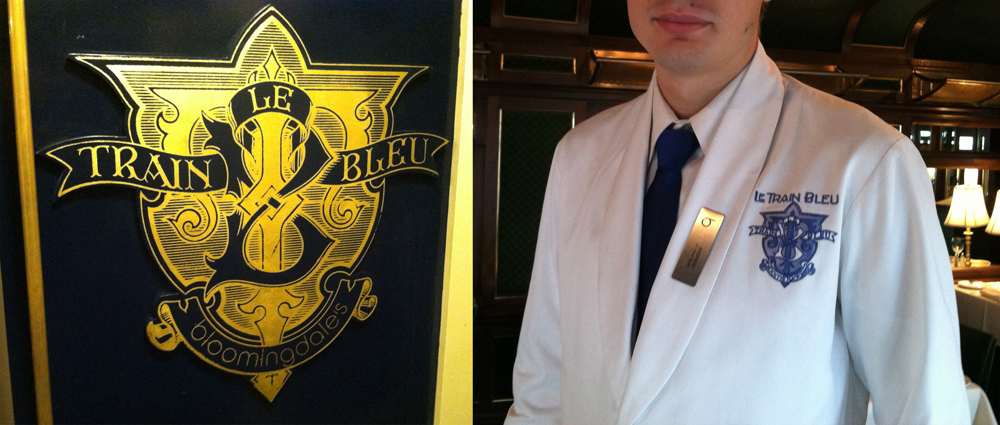
Aside from it being rendered in gold leaf on the outside of the train car and imprinted on the wine list and check wallet, they'd gone so far as to embroider the monogram on each and every uniform in the restaurant—classy! Perhaps that says something about a designs longevity?

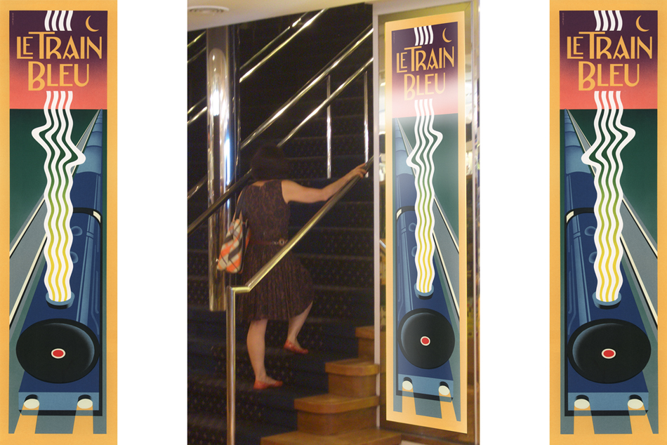
And here's a reminder for those who are interested: there are prints of the Le Train Bleu vertical format artwork—identical to the signage murals outside the restaurant—available on my ILLOZ site. These prints are finely produced, hand-crafted 12 color fine art lithographs that are virtually identical to the original painting.

Steinweiss on Steinweiss

When I originally did the title lettering for "Alex Steinweiss: The Inventor of the Modern Album Cover" I hadn't yet designed "Steinweiss Script". In fact it was designing this headline that spurred me to do that typeface design. In retrospect there were many interior headlines and other lines of copy for the book that Josh Baker, AD at Taschen, would have liked to have had set in a new Steinweiss Script font. But they had to settle for what was available at that time, which was one of several different digitized versions of what Alex Steinweiss had originally designed for Photo-Lettering. Now Taschen has released their more moderately priced trade edition of this incredible book—and just in time for this release I was able to reset all their headlines and other copy the way we had originally wanted to—in Steinweiss Script:

Above: Before and After Details from the older and newer editions

Below: You can Look Inside the earlier edition...

...or Look Inside the newer version:

Our intention was that the newer version, with everything reset in Steinweiss Script, would feel closer to what Mr. Steinweiss would have done had he been able to apply his scrawl to these pages.

Just a reminder: Steinweiss Script is available for purchase on MyFonts, Veer, FontShop and YouWorkForThem. To learn more about these fonts, read Steven Heller's Imprint article or MyFonts' Creative Characters for January.

"Appetite" Opens at Cooper's Lubalin Center

"Appetite – A reciprocal relationship between Food & Design" opened last night at my alma mater The Cooper Union, hosted by the Herb Lubalin Study Center. The exhibition explores how design influences our day to day relationship with food, and covers everything from restaurant signs and menus to supermarket price labels and takeout packaging.

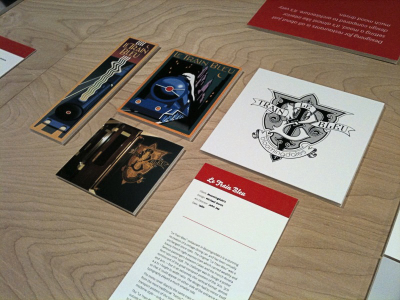
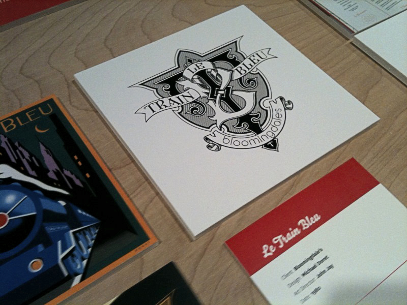
I was fortunate enough to have some of my work included in this show—my "Le Train Bleu" project that I had recently highlighted in this blog. Although I couldn't make it to the opening, my good friend Louise Fili was kind enough to send me some snaps of my work displayed in the exhibition:

Hungry for more? The exhibition is at 41 Cooper Square (3rd Avenue between 6th and 7th Streets), NYC. The show runs through October 9th. The gallery hours are Monday through Friday: 12–7; Saturday: 12–5. The exhibition was curated by Alexander Tochilovsky. Read an interview with Alexander about this exhibition at Eye Blog, and read more about it and see more photos of the exhibition from the opening at Design:Related.

Introducing DeLuxe Gothic — 50% Off Special!

Due to a threatened lawsuit by the folks at FontHaus (who somehow believe they are the only ones entitled to use the name "Bank Gothic") I have changed the name of my font "Bank Gothic AS" to "DeLuxe Gothic". I have great respect for the original designer of Bank Gothic, Mr. Morris Fuller Benton, and chose the name DeLuxe Gothic because it was the name that The Intertype Corporation used for their version of this classic font during the early years of the 20th Century.

My particular take on this design was that I always felt it could use a set of lowercase letters, and that is what sets my font apart from the rest. You can get a better look at it if you download the DeLuxe Gothic Brochure. Coincidental to the release of my renamed font, I've decided to run a Special Promotion on MyFonts: 50% off this font for one time only, and for a limited time—hurry and get yours before they sell out!

Le Train Bleu @ Bloomingdale's

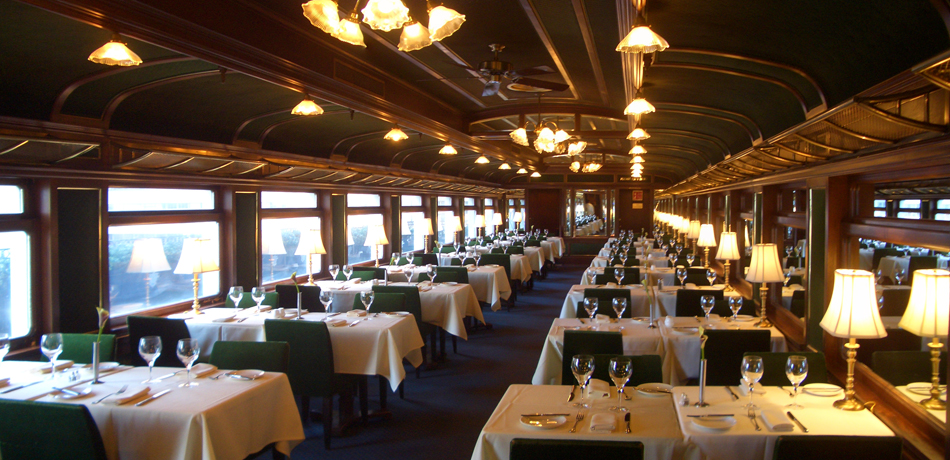
While in New York City to give a talk at the Type Directors Club Laura and I stopped in at Bloomingdale's. I hadn't been back to Bloomingdale's for many years, so while there I thought I'd check to see if some signage I had designed for their "Le Train Bleu" restaurant might still be in use. To my utter amazement, my work was there—still in use after 30 years. The restaurant itself is a stunning recreation of a vintage dining car, and has been virtually unchanged inside since the day my work first adorned its entrance.

The Original "Le Train Bleu" was a luxury French night express train which carried wealthy and famous passengers between Calais and the French Riviera from 1922 until 1938.

Back in 1980 I had designed and painted art for two panels that were to bookend the stairway leading up to the restaurant. The challenge, as outlined to me by then Bloomingdale's Creative Director John Jay, was to design a poster reminiscent of the great transport posters of the '20s, '30s and '40s,—but in an extremely thin vertical format: almost a 4 to 1 height to width ratio. Also the design had to be able to mirror itself so that it could appear on either side of the entrance. Designing the piece so that one had almost a bird's-eye view of the train which was letting out a very art-moderne steam stream seemed like a natural for the format.

This was not a typical project for me at the time because I had never executed a painting like this before. In addition the typography played a much smaller role in the design, and in the end was much more toned down than in most of my other work.

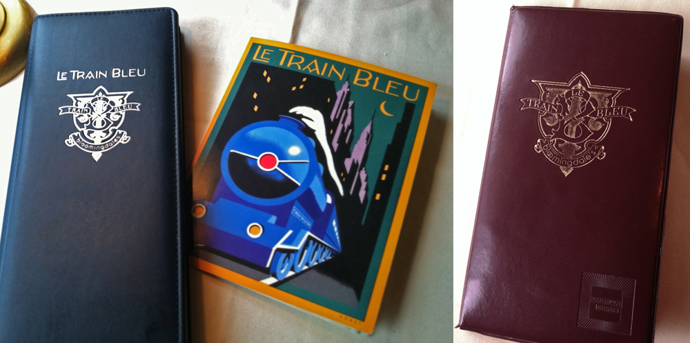
Above is the menu cover I designed as a companion to the stairway panels. It depicts the same train as in the panels from the more traditional "heroic" viewpoint seen in many transport posters of the time. I redid the lettering, but kept it in the same moderne style—only in a lighter weight. And unlike the panels the art for which I had painted in gouache, I did the menu cover as pre-separated mechanical art—much more akin to my current work which is usually done in Adobe Illustrator.

Additionally I had designed the "Le Train Bleu" seal or monogram that appears in relief outside the restaurant and on printed materials. This was much more akin to the type and letterform-centric work that I've become known for, and was designed to be very heraldic in nature. To my surprise this large monogram in relief was also still there, looking as fresh as the day it was first mounted in the vestibule of the restaurant at the top of the stairs.

For those who are interested there are prints of the Le Train Bleu vertical format artwork available on my ILLOZ site. These prints are finely produced, hand-crafted 12 color fine art lithographs that are virtually identical to the original painting.

Please also see my more recent supplemental posting on Le Train Bleu at Bloomingdale's.

Metroscript a "Rising Star" at MyFonts

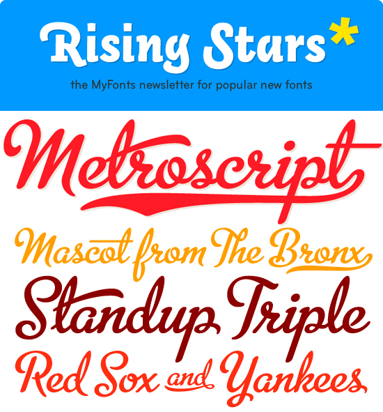
In mid-March I began selling my Alphabet Soup fonts through MyFonts. To my surprise, in that short period of time "Metroscript" rose to the top of their list of "Starlets". The Starlets list ranks all fonts that appeared on MyFonts within the previous 50 days according to their sales volume. MyFonts just sent out their May newsletter Rising Stars highlighting the best-sellers among their new fonts, and I'm proud to say that Metroscript is prominently featured.

This is all very gratifying to me—I arrived at font design by way of my career as a lettering artist—which is not the route taken by most font designers. Font design is a very different discipline from lettering in that it is a much more disciplined craft. I can make a piece of lettering sing by using all kinds of tricks and devices to create visual excitement. It does take a keen eye and lots of imagination and know-how to make a piece of lettering stand out, but font design is much less forgiving: you are limited to one letter next to another in a straight line, and every letter in a font must be in harmony with every other letter. I think much of Metroscript's success has to do with the fact that I brought a lettering artist's eye to a font designer's craft, and I think this may be appreciated by those who are looking for something a little different. I've been told that copy set in Metroscript resembles hand lettering more than any other font.