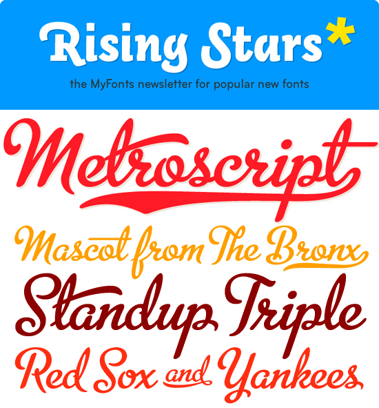
 In mid-March I began selling my Alphabet Soup fonts through MyFonts. To my surprise, in that short period of time "Metroscript" rose to the top of their list of "Starlets". The Starlets list ranks all fonts that appeared on MyFonts within the previous 50 days according to their sales volume. MyFonts just sent out their May newsletter Rising Stars highlighting the best-sellers among their new fonts, and I'm proud to say that Metroscript is prominently featured.
This is all very gratifying to me—I arrived at font design by way of my career as a lettering artist—which is not the route taken by most font designers. Font design is a very different discipline from lettering in that it is a much more disciplined craft. I can make a piece of lettering sing by using all kinds of tricks and devices to create visual excitement. It does take a keen eye and lots of imagination and know-how to make a piece of lettering stand out, but font design is much less forgiving: you are limited to one letter next to another in a straight line, and every letter in a font must be in harmony with every other letter. I think much of Metroscript's success has to do with the fact that I brought a lettering artist's eye to a font designer's craft, and I think this may be appreciated by those who are looking for something a little different. I've been told that copy set in Metroscript resembles hand lettering more than any other font.
