Viewing entries in
Gigs

"QWERTY" Pen & Card Case Released by Acme Studio

Acme Studio of Maui, Hawaii is known for having an incredible roster of world reknowned designers who have designed pens, watches, cufflinks, wallets and various other accoutrements for them. Some time ago I proposed a pen and business card  case to them with a vintage typewriter key theme. This January they've released my "QWERTY" pen and business card case design. Currently it's at the top of their New Releases page (click on "New Releases" at upper left) and and on their Designers page (click on my name a little ways down the list at the left).

I’ve always loved vintage office machines—especially old typewriters. I guess it’s because I grew up with them. My Dad was a writer, and my memories of him are filled with the sound of his tap, tap, tapping away day and night on his trusty old Underwood. When word processors started taking over, he just found it too difficult to make the transition. It’s hard to explain, but I think it had something to do with a kind of personal bond that he had formed with his machine. Because of my early associations with manual typewriters I still love not just their look and graphics, but especially the feel and clackety-clack sound of the keys, and the imperfect impressions they’d make on paper.

Those memories of my father and his Underwood are now very near and dear to me. Typewriters have now been pretty much relegated to the dustbin of history. The “QWERTY” keyboard layout still survives despite many attempts to improve on it. In designing this pen and case I saw an opportunity for me to create a small homage to these wonderful machines. It may sound odd, but the way I see it, in a way it’s kind of like one almost obsolete writing instrument paying tribute to another.

Acme Studio products can be purchased in Acme Shops worldwide, in better stationery and art supply stores, in museum shops, and online.

The Return of . . . KISS (#2)

When Paul Stanley came by my studio to discuss how to proceed on the art for the cover of their upcoming CD/DVD package "Sonic Boom", I had no idea what to expect. I hadn't met with him since working on Rock and Roll Over, and had very little memory of what that had been like. Any anxiety I had melted away when we started talking. Paul is a "gentlemen's gentleman" and I immediately felt at ease talking with him—as if all those years had not intervened since the last time we had spoken. After some small talk he explained what he was after with the new cover art. His vision for this album was to make it as vital and raw as it had been when they did RaRO. He felt that that had been some of the best work that they had ever done, and wanted the new album to recreate that energy both musically and visually. While he didn't want me to reprise what I had done with my art for the earlier cover, he did want me to try to capture some of the same spirit, attitude, energy, and look that I had instilled in that piece. Also one of his stipulations was that unlike RaRO (where I had created abstract, graphic versions of the KISS personas) this time he wanted photographic representations of the four group members in full makeup. When I did RaRO I had a 12" canvas to work on. Now with CD covers and digital booklets that canvas had been reduced to less than 40% of its original size. Designing in a 4¾" space poses some very different problems from what I faced while working on covers for vinyl releases. In fact the older cover design would not have worked at that size, it's many elements would have felt crowded into a small space. So the elements of Sonic Boom had to be bigger, bolder—and fewer. I made the decision to make the title the main focus of the graphics, moving the other elements (faces, KISS logo) into prominent—but subordinate—roles.

So I set about putting pencil to paper and trying to solve this the way I solve any other design problem. I did not want to get psyched-out by thinking too much about how the new design would compare with RaRO. That cover had taken on a life of its own and had become a pop culture icon. Creating an iconic cover could not have been one of my goals. All I was capable of doing was to try to create the most compelling graphics possible within the parameters and limitations that had been set out for me. So I started out at the core of this design by creating what I call a "word constellation" out of the title. I tried to make it communicate its meaning visually by not only making it angular and "explosive", but also by creating a shape that was somewhat suggestive of flight—a "flying wing", if you will. Bearing in mind the symmetrical, mandala-like layout of RaRO I started designing the new piece as a field growing out of the center of the square, with the four members faces moving outwards from the center, and capped with my version of the ubiquitous KISS logo.

It took about a week for me to develop my sketch to the point where I felt confident in what I had come up with. As I had done with RaRO, I felt so strongly about this cover design that I decided to not present any other options—I wanted this to be the ONE.

This is the rough pencil I first presented to Paul. I held my breath as he first took it in, and then was able to exhale when I saw a big smile appear on his face.

Next: A few changes and the final art.

The Return of . . . KISS (#1)

I've been waiting a few months to be able to talk about this—and I have talked about it to some degree in a few online interviews, but not really in any detail. Back in April of this year I received a telephone call from out of the blue—from somewhere in South America. At the other end of the line was KISS' Paul Stanley. It'd been more years than I cared to remember since we last spoke. That was when I had done the cover art for "Rock and Roll Over"—KISS' 5th album and their 2nd to go Platinum. So you can understand my surprise when Paul asked if I'd be interested in designing the cover art for KISS' first studio album in 11 years—which Paul himself was producing.

That's when I started remembering how exciting it was the first time around, to have been involved in that fast-paced world of entertainment and music. For me it had been a far cry from doing the corporate logos, magazine and book covers I had been working on at the time. An "edgy" job for me then was doing a spread for High Times (yep, they've been around for a while)! I've always enjoyed the fact that doing what I do has enabled me to straddle many different design worlds, from the fairly straight to the totally off-the-wall. I always tried to say "yes" to just about anyone who was adventurous enough, and had the vision to see how having me design for them could work to their advantage. At any rate I had said "yes"to KISS the first time around (even though I had no idea what I was doing), so of course I again said yes to Paul. We agreed to meet when he returned at the conclusion of their South American tour.

Much to my surprise the "Rock and Roll Over" cover had in recent years become one of the most—if not the most—talked about piece of art in my portfolio. It was a little bewildering to me how over the years that cover had become an icon for this iconic group. I've been contacted by more people about my KISS artwork in the past 6 or 7 years than in all the years prior, and more than any other piece I've ever done including the New York Knicks logo. So the expectations for this new art I was to work on were quite high.

Next: the new cover design revealed.

(Not Too Much) Lost in Translation

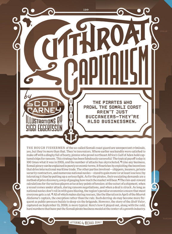
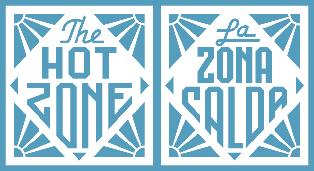
I recently worked with Art Director Maili Holiman designing the opening page and titles for an article about the Somali pirates for the July issue of Wired Magazine (it might take a few moments for this article to load). No sooner had I finished doing the five pieces of art than I was contacted by Wired Italia, who asked me to recreate all the art I had done—but in Italian. Recreating designs with different wording can be challenging as my designs are usually based on the specific letters I'm dealing with, how they relate to one another, how many words there are, etc. The main piece was particularly challenging as the design was more complicated than the others. But at least the main word kept the cap "C" which otherwise would have posed a major problem:

After dealing with the the opener the four other heads were slightly less problematic to deal with:

I don't know, but it seems to me in some cases the Italian version might even work slightly better than it's English counterpart. I had never before dealt with this type of problem, but can only guess that with our shrinking world we'll be seeing more and more of this type of crossover.

Dept. of Redundancy Dept.

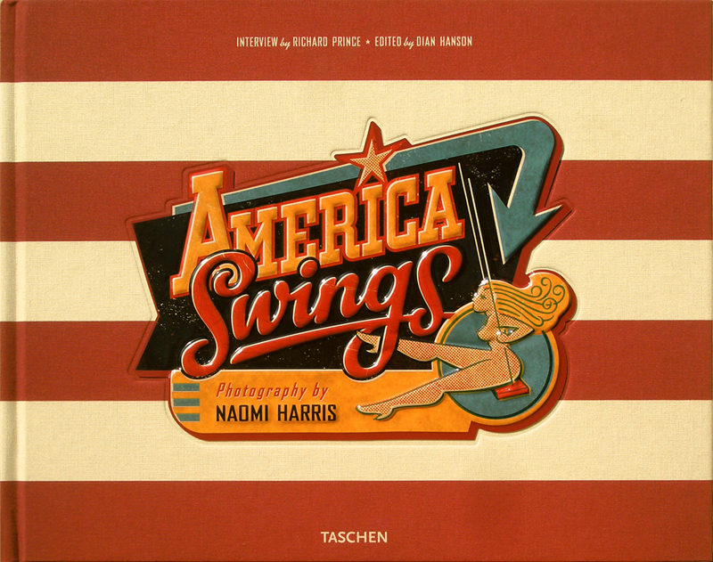
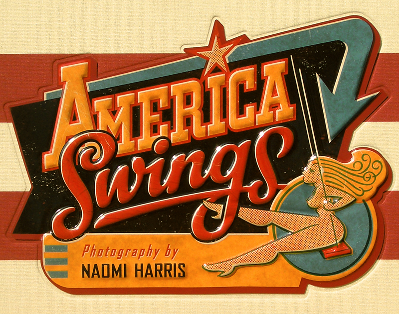
I haven't yet repeated a posting on a particular project, but I felt I needed to do it just this once. I wanted to show off the actual cover that I designed for "America Swings". I designed it to be an actual tin-lithograph like the toys that were produced by companies like Chein and Marx back in the 20th Century. I was absolutely thrilled with the job that Taschen publishing did with fabricating and putting together this cover from the quality of the tin-lithography to the American flag background fabric. Click on the bottom image below for an even better view.

Set the Wayback Machine: "Viva" Astrology

I thought it would apropos and an interesting idea to start the New Year off by initiating a series of posts that looks back at some of my work from times gone by. Much of this work will be pre-digital—done the old fashioned "analog" way, with pen and ink. Most was done as pre-separated art: I inked my art on multiple cells of frosted mylar using a Rapid-O-Graph technical pen. Basically the areas of black ink on each cell could be designated to print either with CMYK callouts or with Pantone numbers. It was a very laborious process that was easily duplicated after the first few versions of Adobe Illustrator had come out.

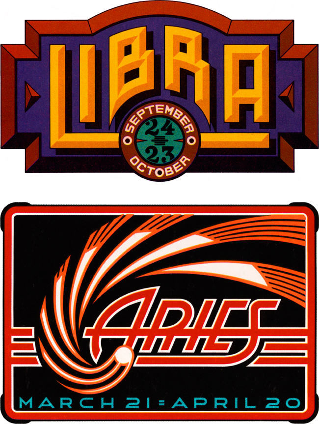
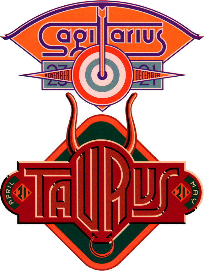
Four Astrology Sign "Logos" for VIVA Magazine

So right now let's set the Wayback Machine for the mid '70s and VIVA magazine published by Penthouse (a kind of Playboy for women). The Art Director—the late Rowan Johnson—asked me to design logos for their monthly astrology column which would change with each issue. Even though at the time I was paid quite a paltry sum for my efforts, this was a great ongoing project for me. Much like my recent "Jewish Zodiac" project, I saw this assignment as an opportunity to create a portfolio of distinct yet related logos. I think they really highlight the possibilities of using letterform design not as an end in itself, but as part of a total design concept where letters are treated as one of several related illustrative elements, and integrated into an expressive whole.

America Swings

Josh Baker, Art Director/Designer at Taschen Publishing, needed a cover design for a book by New York photographer Naomi Harris. The book: America Swings. The subject: a photographic odyssey spanning the 50 States chronicling the swinging sex lives of everyday Americans. My challenge was to come up with a cover design that would encapsulate the "Route 66" flavor of Ms. Harris' travels and communicate the uninhibited/explicit nature of the subject without spelling it out on the cover.  For the cover’s swingin' blonde figure I got a little help from my wife, illustrator Laura Smith. I then created one of the more complex graphics of my career—this time working almost exclusively in Photoshop—as opposed to Illustrator which is my usual application of choice. I also created a detailed map of Naomi's travels across America for the book's endpapers.

The Jewish Zodiac™

About a year ago I was contacted by comedy screenwriter Seth Front who pitched me his idea for "The Jewish Zodiac™": a parody of "The Chinese Zodiac" but with deli foods instead of animals. Each of the 12 signs (based on birth year) would, in a light-hearted way, personify the food's characteristics as well as explore compatability with the other 11 signs. It seemed like a good idea, and I could design them all as vintage deli food labels with the potential of becoming a mini portfolio of 12 related but distinctly different designs. One problem I needed to solve was that Seth had already done food photography, and was intent on using it in the designs. Initially I wasn't hot on using his photography because I thought it would be difficult to integrate into my graphics. But then I figured out a way of using Photoshop and Illustrator to translate the photos into simplified graphics using limited color. The results looking deceptively simple and easily achieved—but figuring it out and translating each photo was in actuality a very labor intensive process. I was then able to extrapolate the label designs using the limited color palettes derived from the processed photographs. Below is a section of one of the photos and the corresponding section of its simplified graphic counterpart I created, reducing it to 6 flat colors:

It took many months to get all 12 done, but I'm very pleased with the group as a whole. Below are two of them—if you'd like to see all twelve in more detail follow this link to the PROJECTS page on my website. To purchase T-shirts, mugs or magnets please visit Seth's "The Jewish Zodiac™" website.

Office Machines & Bubblegum

I've always loved the graphics found on vintage office machines (you know, the ones with industrial hammered metal finishes), which are often comprised of 2 or 3 color decals. They have a lot in common with decals that were used on gum and candy vending machines back in the '40s and '50s. I've managed to collect a few of those, and have always admired the naive, bold and simplistic graphics and design sense they share. I recently found a way to pay homage to them when my friend Jed Davis, Senior AD at both Promo and Direct magazines (and who also runs the indie record label "Eschatone Records") called me with another cover assignment for Promo Magazine.

A few gum machine decals

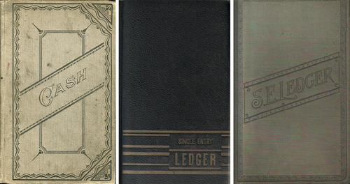
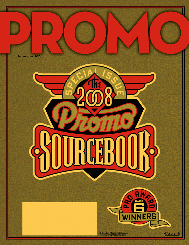
The November issue of Promo is a special issue called "The 2008 Promo Sourcebook" and they needed a cover design that was non-specific, yet eye-catching enough so that people wouldn't mind having it around for several months. My first inclination was to give it a sort of ledger-like look:

But after consideration, I thought that idea might be a little too sedate and staid for what Jed was looking for. Then it occurred to me that perhaps this might be an opportunity to do something along the lines of the decals I had been collecting. I could get color and excitement into a cover that had the feeling of a ledger by also referencing the graphics and decals found on old office and gumball machines. To further the feeling I gave the gold color a subtle "decal" texture, and the background feeling of metal with an industrial machine-like finish.

Fame Has It's Drawbacks...2

Back in May I did a blog posting here talking about the mis-perception that my design services are too expensive for most clients. At the time I wrote: "Something I hear quite frequently runs something like this: 'You'd have been perfect for our project, and I'd have hired you in a minute, but you know, we probably wouldn't have been able to afford you.'"

I'm still getting feedback from many of you out there that you believe what I do is too pricey for your budgets. While that may be true in some cases—such as in national advertising or corporate logos, I do pride myself on my ability to tailor what I do to a client's needs and (more and more) to limited budgets. Here's another case in point.

I was contacted by a photographer from Berlin named Tanja Ortmaier ("Spooky Sally") who does predominantly 1940s style pin-up photography under the name "Cherrymuffin Studios". She asked if I would be willing to design a new logo for her that she could use on her website and could be adapted for various other uses such as signage. While her budget was fairly modest, I was impressed with her work (it's not every day that I get to work with a pinup photographer!) and her enthusiasm was, to put it mildly, infectious! Below are two samples of what I was able to do for her: Upper: for use on website | Lower: for use on signage

Because of her openness and her ability to accept certain limitations, we were both able to bring this project to a successful conclusion in a very short amount of time. Here's a few comments from her:

"Hey Michael, Again - this is awesome! Great how you captured the details of the camera! ...and I'm very happy with the flashlight as well!...YES I'm really happy with all that! Thank you for such a great work! Yippiejaiyeah, Sally."

So while yes—I am in it for the money—I don't have specific rates: hourly, daily or otherwise. I try to evaluate each project on it's own merits, and come up with a price that is fair for all involved. If a client has a set budget (e.g. such as a specific limited rate for a magazine cover) I try to figure out how I can best meet their needs while not overextending myself. Sometimes I can come up with a solution that's a lot simpler than what might have been envisioned. Many times I can figure out a way to successfully solve a design problem that doesn't take me a long time, yet more than satisfies the needs of the project. So please, just remember—if you're in doubt, it doesn't hurt to ask me!

No Second Chances?

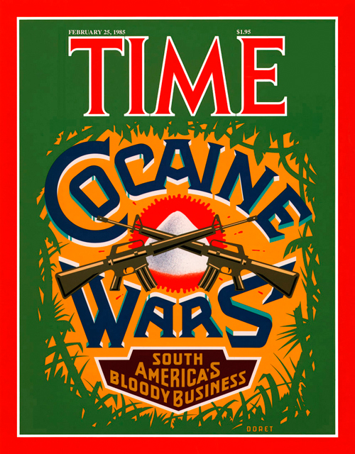
They say there are no second chances, but recently I found that statement to be not entirely true. I've designed and executed art for many covers of TIME magazine. I was never entirely pleased with the cover I did for TIME's "Cocaine Wars" story. I had originally wanted to focus the design around a skull image, and to have the letters in "Cocaine Wars" have snowcaps on them like the letters you'd see on ice machines. But the powers-that-be at time had me eliminate the skull (too menacing) and in it's place illustrate a small mound of "cocaine". The result as you can see was a still a fairly good cover but with a focal point that was kind of anti-climactic.

Fast forward to present day: Rick Klotz of FreshJive—an LA streetwear manufacturer, who also runs his flagship store Reserve in the heart of the Fairfax district—contacted me to see if they could license some of my older designs for silkscreened T-Shirts. He immediately gravitated to some of my TIME covers—including "Cocaine Wars" among others among others. Since I would have to reconfigure the art for silkscreen anyway I immediately saw this as an opportunity to make good on that design that I never felt right about. Freshjive will be distributing that T-Shirt design among others of mine in two different color schemes for their Summer '09 line.

True Crime

I've always loved, loved, LOVED the covers that graced all the various pulp magazines from the '20s through the '40s. Their incredibly eye-catching blends of lurid images, imaginative, fun letterforms and brilliant color palettes always spoke directly to my pop sensibilites, and has had an immeasurable influence on what I do. So I wouldn't be exaggerating if I said I was bubbling over with perspiring enthusiasm when I accepted this assignment from Josh Baker at Taschen America: he asked me to design the cover for "True Crime Detective Magazines: 1924-1969", Taschen's 336 page tome on that particular pulp genre. They wanted a cover that was a direct reflection of the hundreds of pulp covers contained in the book. Particularly challenging was the integration into my design of ten separate blocks of information. I pored over hundreds of pulp covers looking for stylistic clues to help me design all these separate elements. I also searched for ways to keep them organized in a cohesive design. It was necessary to employ a variety of techniques including hand-lettering, straight typesetting and combinations (in varying degrees) of both. One thing which really helped the success of this cover was being able to use the smolderingly hot femme fatale illustration (from Real Detective—January 1938) which I was given to work around. The finished cover can be seen above (together with a few prime examples of the book's contents).

Two Magazine Covers for August

Just completed (almost simultaneously) 2 magazine covers. The first one for Cincinnati Magazine. Cincinnati is the home of Tide laundry detergent, and so Art Director Grace Saunders suggested using the classic Tide packaging as a jumping off point for a cover on environmental awareness in that city. I suggested that they really go "green" with the graphic, making the familiar orange, yellow and blue iconic image more of a statement by using an unexpected color treatment. The "Fresh" graphic was hand-lettered while the various subheads were created with different fonts including my recently released Bank Gothic AS which adds lowercase characters to Morris Fuller Benton's classic font.

The second cover was completed for Art Director Jed Davis for Promo Magazine. Because of time constraints, I was forced to rework an illustration of a batter I had originally created for my silkscreen poster celebrating the release of my font Metroscript. The cover story was about how stadiums these days are having to come up with ever more creative ways of attracting people to ballparks—including promotions like having Elvis impersonators parachute into the stadium: thus the Elvis themed "scorebook"–like cover.

Label Treatment: “Eschatone Records”

An interesting job I did recently was for a new client in Brooklyn. I designed a record label for the independent record company “Eschatone Records” who've started producing old-style vinyl records. This was the type of project that I never thought I’d get to see—but the surprising new found popularity of vinyl has given this genre a new lease on life. One of the owners of the company, Jed Davis, is a big fan of record labels from vinyl’s heyday, so I had a lot of fun giving this job some of the style I remembered from the 45 RPM labels I collected as a kid. A local art space Zakka Corp. in Brooklyn is hosting an exhibition of Eschatone's album art beginning May 23, 2008.

Bette in Vegas

I recently did a logo for Bette Midler’s Las Vegas show at Caesar’s. The art director is actually and old pal of mine, Rod Dyer, a really colorful character who incidentally has a dual career operating one of LA’s best and longest running restaurants: Pane e Vino. Laura (my wife, illustrator Laura Smith) and I have loved going there for years—it’s undoubtedly one of our favorite LA restaurants. It has a fantastic outdoor garden seating area where you can always see some of Hollywood’s glitterati. One day while having lunch with Rod, Billy Dee Williams joined our table, Rod left, resulting in our having lunch with Lando Calrissian.

Bette's new show is at The Colosseum, where she takes over the slot occupied for years by Celine Dion. Bette alternates showdates monthly with Elton John and Cher.