Viewing entries tagged
logo design

60 Second Green—An Eco-Friendly Logo

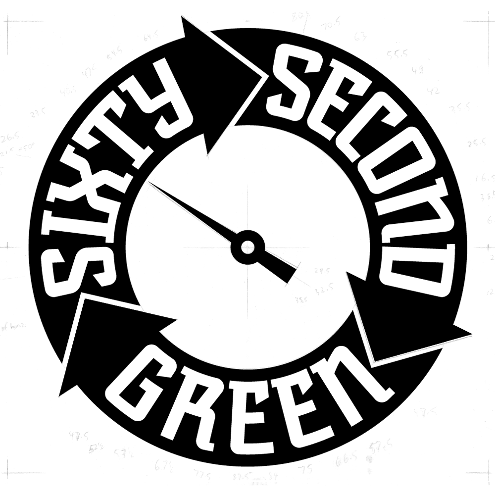
This logo was selected for inclusion in Graphis Logo Design 8 Much of the design work I do tends to be seen by many as “vintage inspired”. I do frequently look to the past for inspiration, but it would be wrong to categorize all my work that way. Case in point: the logo I designed for “Sixty Second Green”. This website will have a series of tips presenting simple ideas and products that are “green” and eco-friendly. The site will propose simple yet powerful ideas on how people can save money and at the same time do good things for the environment—all within videos no longer than 60 seconds. My challenge was to create a memorable logo that would be reflective of the green/sustainability movement.

Working with Mark Pruett, owner and senior editor at Storyville Post (whom I had previously worked with some years back designing their logo) I came up with several loose ideas:

Many of the roughs used the obvious element of a leaf as a motif, but one was reminiscent of the design of the Universal Recycling Symbol, designed back in 1970 by USC student Gary Anderson.

Fortunately this rough was what the client reacted most strongly to, and we were able to develop a unique logo that didn’t resort to the usual visual clichés.

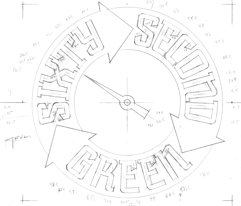
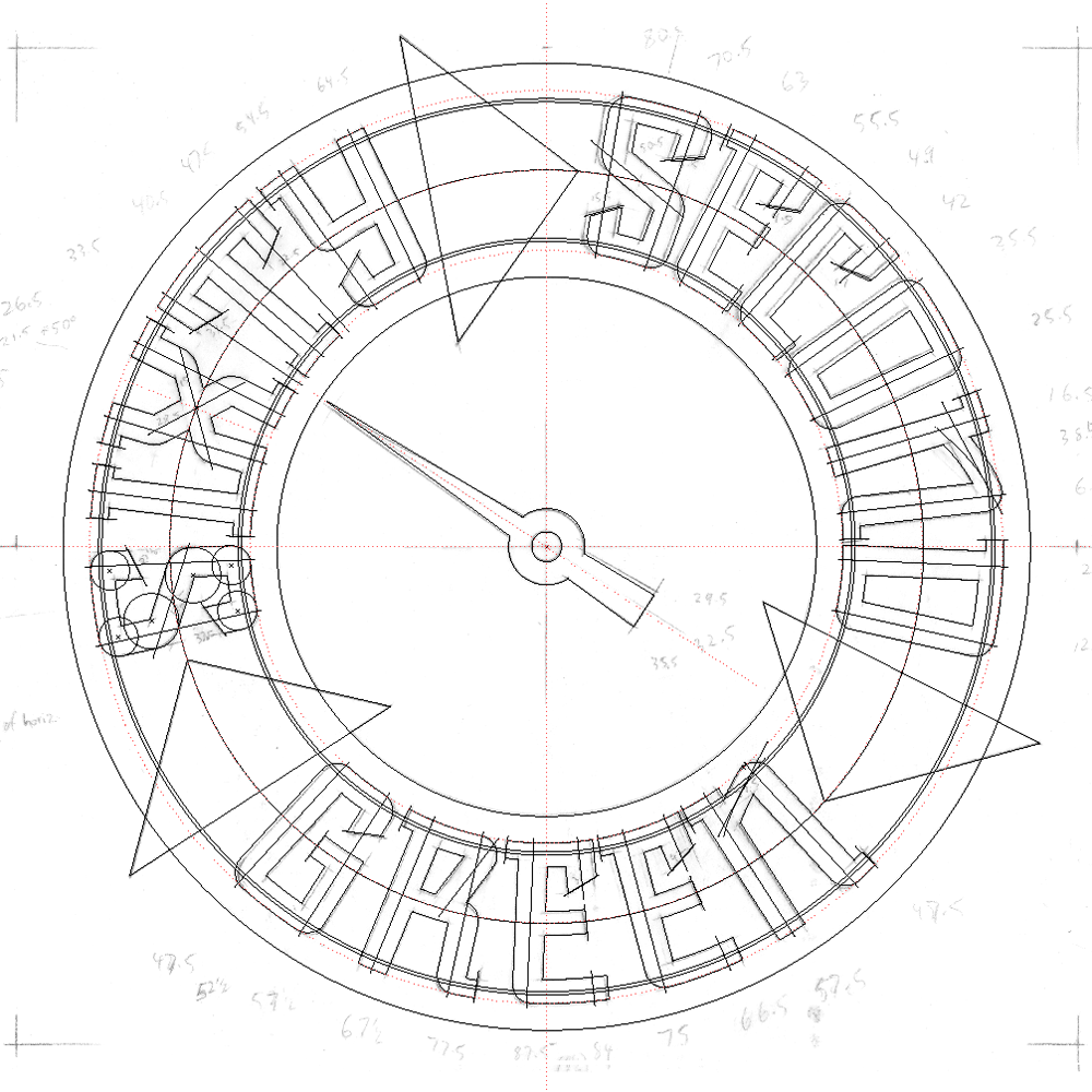
So to develop this design I first had to figure out its geometry by placing my original rough drawing in Adobe Illustrator and working over it:

Then I created a new drawing using the inner mechanics derived from my Illustrator sketch. One really cannot set type around a circle without it looking somewhat awkward, so you can see that the verticals in each letterform I’m creating point directly towards the center of the circle, and are marked in the pencil drawing with angle notations:

Using the angles I had earlier jotted down on the drawing, I started building the letterforms and the logo.

Note that the letterforms in the upper portion of the logo flare outwards at the top, while those at the bottom are pinched in at the their tops. Yet they’re all consistent within the logic of the design and don’t read as different sorts of letters:

I then created a version with a bit of shading and a black background:

This iteration was used for the animated version that Storyville Post created from my art for the Sixty Second Green videos:

COMMENTS WELCOME!


“Sweet!”/A Logo Project–Part 5 of 5: TINSELTOWN

Please read Parts 12, 3, and 4 of this series before proceeding!

Finally, we arrive at Tinseltown, and the last of the logos I created for Sweet!

Being the beating heart of Los Angeles, Hollywood is Tinseltown. And Tinseltown is, of course, the movies. So it’s only fitting that the Tinseltown boutique is the beating heart of Sweet! In Tinseltown you’ll find all your movie theater favorites in theater sized boxes, plus more Hollywood memorabilia and nifty trinkets than you can shake a stick at.

Gary felt that this logo should look like a classic theater marquee. I had an image in my head of what that might look like for this logo. But for something like this I always need do some research, to help me get the right attitude and not to just rely on my memory. There are some fantiastic theater marquees in downtown Los Angeles, but I found one that really was going in the direction I was visualizing in, of all places, Erie, Pennsylvania—The Warner:

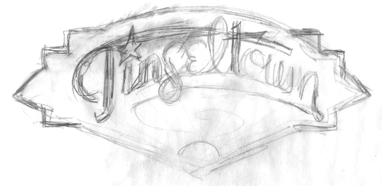
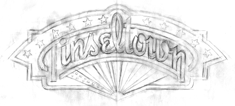
Although this marquee was a bit too intricate for my taste, and there was no neon (I must have neon!) I loved the whole sun-ray thing going on behind the letters, and decided that this marquee—although it would not be my only point of reference—it would be my main inspiration point. So I started puttin my thoughts to paper:

In the first rough above, I was heading in a direction, but still groping around for specifics. By the second rough, I was firmly on my way to solving the problem. And by the third rough, more or less nailed the basics of the design:

At this point, the design was approved, and I went on to build the design in Illustrator. I do it in values of gray before assigning color, just so I know that certain shapes are separating from others properly. Below I’m building the graphic over a template of the rough pencil drawing (above). To be honest there were many, many more steps than what you see depocted below, but it would be impossible to show them all, and very difficult for a viewer to decipher exactly what’s going on. Suffice it to say that I built this art in layers, and in many ways it may have been similar to building an actual neon sign:

I didn’t want to literally appropriate the color from the Warner marquee, so I started doing my own color solutions, but I didn’t think they worked the way I wanted them to:

So I pretty much went back to a color palette more reminiscent of that Warner marquee:

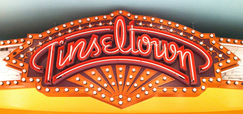
Building the art like a real sign apparently had its advantages because Gary loved the art so much that he decided to have it made into a real lifesize neon sign for inside the store.

To do this would be quite an elaborate project, and so Gary and his Store Architect Richard Altuna enlisted the services of SignMeister Robert M Fitch (who was already working on other signage in Sweet!) to oversee the implementation of this complicated project which included three types of sign illumination: chasing light bulbs, neon script and internal LED illumination. So together with Robert’s assistance I’ve put together a very abbreviated photographic synopsis of how this sign was assembled and finally installed in Sweet!. I think the sign really turned out well, and ended up looking surprisingly close to my graphic.

This is what’s called open face channel lettering which, in the case of a connected script type, becomes a “sign can” which defines the letterform and houses the neon. It's constructed from sheet metal, the returns (sides) are hand formed and welded to the letterform back plate. My Illustrator vector art was used to cut out the basic shapes. As in my art, the letters were formed out of only four separate pieces:

Robert specified different colors for the inside and the outside of the can lettering. Here the different planes of the letters are being masked off and painted:

Here the sign box in which everything goes is being created. The sheet metal sides are being pieced together, and you can see some of the specialized tools—the sign hammers—in the foreground:

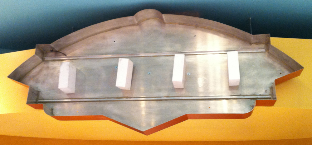
These are routed Sintra pieces that are applied to the sign face and perimeter details to help create dimension. The scale of the sign wasn’t large enough to form some of my details out of sheet metal, so this non-traditional material was used since the sign would only be used indoors:

At the site, the final sign box is hung, awaiting it’s innards...

…which are finally placed in the box:

Robert designed and had fabricated side extensions for the marquee, nicely picking up some of the design elements of the sign graphic:

When the sign's neon and chase lights are illuminated, its color appearance changes dramatically:

That's all Folks. See you at Sweet!

COMMENTS WELCOME!


“Sweet!”/A Logo Project–Part 4 of 5: YUCKY

Please read Parts 1, 2, and 3 of this series before proceeding!

Whether or not you are aware of it, there’s a #%@*load of gross and disgusting candy out there—either in form, or in content—or both. How much there is—is incredible. Who’s eating it? Juvenile boys and immature adults! So Gary Shafner thought: wouldn’t it be fun to gather all the gross candy together under one roof? And thus “Yucky” was born. In this boutique you will find every form of revolting, sickening and nauseating confection imaginable. Eyeballs, severed fingers, blood, snot, maggots, poop, insects, zits, scabs, worms and earwax will be among the delicacies you’ll be able to choose from—and many of them dispensed directly from toilets!

So the design challenge in doing a logo for Yucky was to capture the gross nature of what this store was about, doing it with a sense of fun, but not to create a graphic that was itself repellant. This was a true challenge!. Then I remembered one of my favorite illustrators from when I was growing up: Basil Wolverton—the self-professed “Producer of Preposterous Pictures of Peculiar People who Prowl this Perplexing Planet”! If his name isn’t on the tip of your tongue, his “outrageously inventive” work (below) may be familiar:

It occurred to me that to design a logo in the spirit of his illustration might just be the ticket. After pondering this for a bit I decided that the central letter in YUCKY—a “C”—could be created as if it were a Basil Wolverton head, mouth wide open, and hurling over or through the letters to its right. The other letters surrounding the “C” could contain or support other items expanding on the revolting candy idea. And so I began my “homage” to the great Mr. Wolverton, starting with some very rough sketches:

I liked where this was going, so I got a little tighter, developing the drawing a bit further:

This was the point that I presented this idea to Gary, not knowing how he’d react. Fortunately, he was familiar with Basil Wolverton, and was totally in tune with my idea:

I felt I needed to refine some of the detail in the drawing and develop the character a bit more, making it more “Wolverton-esque”, so I did some pencils like these:

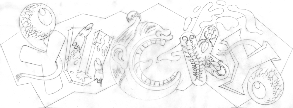
Then finally I had the pencil drawing base on which to build the final art of “Yucky”:

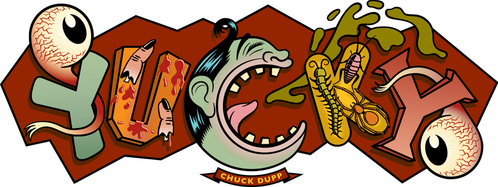
At first I believed I could create the art as would have Mr. Wolverton, with pen and ink. My first feeble attempts only proved to me that he had incredible control over the drawn line, and I had virtually none. So, with my tail between my legs, I went back to my Mac and started drawing the logo in Adobe Illustrator. Gary decided that the character at the center of the logo should be appropriately named “Chuck Dupp”:

I tried to imagine what sorts of colors Wolverton would have used, that all at once could be disgusting, yet “candy-freindly”. I couldn’t come up with a good reason to NOT make Chuck a sickening shade of green:


A further development of the color, adding bloodshot eyes, a background color and dropshadows:
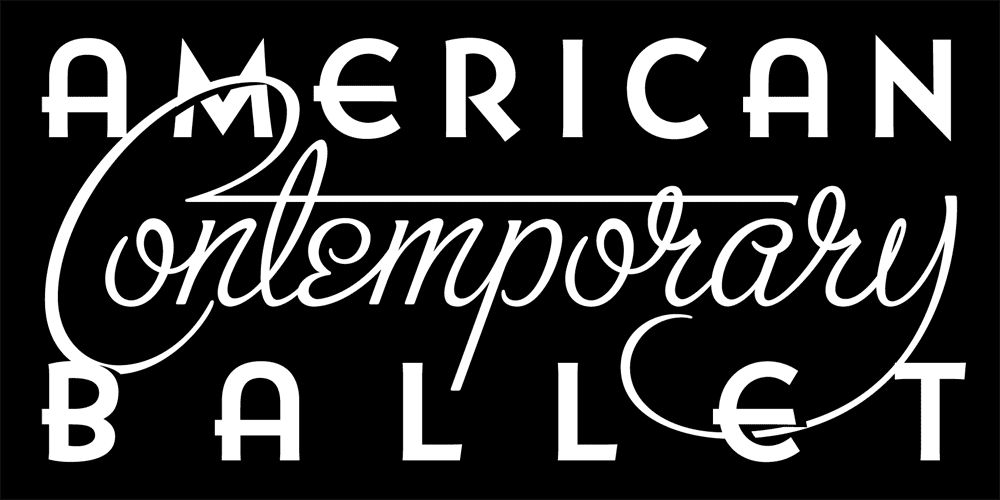
And finally some stippling all over, and highlights in the barf—giving the whole thing a bit more dimension, grit, and Wolverton appeal:

The back wall of Yucky is tiled, very much like a public restroom. And like a restroom it is fitted with toilet bowls (as I mentioned earlier) from which candy will be dispensed. Here’s the wall as it was when the space was being built:

Gary figured that what could be better than to bring back the idea of the old arcade photos—you know, the ones where you could get a photo of you (and your pal’s) head(s) popping up behind—and apparently on the body(ies) of—some life-size painted, ridiculous looking figures:


Gary’s reinvention was that here you could get a photo of yourself sitting on one of the toilets, and in front of your legs would be a painted cut-out of a pair of legs with pants around the ankles. To cap it all off and make this Kodak Moment more memorable Gary wanted to have painted on the tile overhead a large version of the “Yucky” logo. Sounds good to me!

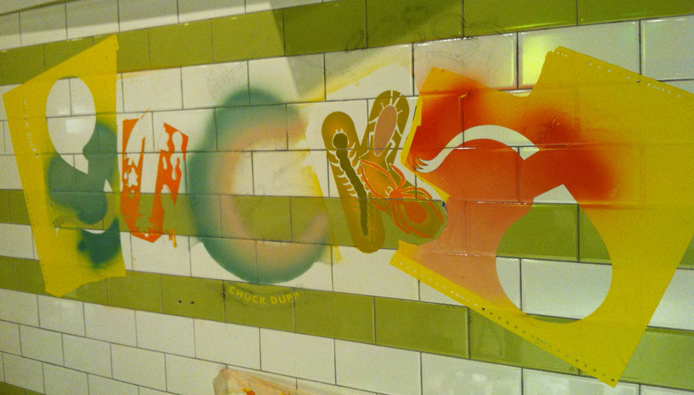
So Gary hired the very multi-talented sign-painter, fine/guerilla artist, and sculptor Richard Ankrom. Not having any talent at all myself for doing this kind of difficult handwork, I decided to look in on Richard as he worked on this and brought my logo to life. I couldn’t have hoped for this to be done any better than what Richard did. Below, a few shots of the logo as it materialized on the tile wall, starting with a shot of Richard in the space, in preparation mode (notice the "1-Shot" sign painters' paints):

A shot of the paper roll, taped to the tile wall, and through which Richard will pounce the linework he’ll need to follow:

The pounced linework can clearly be seen in this shot before any painting had started. Also clearly seen in the reflective tile is my hand taking the shot:

Gary uses all sorts of various methods and techniques to achieve his results, from laser or hand-cut friskets, to airbrush to regular old old-fashioned handwork with paintbrushes:

Here we are at about the halfway point, the pounced lines still visible:

Richard said he really got into painting the bloodshot eyes:

One of the later stages was when the black linework gets added in. Here Richard is doing some of the stippled, textural brushwork using a “mahl stick” to keep his hands off the wall and prevent them from smudging the wet paint. The paint can take up to a day to fully dry:

Finally . . . it was worth all the hard work! When I selected color for this logo, I had no idea that a color had already been selected for the tilework. Fortunately everything meshed together beautifully:

And here’s the “Yucky” photo-op minus, of course, the dropped pants cutout—picture yourself here:

Next up . . .  in our final installment we’ll take you back to where it all began—Part 5: “Tinseltown”.

COMMENTS WELCOME!


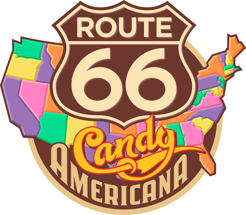
“Sweet!”/A Logo Project–Part 3 of 5: Route 66 / Candy Americana

Please read Parts 1 and 2 of this series before proceeding!

“Won't you get hip to this timely tip / When you make a-that California trip / Get your kicks on Route sixty-six.” Well, If by “California trip” they meant the Sweet! candy shop in Hollywood, and if by “kicks” they really meant “candy”, then there’ll be plenty to be got in “Route 66 – Candy Americana”.

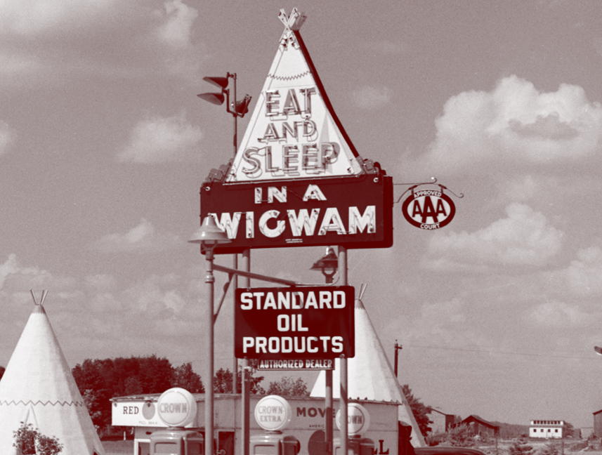
The real historic Route 66 still runs through Hollywood only a few blocks south of Sweet!, on Sunset running west down to the ocean ending at the Santa Monica Pier. But the Route 66 in Sweet! harkens back to a sweeter, simpler time. In this shop you’ll find an actual, built-to-scale gas station built out of porcelain enamel, just as you’d see if you were driving down the original Route 66 back in the ’50s, before the Interstate system made the road obsolete. You’ll also find a scale reproduction of the famous Wigwam Motels—you know, where you could have stayed on your road trip across America (“Sleep in a Wigwam!). All this to house the finest selection of classic American candies, some that you may not have seen in a while.

Obviously the logical place to start a Route 66-ish logo would be to use the iconic road sign as a base. So with that as a given (which I gave myself) I started with some very rough sketches like these:

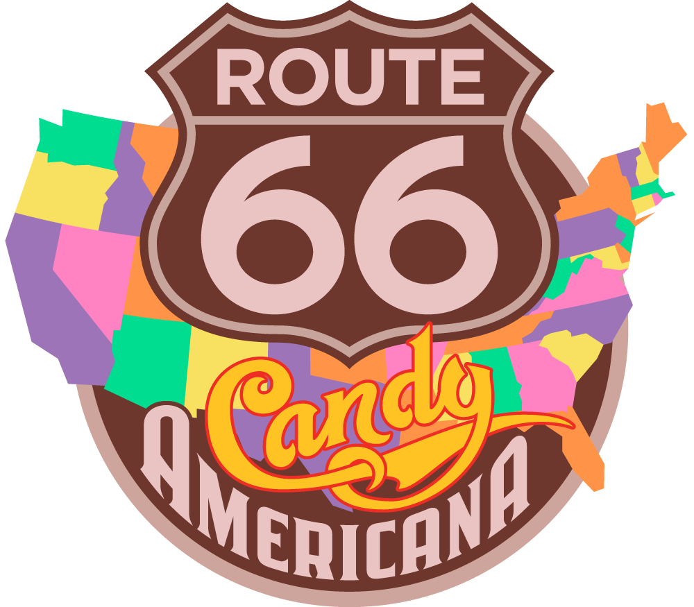
One of the most critical parts of this direction was to figure out how to successfully integrate all the different elements. I had a sign, a map, and several different styles of lettering/typography. I also felt it had to have the authentic look of classic American Automobilia, yet be playful and colorful enough to represent a candy store. So I started to work out exactly how all the elements might fit together. After combining a map of the USA and a standard Route 66 sign I started designing my own “66” numerals and the words “Candy” and “Americana”. Not only was I trying to integrate the two words , but to do so with the right amount of playfulness in “Candy” and the right amount of gas station-y feel in “Americana”. As you can see below, there was a lot of drawing and redrawing before I felt I was close to how it should be:

Once I was happy with the balance, In tightened up the drawing in preparation for redrawing the whole thing in Adobe Ilustrator:

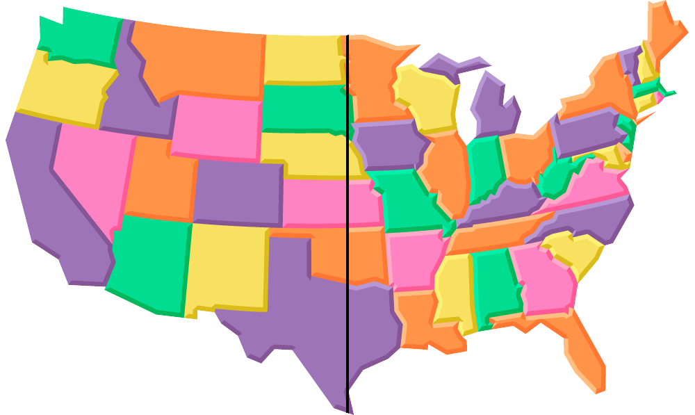
To help give this logo a bit more candy store appeal, I envisioned the individual states in five different “Good ’N’ Plenty” colors (which I’ve always loved):

So first I needed to create an accurate (but graphic) map of the USA in Adobe Illustrator where, for separation purposes, no two states touching each other were the same color. So as a working model I did the file in black and 4 grays, then made it the “Good ’N’ Plenty” USA map in 5 colors:

. . . and here are the map, sign and lettering all put together in my first draft:

But to me it was all feeling way too flat. I decided that I wanted to give the states a soft, dimensional “marshmallow-y” feel. So I first added a darker extrusion on the right and lower portions of the states (left side of the map, below), and then a lighter area on the upper and left portions (right side of the map, below)—the Marshmallow States of America:

. . . also adding a dropshadow to the word “Candy” and to the Route 66 lettering and badge, and an outline to the map:

I wasn’t too happy with the mauve-y color, so I gave it one last tweak, warming it up a bit. Everybody loved the way it now looked and felt:

This graphic will be used in the store on packaging, T-Shirts, bags, etc.

Tomorrow we’ll move from the sublime to the ridiculous, from Route 66 to Part 4: “YUCKY” – the most disgustingly delicious candy shop logo in the world!

COMMENTS WELCOME!


“Sweet!”/A Logo Project–Part 2 of 5: Peace of Candy + AS IF

Please read Part 1 of this series before proceeding!

According to Sweet!’s founder, Gary Shafner, all the world’s countries have their differences—they either love or hate each other—but truth be told, we all have one thing in common: everyone loves candy. Gary wants to share that sentiment by finding some of the wackiest, and some of the best confections from around the globe and making them available in his "Peace of Candy" shop. World Peace through sugar rush!

Take Japan for example. In the US Kit Kat is licensed by Hershey, but it was originally created by Rowntree’s in England, and is now a Nestlé product there and in most of the rest of the world. But the Japanese have turned Kit Kat into something that is both uniquely their own and immensely popular. Over the years they have developed over 200 flavors of Kit Kat. The all-time favorite Japanese Kit Kat flavor is Orange. Gary says that among the many, many other candies from around the globe you will find in Peace of Candy of course there will be those Orange Kit Kats, packaged in a special “Tokyo Tower” commemorative box:

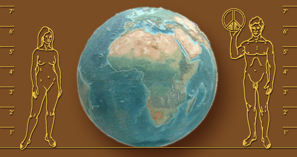
How will you find Peace of Candy when you’re in Sweet! you might ask? Just look towards the center of the store where you will find a giant relief globe (below)—7 feet in diameter—originally salvaged from Chicago’s Historic Rand McNally Building. There’ll be Peace signs placed over each and every country.

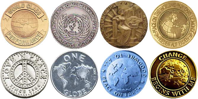
Inspiration for creating a logo for Peace of Candy was not hard to come by. Medallions extolling the virtues of Peace and Goodwill may easily be found. So it was not much of a stretch to take our design cues from some of these many and varied metallic coins.

The first pencil sketch pretty much summed up the direction I wanted to go…but then it was decided that we needed to add the tagline “Sweet All Over”:

Once the direction was approved I needed to start fleshing out the look of the medallion, giving it depth and life. At the beginning, everything was pretty flat. Then I added dimension and texture—all done in Adobe Illustrator:

We tried different iterations of how to treat the “Sweet All Over” tagline panel:


And the final selected version:

I’m told that they’re actually going to make chocolate medallions with this design in relief!

AS IF – Shop for Spoiled Girls

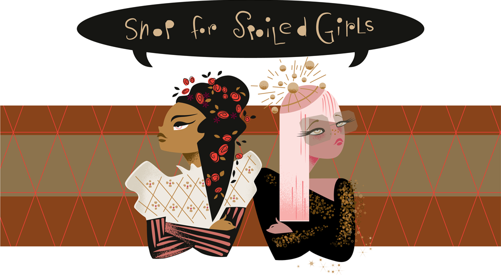
Because at least one of the shops (Yucky—coming up in Part 4) is mainly directed at boys, Gary didn’t want girls to feel left out, so he created a shop just for them: “AS IF – Shop for Spoiled Girls”. The theme of this shop revolves around two characters: Amanda Sugar (initials AS) and Isabella Fairchild (initials IF). These are two pampered, coddled, rotten and snobbish little girls. The back story is that both have a boarding school background, but have different (but indeterminate) ethnicities. Amanda is more into the club scene, while Isabella is more into period design. But over time they both realized that they had more in common than not—fashion being their common denominator—and begrudgingly became friends.
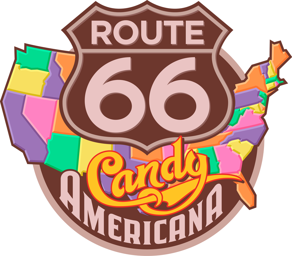
Gary, having become familiar with the illustration work my wife Laura Smith had been doing, decided she would be the right person to create a graphic of these two characters for this very girly boutique. So having been briefed by Gary on what these two were about, Laura set out to bring them to life.

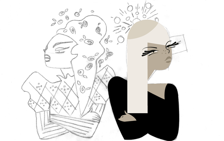
The first thought was to have Amanda and Isabella back-to-back, kind of like bookends—as are these two Mudflap Twins:

But Amanda and Isabella really aren’t refusing to acknowledge each other, as this type of arrangement might suggest. But Laura decided to keep something of this back to back, belligerent attitude, only a bit less contentious.

To capture a bit of the attitude and indeterminate ethnicity of these two brats Laura looked at many, many fashion shots of female models—only these were a bit older than her subjects were supposed to be. She looks at reference like this not for any specific details, but to get a better feel for her subject matter, possibly combining many separate features into an interesting composite.

Here’s Laura’s concept sketch of these two characters. Can you guess which character is which?

First she roughed this out in pencil and went over that with pen. She usually go through more stages, but felt good about this direction:

Here’s a tighter pencil drawing, where Laura starts working out some of the details:

Once it was clear that Laura wanted to contrast the darkness of one girls hair and oppose that with the a lighter or blond color on her counterpart the piece was easier to visualize and I was able to flesh the rest out on computer. For Laura, it’s an organic process. Value or color against color, making sure that eveything reads properly:

Finessing the eyes of Amanda Sugar (on the right) was a little trickier. Laura had to play with that a little until she was satisfied. Laura wanted Amanda’s eyes to have a slightly more “Asian” look to them:

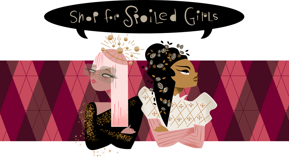
Color and background needed tweeking in a way that made them both equally important and not overwhelmed by the background pattern. And Laura decided that the two girls should be in “AS IF” order: Amanda Sugar on the left, and Isabella Fairchild on the right:

So here they are, visualized in their perpetual love/hate relationship—unwilling to see eye-to-eye, yet unable to live without each other.

Tomorrow our global trek comes full circle—back to the US and ending up in Part 3 on “Route 66 – Candy Americana”.

COMMENTS WELCOME!


“Sweet!”: 6 Logos for a New Candy Store Opening in Hollywood/Part 1 of 6

So . . . what ever happened to the corner candy store—do they have a future? For the answer, please keep reading!

Photo courtesy of Mod Betty/Retro Roadmap

I recently worked on a wonderful project—designing logos for a new concept in candy stores—and this is going to be big! It’s just about to open in the Hollywood and Highland Center in the heart of Hollywood. It’s called “Sweet!” and is the creation of Gary Shafner—the brains behind NPA (National Promotions & Advertising), one of the first guerilla marketing companies. It’s a collection of 12 boutique candy shops, each with their own identity—but all under one roof. When I met Gary at his headquarters, I was blown away by his crazy inventiveness: the only way to gain access to his office/warehouse/printing plant was to enter through an actual vintage Greyhound bus that is built into the facade of his building, the interior of which also formed the reception area.

As you enter the NPA headquarters it becomes apparent that this playful attitude continues throughout the building, as the bus depot theme gives way to a ’50s diner theme, an auto showroom theme, an outdoor city street theme, and on and on as the interior morphs into a very personal kind of amusement park, and a kitchy, friendly environment for Gary’s employee’s to work in.

Gary found my work through a friend of his: Chris Nichols, Associate Editor at Los Angeles Magazine had directed him to me. Chris brings a historical perspective to the magazine, being a passionate advocate for historic Los Angeles, and serving on the LA Conservancy’s Modernism Committee. Mr. Nichols, being familiar with my work, understood what Gary was looking for and saw in my work an understanding for Gary’s playful, eclectic vision.

So why Sweet! . . . and why now? Gary grew up in this town loving what Hollywood was, and realizing that the Hollywood of days gone by was no more . . . and that once tourists were done with the Chinese Theater, after they had seen the footprints, the Hollywood experience was basically over. He decided that he wanted to build a magical place in Hollywood, and that perhaps he could bring back a little bit of that experience by opening this boutique of 12 different candy shops—each staged differently with a different fun theme, and all about the joy of candy and of being in Hollywood—in Tinseltown . . . in a word: “Candytainment”!

I ended up designing graphics for five of these shops—each completely different stylistically from the one before. My wife, illustrator Laura Smith also created a more illustrated logo for a sixth shop. Right here, over the next few days I’m going present a case study (one or two a day) of each of the graphics we worked on, and describe briefly the inventive fun that Gary has in mind for each shop.

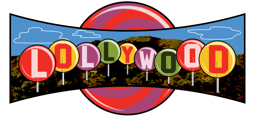
The first stop in any candy themed tour of Hollywood would of course be . . . Lollywood:

Lollywood

As far as anyone knows, Lollywood will be the only, first ever store in the world that sells only Lollipops . . . and there will be lollipops of every shape, size, taste, and description. Gary has gone out of his way to make this shop totally unique, building into it both a life-size Sugar Plum tree and, for the counter . . . The Good Ship Lollipop! While shopping, sugar lovers will be serenaded by clips of both Shirley Temple and The Lollipop Guild. And Gary promises there’ll be more surprises as well.

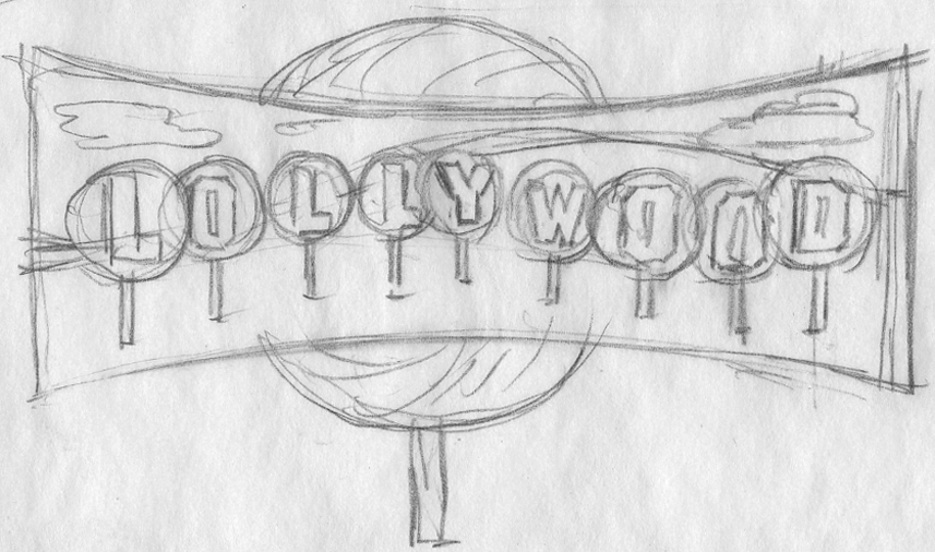
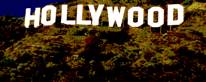
As far as the logo was concerned, the obvious way to go was, of course to reference that darned Hollywood sign. To my mind it’s been overused commercially to the point where it’s lost any design relevance. So I felt I had to bring something fresh to it while still maintaining its recognition factor. The direction I decided to go may seem obvious, but I think it actually works pretty well. I decided to embed those letters inside giant lollipops, and have this scene appear inside a giant Cinerama shaped screen in front of an even larger lollipop swirl.

This was how I presented the idea to Gary. At this point I didn’t know how I was going to render any of this (especially those hills). but I felt inspiration would come to me.

Getting the go ahead was easy. The hard part was figuring out how to do it! Here is one of the early stages in Illustrator.

Then I had a brainstorm (or at least I thought so): I’d take a photo of the Hollywood sign, then I’d manipulate it in Photoshop making it really flat and graphic. I’d use only the portions of the photo that were the actual hillside under the sign. Why go to this extreme when I could probably take any hillside photo and make it work? I’m just a sucker for “the real thing”, I guess.

I thought this was working pretty well, so I put it into the art . . . and voila!

I had already been working on the lollipops—my thought was to make the letters kind of like large fossilized insects caught in amber.

But with some further development, I still wasn’t thrilled. It didn’t seem colorful enough—in fact it was starting to feel a bit  gloomy.

This is one thing that I love about working digitally—you can almost design “on the fly”. If the colors aren’t working the way you want, just keep shifting things around until you get to where you want to be.

Please check back here tomorrow, and I'll post two more designs in Part 2: "Peace of Candy" + “AS IF / Shop for Spoiled Girls”.

COMMENTS WELCOME!


An Interview With “Posting and Toasting”–Pt. 2

Yesterday I presented Part 1 of  Seth Rosenthal‘s interview from his blog (Posting and Toasting) with me about my experience in creating the identity for the NY Knicks. So without further adieu, reproduced below is Seth's second installment:

Star-divide

Behind the Knicks Logo with Michael Doret: Part 2

In Part 1 of our conversation with Knicks logo designer Michael Doret, we talked to Michael about the initial assignment he received in 1991 and got to see a few of his sketches and logo concepts that didn't end up getting picked. It was a prolonged back-and-forth process between Michael and the league, and today we'll look back at the steps of that process leading up to the Knicks logo that's been in place for 20 year sand counting.

Before we take a look at some more sketches, I should mention that, out of sheer coincidence, ESPN's Jared Zwerling has an interview up today with Tom O'Grady, who was-- at the time-- a representative of the league office that contracted Michael's work for this project. Though this conversation has been more about turning up old sketches than it's been about the stories surrounding them, I invite you to check out Jared's piece for another perspective on the logo's history.

Star-divide

Here's more from Michael:

"The development of this logo lasted about six months, and during that time there was a lot of back-and-forth in terms of which designs were developed further and which designs were shelved. I was hired by NBA Creative Director Tom O'Grady, who was great to work with. He was very open to all the ideas I presented to the league. In the one idea they ended up selecting, I had pretty much taken many of my design cues from their old Knicks logo. I had thought "I know they're telling me to shoot for the moon on this, but I know that the way these things work—they'll get scared and won't want to make a big change". So, I gave them that one as a sketch, which was kind of like an updated, contemporized and cleaned up version of the old logo."

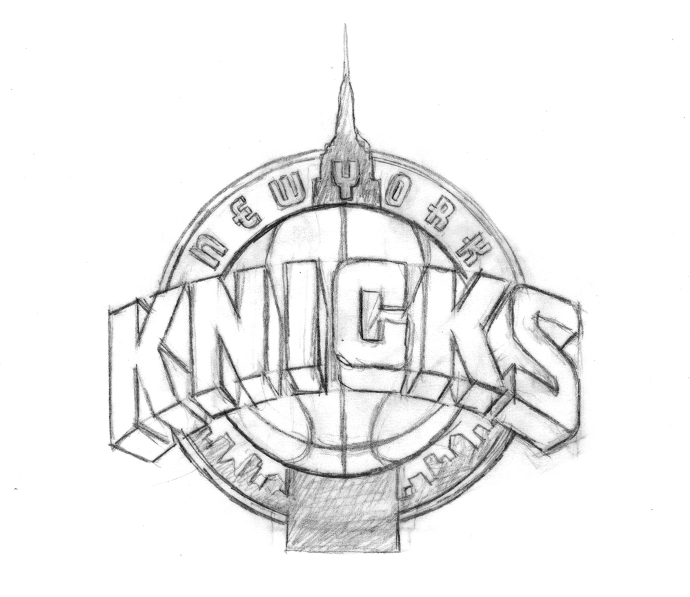
With that in mind, here's a look at the metamorphosis of the logo with which we're familiar today:


A couple of things:

1. You can see in that third-to-last sketch where Michael started experimenting with the color scheme (which is different from the final one).

2. Recall from Part 1 that one of the initial design requests was the inclusion of the Empire State Building, so some of these look just like the familiar logo, but wearing a building hat. Obviously, that element got cut from the final logo.

Ultimately, this was the design of Michael's that the Knicks chose heading into the 1992 season. A few years later, Michael was asked to design and integrate the "New York" line above the "Knicks". Recently the logo has undergone a minor color makeover, but it's otherwise the same as it was back in '92, not unlike my voice.

Now, that wasn't the only thing Michael was working on for the Knicks project. He also presented them with a series of monogram sketches-- more compact, initial-based logos that could be used for other purposes. Here are some of those sketches:

The league ended up setting for just the main logo and none of Michael's monogram designs. But wait-- that last one looks familiar, doesn't it? Indeed, it's the token insignia the Knicks have been using as a secondary logo in 1995. It's graced equipment and merchandise since then, and was featured on the back of the uniform until recently. Michael's design drew its inspiration from the old MTA subway tokens, and, if you look back at yesterday's post, elements of it crept into early concepts of the main logo. New York's adoption of the design has a bit of a story behind it:

"Being a New Yorker and growing up riding the subways, I always had that image of the subway token with the Y cut out of it somewhere in the back of my head. I just saw an opportunity to somehow use that iconic NY image for an iconic NY team. Using it for a secondary Knicks logo was something I wanted to push for. When we started discussing a secondary logo—"a monogram or something". I gave them quite a few different ideas, but at the time, they decided not to use any of them. I thought "okay, that's fine"-- I was being paid fairly for the logo development work that I was doing. That whole secondary logo/monogram thing was dropped, and I got paid for the work I had done on it (but not for finished art or usage). Then, several years later, after this whole project was done, an old friend of mine called and said "did you know the Knicks are using that token logo you did for them in your sketches?". I had had no idea-and more importantly, I had not been paid for any usage fees for that design. No one from the organization had informed me, so I contacted the people at the NBA. I don't think Tom O'Grady was there anymore, or maybe he wasn't in the same position—at any rate I don't remember speaking to him about this. I tried to discuss it with some people there, and they informed me that no, the token monogram was their idea—they had created it, and I had had nothing to do with it.

A couple of years had gone by before I found out about this infringement, and In the meantime some of my work had been published in a book called "Design In Progress - What Happens Behind the Scenes", which was about how design projects are developed. I had picked the Knicks logo as a case study of how I develop a logo design, and so in the book were printed many of the sketches seen in this blog. It was just one or two pages in the book, but among the material published was one of the sketches that had included the NYK token monogram. This book was published just after I had completed the Knicks project, and well before the Knicks had started using the token logo. So when they said to me "well, you didn't do it, and if you're going to insist on this and say you did, you're going to need to prove it", I just pointed them towards the book, which had a copyright date of 1992. Realizing they were caught with their pants down and wanting to avoid any kind of legal entanglements, they begrudgingly told me "well, okay we'll pay you for this", and then to punish me said "but you'll never work for the NBA again". That, of course, has been borne out by history.

I felt like I was there at the beginning helping to create a look that a lot of sports teams have picked up on, and from which a lot of other designers really benefited. After that debacle it wasn't me that was being consulted for my design expertise—but other designers who took their cues from what I had begun—and you can see that in a lot of the team logos these days. I feel like I should have been part of that. But if I had to do it all over, I would still stick to my guns and fight for what's right."

Cool. Thus concludes our journey through the history of the Knicks logo(s). Huge thanks to Michael for sharing all this with us, and to P&T's normanhathaway for helping to set it up. Once again, I encourage you to check out Michael's website and blog, and to read the ESPN interview with Tom O'Grady for more logo history.


An Interview With "Posting and Toasting"

My good friend Norman Hathaway is an avid New York Knicks fan, and follower of Seth Rosenthal's humorous Knicks blog Posting and Toasting which boasts one of the biggest communities of Knicks fans on the internet. Apparently Norman spoke or wrote to Seth about my involvement with the NBA, and specifically about how I created the current identity for the Knicks. So Seth contacted me, and we talked about how that whole thing went down. I dug up a ton of my old sketches and comps for this project and sent them to Seth who put them all together, interviewed me and is now posting the story in two parts over two days on his blog. Today, I've reproduced verbatim (below) Seth's first post, and tomorrow will do so again with the second:

Star-divide

Behind the Knicks Logo with Michael Doret: Part 1

This is the current Knicks logo. This is what the Knicks logo looked like in 1992. Little has changed, y'all. They added a little "New York" and modified the colors recently, but have done nothing else to alter a design that's been the primary logo for over twenty years. That emblem has been a constant symbol of the team, and its distinctive big, block lettering echoed throughout several other teams' redesigns in the '90s, some of which are still in place today. So, where did this logo-- which has persisted through multiple Knicks regimes-- come from? With the help of P&T citizen normanhathaway, I had the pleasure of corresponding with Michael Doret, the man who made the Knicks logo.

Doret is a New York-raised, Los Angeles-based designer and lettering artist with a rather extensive resume. When the NBA approached him in Spring of 1991, he'd already done some work for the league, as well as designs and design ideas for the MLB, the NFL, TIME Magazine, the band Kiss(!), and a lot more. So, the league felt pretty confident in his abilities and gave him pretty much free reign to try out different logos and letterforms:

"Before starting on this design project I didn't receive that much input from the NBA other than the directive that they wanted to have something symbolic of New York CIty incorporated into the logo. After discussion we eliminated several options (such as the Statue of Liberty), and settled on the iconic Empire State Building as the only viable alternative that might work in the new logo. So in the beginning stages that was the given which, as we all know, they ended up deciding against as the logo development progressed. I think other than keeping the original blue and orange from the old logo, there wasn't that much else given me in terms of requirements. The directions I took were mostly left up to me."

It was a fairly open-ended task and, as Michael notes, the only specific request made of him didn't even make it to the final product. So, with that dearth of instruction in mind, he set about producing a variety of design concepts. In Part 1 of our magical journey through Michael's old files, he'll show us some of the concepts that didn't make it.

Star-divide

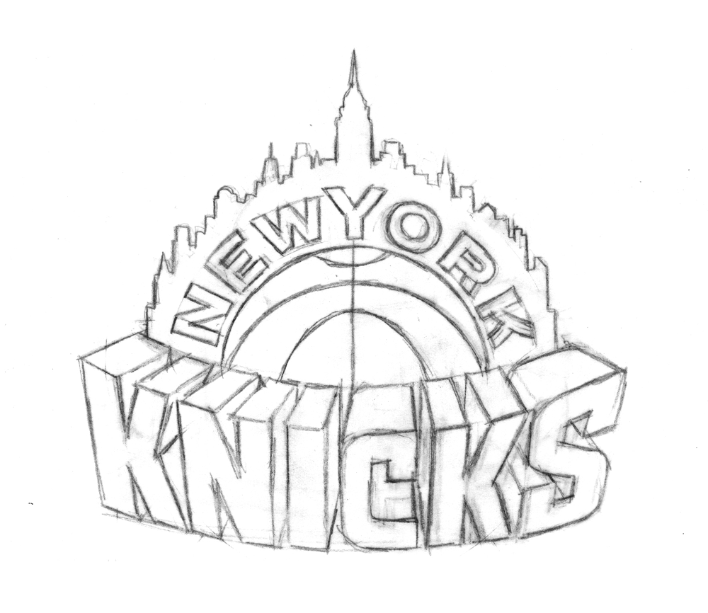
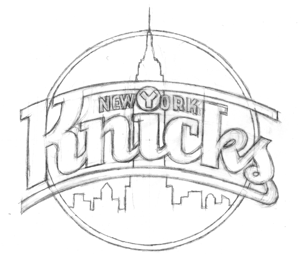
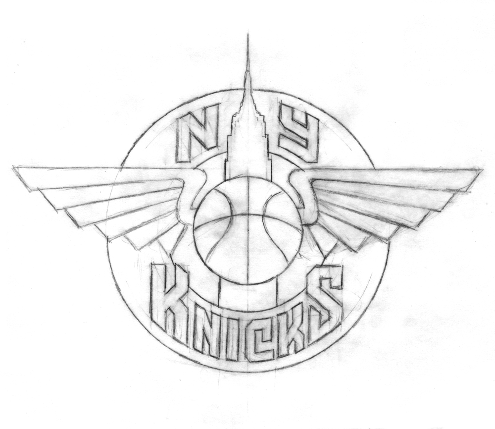
To generate ideas, Michael began with some rough sketches, examples of which are below.

With the Empire State Building icon relatively unchangeable, Michael focused his imagination on the lettering:

"At that time (and even still) my work was all very lettering-oriented. I was trying to open up new areas of letterform design that, up until that point, had tended to be a bit stodgy and traditional. I was just trying to do something different for the time. In actuality I was picking up a lot of cues from bygone eras, from when lettering was really in its heyday-like in the 1930s and '40s-only this time around with a slight twist."

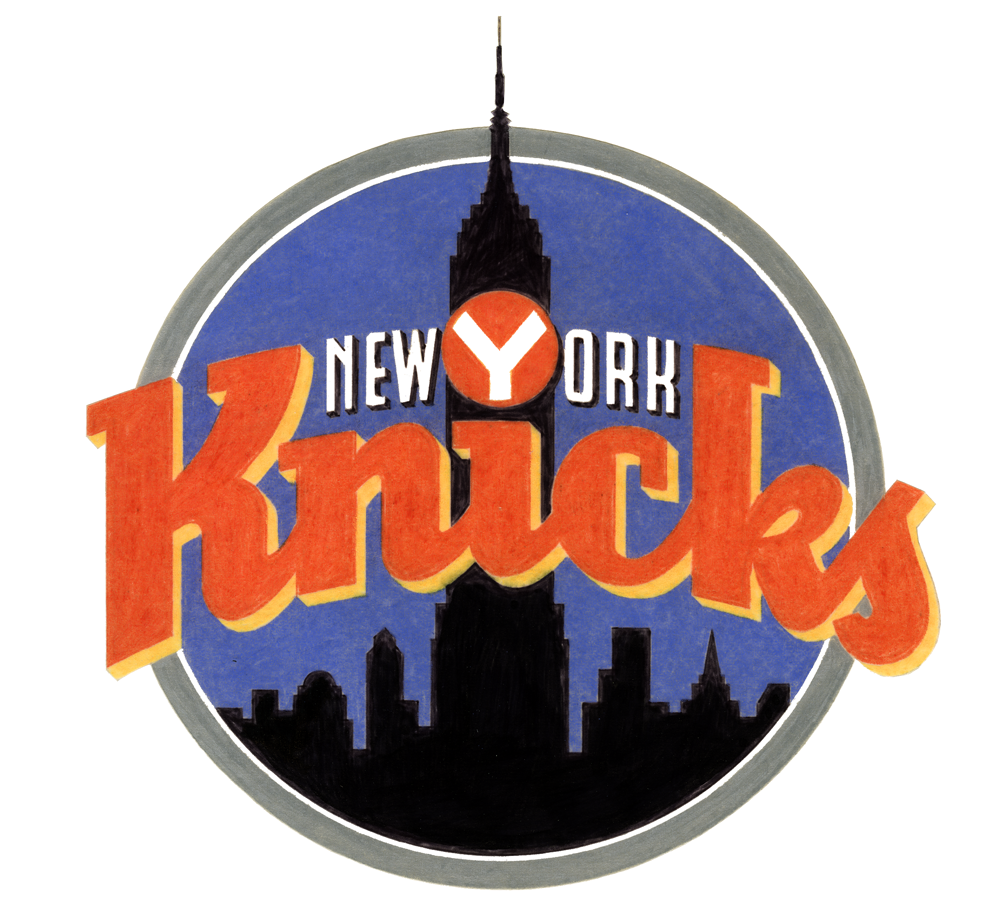
Some of the sketches and elements of others eventually made it into color concepts which, before the widespread use of computer design programs, Michael rendered in colored pencil (the '90s were a dark time).

Any of these could have ended up as the Knicks' primary logo (and, incidentally, Michael loves all his logo babies, but told me the first of those color logos was his favorite), but alas, they could only pick one

In Part 2 (tomorrow, perhaps) we'll look at the process behind the logo of Michael's that the Knicks did choose, and learn about how another familiar piece of Knicks iconography also comes from Michael's desk.