Viewing entries tagged
heraldry

Le Train Bleu #2

Two years ago I visited Bloomingdale's in NYC, and specifically their Le Train Bleu restaurant for which "back in the day" I had originally designed many of the original elements. In my visit to NY last month I revisited the restaurant—and this time dined there. If I was surprised the last time to see that my signage and monograms were apparently still in use, dining in the restaurant this time allowed me to see the full extent to which everything I had done was still there—just as it was the day it opened back in the '80s. I hadn't known that they were still using the menu design I had done for them, or to the extent that they were using the emblematic monogram I had done at the same time. After years and years of use I would have imagined that the menu would have been a bit dog-eared, but apparently they've been printing and reprinting it all this time.
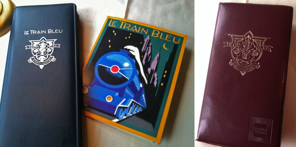
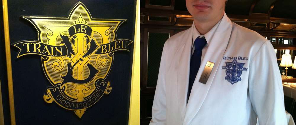
Aside from it being rendered in gold leaf on the outside of the train car and imprinted on the wine list and check wallet, they'd gone so far as to embroider the monogram on each and every uniform in the restaurant—classy! Perhaps that says something about a designs longevity?

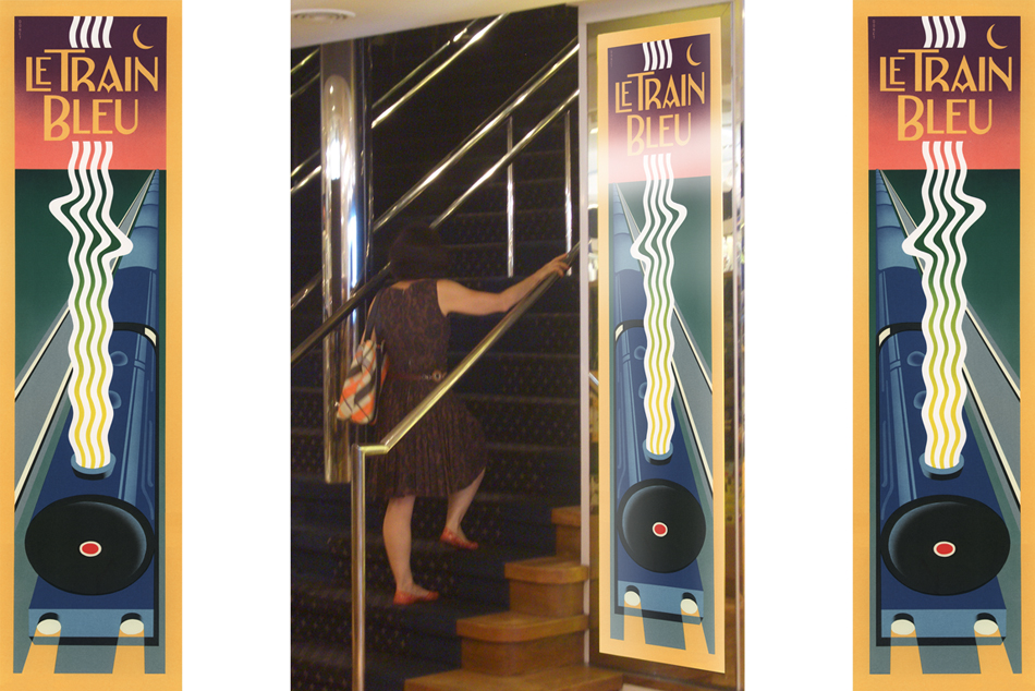
And here's a reminder for those who are interested: there are prints of the Le Train Bleu vertical format artwork—identical to the signage murals outside the restaurant—available on my ILLOZ site. These prints are finely produced, hand-crafted 12 color fine art lithographs that are virtually identical to the original painting.

"Appetite" Opens at Cooper's Lubalin Center

"Appetite – A reciprocal relationship between Food & Design" opened last night at my alma mater The Cooper Union, hosted by the Herb Lubalin Study Center. The exhibition explores how design influences our day to day relationship with food, and covers everything from restaurant signs and menus to supermarket price labels and takeout packaging.

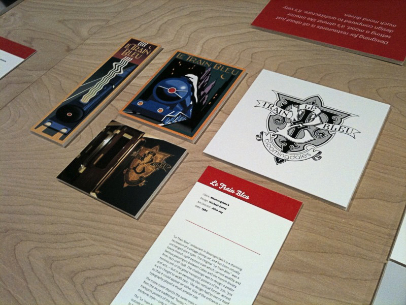
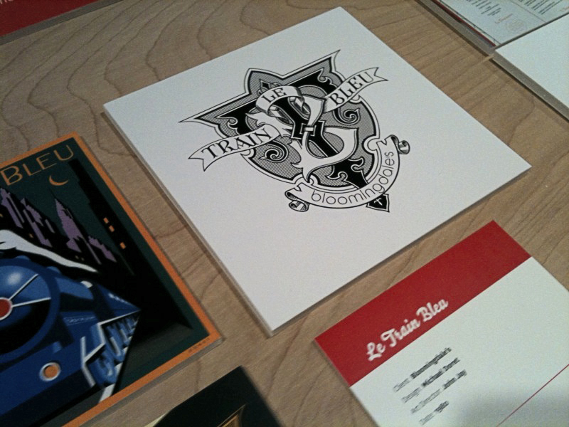
I was fortunate enough to have some of my work included in this show—my "Le Train Bleu" project that I had recently highlighted in this blog. Although I couldn't make it to the opening, my good friend Louise Fili was kind enough to send me some snaps of my work displayed in the exhibition:

Hungry for more? The exhibition is at 41 Cooper Square (3rd Avenue between 6th and 7th Streets), NYC. The show runs through October 9th. The gallery hours are Monday through Friday: 12–7; Saturday: 12–5. The exhibition was curated by Alexander Tochilovsky. Read an interview with Alexander about this exhibition at Eye Blog, and read more about it and see more photos of the exhibition from the opening at Design:Related.

Le Train Bleu @ Bloomingdale's

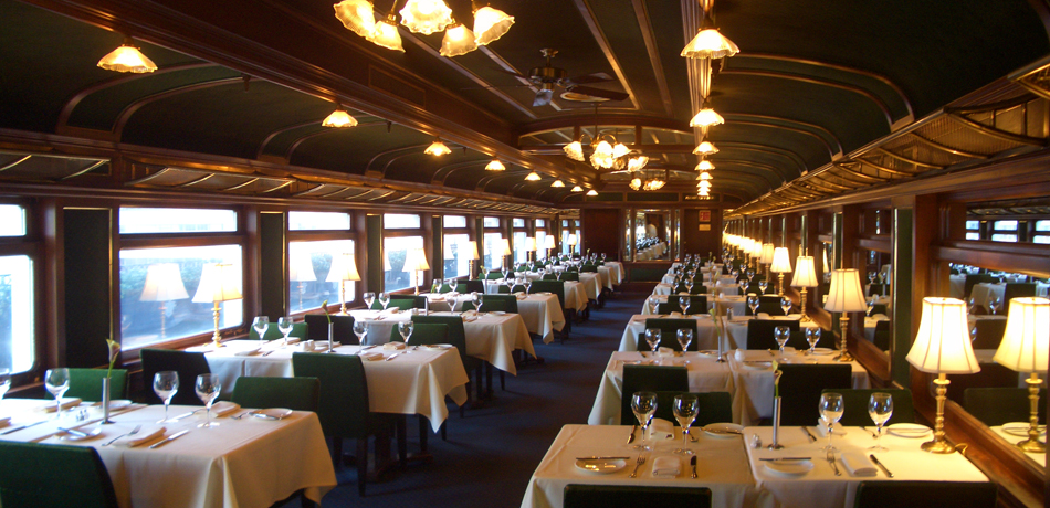
While in New York City to give a talk at the Type Directors Club Laura and I stopped in at Bloomingdale's. I hadn't been back to Bloomingdale's for many years, so while there I thought I'd check to see if some signage I had designed for their "Le Train Bleu" restaurant might still be in use. To my utter amazement, my work was there—still in use after 30 years. The restaurant itself is a stunning recreation of a vintage dining car, and has been virtually unchanged inside since the day my work first adorned its entrance.

The Original "Le Train Bleu" was a luxury French night express train which carried wealthy and famous passengers between Calais and the French Riviera from 1922 until 1938.

Back in 1980 I had designed and painted art for two panels that were to bookend the stairway leading up to the restaurant. The challenge, as outlined to me by then Bloomingdale's Creative Director John Jay, was to design a poster reminiscent of the great transport posters of the '20s, '30s and '40s,—but in an extremely thin vertical format: almost a 4 to 1 height to width ratio. Also the design had to be able to mirror itself so that it could appear on either side of the entrance. Designing the piece so that one had almost a bird's-eye view of the train which was letting out a very art-moderne steam stream seemed like a natural for the format.

This was not a typical project for me at the time because I had never executed a painting like this before. In addition the typography played a much smaller role in the design, and in the end was much more toned down than in most of my other work.

Above is the menu cover I designed as a companion to the stairway panels. It depicts the same train as in the panels from the more traditional "heroic" viewpoint seen in many transport posters of the time. I redid the lettering, but kept it in the same moderne style—only in a lighter weight. And unlike the panels the art for which I had painted in gouache, I did the menu cover as pre-separated mechanical art—much more akin to my current work which is usually done in Adobe Illustrator.

Additionally I had designed the "Le Train Bleu" seal or monogram that appears in relief outside the restaurant and on printed materials. This was much more akin to the type and letterform-centric work that I've become known for, and was designed to be very heraldic in nature. To my surprise this large monogram in relief was also still there, looking as fresh as the day it was first mounted in the vestibule of the restaurant at the top of the stairs.

For those who are interested there are prints of the Le Train Bleu vertical format artwork available on my ILLOZ site. These prints are finely produced, hand-crafted 12 color fine art lithographs that are virtually identical to the original painting.

Please also see my more recent supplemental posting on Le Train Bleu at Bloomingdale's.