Viewing entries tagged
Sonic Boom

Kiss Kulture Klash

Authors Note: Yes, I've previously done posts on this work, but there's always intense interest in this subject, and I'm presenting some new material here.

When I was asked to design and do the art for KISS’ 4th studio album Rock and Roll Over, I was fairly ignorant of the culture that was forming around the group. I was unencumbered by any preconceived ideas as to what the group and their music was about. Many are surprised to hear that Gene, Paul, Ace and Peter had to explain their different personas to me before I started working on the design.

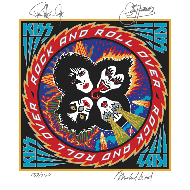
I’d love to be able to show my working pencil sketches, but over the years they’d gotten lost or destroyed, and the only record left was the original colored pencil comp that I used to explain my concept to the group. A few months earlier I had done a cover for IDEA, a Japanese art magazine that had done an article about my work, and for whom I had created a cover. I really loved how that cover had turned out, so my thought was to try to emulate the look I had come up with on this new cover for KISS. My cover for IDEA had certain gamelike, and very graphic elements that I thought would work well telling the story of what KISS were about.

Since their makeup reminded me of classic Japanese Kabuki players, I thought the look would be appropriate. So I created a little story around each character and put them all together in a sort of “mandala” motif surrounded by a sawtooth blade with lettering. I kept the colors simple and bold as I had done with my IDEA cover. Here (yellowed and a bit worn with age) is the original colored pencil sketch I created for the group’s approval:

The meeting went particularly well, since I was expecting outright rejection of my idea—which at the time was pretty unorthodox for an LP cover. The changes gthey asked for, I felt, were fairly minor—adjustments to the faces (with the exception of Peter Criss), and rotating the lettering 90°.

The KISS logo already existed, but I felt it needed some help to work better with my design (Paul told me he had drawn it on his dining room table). So I redrew it, making the design more consistent, and adding the lightning strokes to help give movement to the sawtooth blade.

After the cover was done, I didn’t think about it very much. It was only years later that I came to understand that this cover had taken on a life of its own and become sort of a cultural icon. I started to realize that when I discoved all the incredibly blatant and poorly done rip-offs of my design. Rather than upsetting me, seeing all that was quite amusing . . . after all, isn’t imitation “the sincerest form of flattery”?

Another indicator to me of how pervasive this design had become in the culture was that people were having it permanently etched onto their bodies. This both horrified, and delighted me at the same time! Personally I would never have anything tattooed on my body—especially one of my own graphics: I’d get bored with the design way too quickly, and then it would be too late to do anything about it. Here are some shots of the process of one lucky soul having the complete Rock and Roll Over art permanently engraved on his right flank. The tattoo artist did a pretty good job, if you ask me!

And below, for your viewing pleasure, a few more of my favorite RaRO tattoo shots. I especially like the one of the guy getting his back autographed by Paul Stanley. Now that’s what I call Kiss Kommitment!

Speaking of Paul, he contacted me again recently. It seems that KISS were about to record their 19th studio album. They hadn’t done one of those for eleven years, and he told me they wanted to recapture some of the magic that the Rock and Roll Over design had provided for them when they were starting out. So, in a way they kind of wanted Rock and Roll Over All Over Again—the same . . . but different.

Attempting to recreate the success of an iconic image is a thankless task. You can’t realistically have that as a goal. The most you can do is to give it your all and try to do the best piece of art you’re capable of doing. Here are a series of rough sketches that led up to the finished design

The hardest part of this process was figuring out what to do with the four faces. This time Paul wanted them to be photographic instead of just plain old graphic—as they were the first time around. And I couldn’t get new photography—it had to be taken from existing files. The approach I decided on was to take the best photos I could find with the most contrast and shadows, and translate them into flat graphics that I could make work with the rest of the art. I’ve simplified the steps a bit, but here’s an example of what I did with the faces, using a photo I found of Gene’s face:

Everybody’s got an opinion as to whether the art for Sonic Boom is better or worse than that for Rock and Roll Over. Being so close to both designs it’s difficult for me to say. As far as Sonic Boom is concerned, I did the best I could within strict limitations provided by Paul. I think it solved the problem, and I’m quite happy with the results.

I’ll leave it to time, to posterity, and to others to decide if Sonic Boom becomes as much a cultural touchstone as Rock and Roll Over did. If it does, we may soon start seeing . . .

Purchase an original “Rock and Roll Over” press proof HERE

COMMENTS WELCOME! 


The Return of . . . KISS (#2)

When Paul Stanley came by my studio to discuss how to proceed on the art for the cover of their upcoming CD/DVD package "Sonic Boom", I had no idea what to expect. I hadn't met with him since working on Rock and Roll Over, and had very little memory of what that had been like. Any anxiety I had melted away when we started talking. Paul is a "gentlemen's gentleman" and I immediately felt at ease talking with him—as if all those years had not intervened since the last time we had spoken. After some small talk he explained what he was after with the new cover art. His vision for this album was to make it as vital and raw as it had been when they did RaRO. He felt that that had been some of the best work that they had ever done, and wanted the new album to recreate that energy both musically and visually. While he didn't want me to reprise what I had done with my art for the earlier cover, he did want me to try to capture some of the same spirit, attitude, energy, and look that I had instilled in that piece. Also one of his stipulations was that unlike RaRO (where I had created abstract, graphic versions of the KISS personas) this time he wanted photographic representations of the four group members in full makeup. When I did RaRO I had a 12" canvas to work on. Now with CD covers and digital booklets that canvas had been reduced to less than 40% of its original size. Designing in a 4¾" space poses some very different problems from what I faced while working on covers for vinyl releases. In fact the older cover design would not have worked at that size, it's many elements would have felt crowded into a small space. So the elements of Sonic Boom had to be bigger, bolder—and fewer. I made the decision to make the title the main focus of the graphics, moving the other elements (faces, KISS logo) into prominent—but subordinate—roles.

So I set about putting pencil to paper and trying to solve this the way I solve any other design problem. I did not want to get psyched-out by thinking too much about how the new design would compare with RaRO. That cover had taken on a life of its own and had become a pop culture icon. Creating an iconic cover could not have been one of my goals. All I was capable of doing was to try to create the most compelling graphics possible within the parameters and limitations that had been set out for me. So I started out at the core of this design by creating what I call a "word constellation" out of the title. I tried to make it communicate its meaning visually by not only making it angular and "explosive", but also by creating a shape that was somewhat suggestive of flight—a "flying wing", if you will. Bearing in mind the symmetrical, mandala-like layout of RaRO I started designing the new piece as a field growing out of the center of the square, with the four members faces moving outwards from the center, and capped with my version of the ubiquitous KISS logo.

It took about a week for me to develop my sketch to the point where I felt confident in what I had come up with. As I had done with RaRO, I felt so strongly about this cover design that I decided to not present any other options—I wanted this to be the ONE.

This is the rough pencil I first presented to Paul. I held my breath as he first took it in, and then was able to exhale when I saw a big smile appear on his face.

Next: A few changes and the final art.

The Return of . . . KISS (#1)

I've been waiting a few months to be able to talk about this—and I have talked about it to some degree in a few online interviews, but not really in any detail. Back in April of this year I received a telephone call from out of the blue—from somewhere in South America. At the other end of the line was KISS' Paul Stanley. It'd been more years than I cared to remember since we last spoke. That was when I had done the cover art for "Rock and Roll Over"—KISS' 5th album and their 2nd to go Platinum. So you can understand my surprise when Paul asked if I'd be interested in designing the cover art for KISS' first studio album in 11 years—which Paul himself was producing.

That's when I started remembering how exciting it was the first time around, to have been involved in that fast-paced world of entertainment and music. For me it had been a far cry from doing the corporate logos, magazine and book covers I had been working on at the time. An "edgy" job for me then was doing a spread for High Times (yep, they've been around for a while)! I've always enjoyed the fact that doing what I do has enabled me to straddle many different design worlds, from the fairly straight to the totally off-the-wall. I always tried to say "yes" to just about anyone who was adventurous enough, and had the vision to see how having me design for them could work to their advantage. At any rate I had said "yes"to KISS the first time around (even though I had no idea what I was doing), so of course I again said yes to Paul. We agreed to meet when he returned at the conclusion of their South American tour.

Much to my surprise the "Rock and Roll Over" cover had in recent years become one of the most—if not the most—talked about piece of art in my portfolio. It was a little bewildering to me how over the years that cover had become an icon for this iconic group. I've been contacted by more people about my KISS artwork in the past 6 or 7 years than in all the years prior, and more than any other piece I've ever done including the New York Knicks logo. So the expectations for this new art I was to work on were quite high.

Next: the new cover design revealed.