
10 Years Apart
In 2005 I was asked to create a promotional poster for an exhibition of music-related graphics that was to be held at the Forest Lawn Museum in Burbank, California. The show was to be called “Revolutions”, a name that was a stroke of genius from the fertile mind of my friend Brad Benedict—creator of Capitol Records’ “Ultra-Lounge” series.
“An art show held above a cemetery?” one might ask. Attending events at cemeteries is nothing new for Angelenos who for years have been picnicking and enjoying movies outdoors on warm evenings at the Hollywood Forever Cemetery. Actually the Forest Lawn Museum is a wonderful venue, set atop a hill in Burbank with incredible panoramic views of the entire city of Los Angeles—not unlike the sweeping vistas one experiences from atop the Getty Museum on the other side of the city.

The View from Forest Lawn Museum
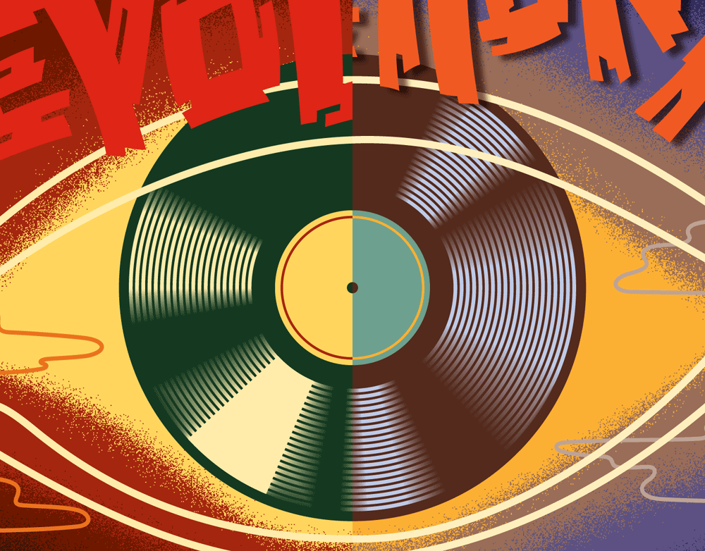
The challenge was to create an iconic image that could represent all the incredible diverse types of art that have been—and continue to be—created to accompany the prodigious output of the recording industry. I felt that a representation of the human eye (even though to some it might seem a bit clichéd) should play a prominent role in the design. So, with that in mind, I started thinking about the work of two of my favorite artists: A.M. Cassandre and Renée Magritte, and the work that they had done with the motif of the human eye. One of Magritte’s most famous and intriguing paintings is called “The False Mirror”:

Magritte: The False Mirror
When I took a look at this famous piece, I realized how powerful one simple image like this could be. Next I took a look at some of Cassandre’s work and realized that he had returned time and again to this highly symbolic motif. Here are two magazine covers he created for Harper’s Bazaar:

Cassandre: 2 Bazaar Covers
It then occurred to me that the pupil of the eyes could be made to represent a vinyl record label and the iris represent the LP itself. What better way to represent the visual art of the recording industry?
I wanted to “frame” the poster to help amplify the idea that this was an art exhibition, and I remembered a series of album covers that Capitol Records released between the late 1940s and the early 1950s that all used a very graphic “frame” on the cover over which they would attach a smaller label containing the graphics for that particular recording. I believe it was a kind of an early “branding” that Capitol Records was attempting so that people could immediately identify the recordings as belonging to Capitol. The covers with the frames appeared on Capitol’s 10” extended play recordings which usually contained three to four songs per side, as opposed to the one song per side that was commonplace up until then. These 10” recordings were the predecessors to 12” long playing records. Here are a few examples:

Capitol EP Series
To accomplish this “framing” I decided to photograph a wooden door in my studio, cut the photo up into strips, and then alter the color and make it more graphic through the magic of Photoshop. Here’s the portion of the frame that runs along the bottom of the poster:

Wood for Frame
The idea for how to treat the headline, the title of the show flowed directly out of the word itself: “Revolutions” I would treat it in a very graphic way, but I would reference the brush lettering of hand-painted placards that are often seen at "revolutionary" demonstrations and protests. Although I would not follow it stylistically, the banner for the Polish “Solidarity” movement that helped bring about the fall of Communism came to mind:
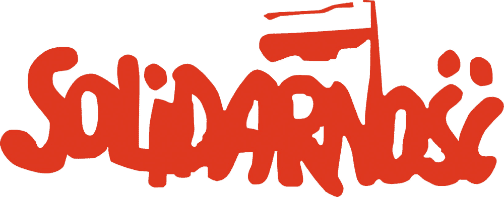
Solidarnosc
So with all the elements of my design firmly in hand, I began assembling them into a pencil drawing and presented it to the Museum:

Revolutions Pencil Sketch
My design was quickly approved, and so I set about the work of putting it all together. The most difficult part in creating the finished art was how to render the “pupil” and the “iris” of the eye. Working in Adobe Illustrator made it fairly easy, creating it in sections and using the gradient tool. Below I’ll contrast the sketch I did with the finished art—it’s a very tried and true method for rendering a shiny vinyl recording:
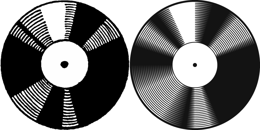
Record Disk Sketch and FInal
As I mentioned, like most of my art, I created the final in layers in Adobe Illustrator. Creating the art in layers allows a lot of flexibility when designing a complex piece like this one. Here is a representation that demonstrates how the different layers all fit together:

Revolutions Poster Layers

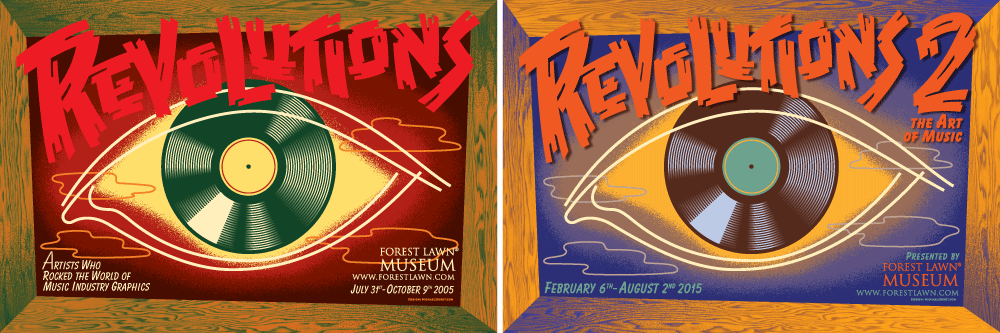
Revolutions Poster -2005
Earlier in 2014 the Forest Lawn Museum contacted me again to let me know that they were going to hold another exhibition “Revolutions 2” on the 10th anniversary of “Revolutions” in 2015, and asked if I would prepare another poster for the upcoming show. I told them that my idea for that would be to suggest a continuity between the two shows by literally repeating the first poster. I explained that giving the second poster a new color palette would provide enough differentiation between the two shows. The folks at Forest Lawn agreed, and I began work on “Revolutions 2”.
To help make the new palette more coherent I created a gradient between two of the dominant colors I selected, then was able to pick out intermediate colors for the background:

Color Palette for Revolutions 2
The new poster would have abbreviated copy, so I needed to slightly reorganize some of the elements and add a “2” to the title. I also needed to change the subtitle to “The Art of Music” from the more cumbersome “Artists Who Rocked the World of Music Industry Graphics” (quite a mouthful!). Finally a shadow was added behind the title to help give the piece a little more depth, and (for reasons I cannot recall!) I reversed the direction of the shadows on the frame sections.

Revolutions 2 Poster
Below are the two posters—separated by a decade and side-by-side. To be honest, in my opinion the later poster is more successful. I think the colors work better and are more pleasing.
Revolutions Side-By-Side
As you’ve no doubt noticed, as of the date of this writing the show is up at Forest Lawn. But the big star-studded event opening will be held at the Museum on Saturday February 28th from 6:00 to 8:00 PM. It’s quite a bit larger than the 2005 show with over 175 paintings, photos, sculpture and prints from over 30 artists (including five pieces by yours truly). If you are a lover of album covers or posters, this is an event not to be missed!
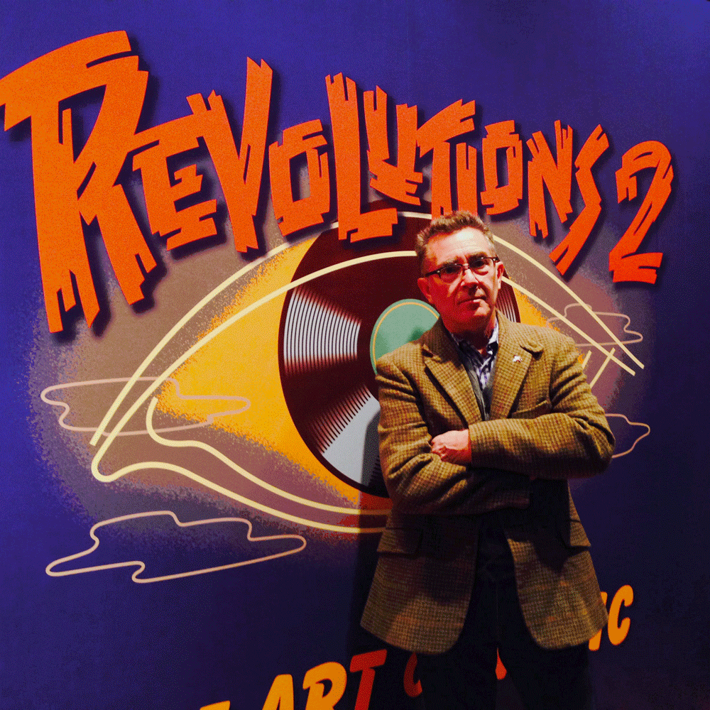
OpeningNight
Opening Night at Forest Lawn Museum.
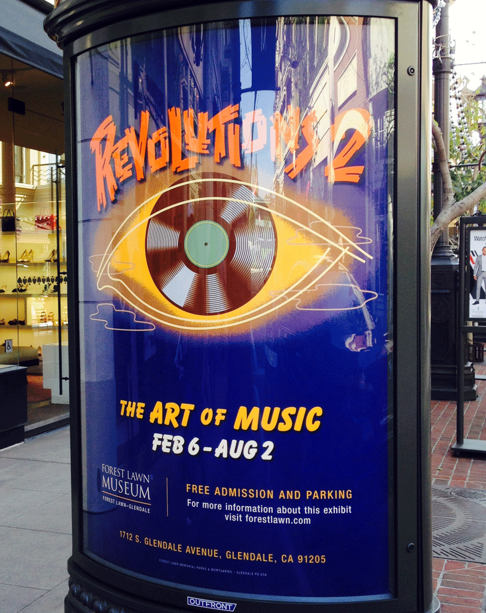
Kiosk at the Americana/Glendale
Alphabet Soup