Viewing entries tagged
Album Cover

Steinweiss on Steinweiss

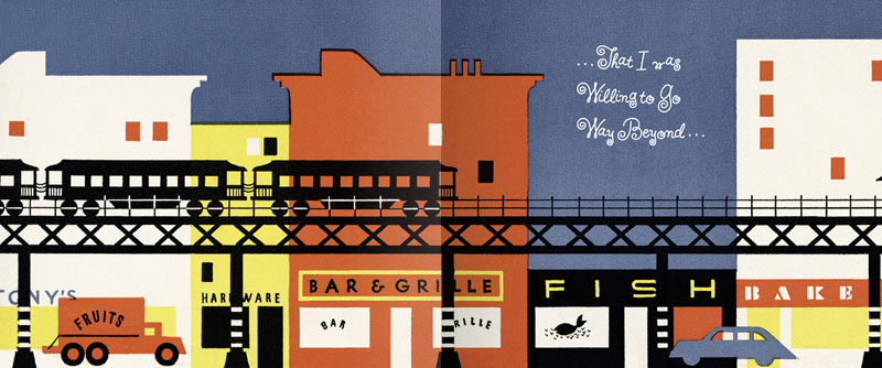
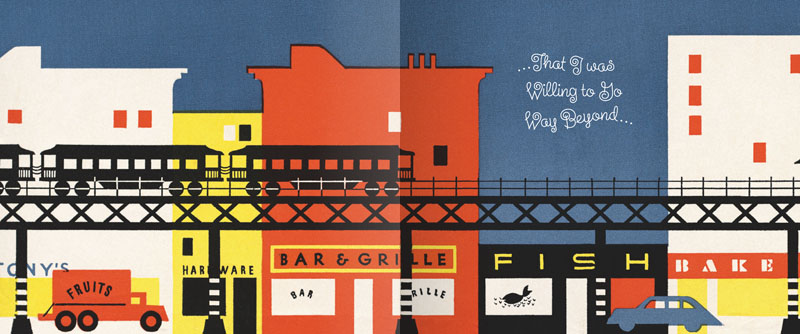
When I originally did the title lettering for "Alex Steinweiss: The Inventor of the Modern Album Cover" I hadn't yet designed "Steinweiss Script". In fact it was designing this headline that spurred me to do that typeface design. In retrospect there were many interior headlines and other lines of copy for the book that Josh Baker, AD at Taschen, would have liked to have had set in a new Steinweiss Script font. But they had to settle for what was available at that time, which was one of several different digitized versions of what Alex Steinweiss had originally designed for Photo-Lettering. Now Taschen has released their more moderately priced trade edition of this incredible book—and just in time for this release I was able to reset all their headlines and other copy the way we had originally wanted to—in Steinweiss Script:

Above: Before and After Details from the older and newer editions

Below: You can Look Inside the earlier edition...

...or Look Inside the newer version:

Our intention was that the newer version, with everything reset in Steinweiss Script, would feel closer to what Mr. Steinweiss would have done had he been able to apply his scrawl to these pages.

Just a reminder: Steinweiss Script is available for purchase on MyFonts, Veer, FontShop and YouWorkForThem. To learn more about these fonts, read Steven Heller's Imprint article or MyFonts' Creative Characters for January.

Is Steinweiss Your Type? Pre-Valentine's Sale!

R U My Type? Mark your iCals! The Steinweiss Script 20% off sale will begin on Tuesday, February 8th.

Steinweiss is the perfect type for helping to pull you out of your shell, and getting you to express your most heartfelt sentiments.

Available in Bold, Medium and Light, or all together as a loving Family.

Just go to MyFonts on (or after) February 8th to hook up.

If you'd like to cozy up and get more familiar with Steinweiss before jumping into a serious relationship, read Steven Heller's recent Imprint article. Steinweiss Script also features prominently in the lovingly composed interview I just did for Creative Characters.

Steinweiss Script - Just Released!

We're very proud to be able to finally announce the release on MyFonts of The Steinweiss Script Family. We've described these fonts briefly in the last two postings (scroll down) but, to reiterate, this family is made up of three weights—a Light, a Mediuim and a Bold. Within each of the three weights, through advanced OpenType features, a user has the ability to access three distinct variations: Simple, Fancy, and Titling. Rather than trying to describe them again, I've provided an image that demonstrates what they are:

I began designing this font with just the larger caps and taller ascenders/descenders, but in the end felt that giving user's these options would add usefulness to the font. These variations make Steinweiss Script accessible not just for headlines, but for applications where vertical space might be an issue,  and also for longer passages of text.

To help users understand how to be able to access these features (and also to show off the font) I created "The Steinweiss Script User's Guide" in PDF form (1.2 MB download). I've also created an "Incomplete" character showing to give somewhat of an idea of what's in the font:

Steinweiss Script is available on MyFonts and FontShop either as a family of all three weights, or each of the weights can be licensed individually.

As always, we'd love to hear your comments about this font!

Steinweiss Script - Design and Art: Michael Doret - after Alex Steinweiss Steinweiss Script - OpenType Programming: Patrick Griffin/Canada Type

Steinweiss Script Update: Release Date Set

Head's up everybody! I've just set the release date for the Steinweiss Script Family for Tuesday, November 9th. It will be available only on MyFonts—at least initially. And I'll be running an introductory sale at a 20% discount. For a good preview of what's in the font and how it's OpenType features work you can download "The Steinweiss Script User's Guide" (about 1.2 MB).

"Steinweiss Script"...Soon to be Released

Back in the summer of 2009 I was contacted by Josh Baker at Taschen Publishing about doing some work on the huge commemorative edition they were putting together on the work of Alex Steinweiss. For those of you who are not familiar with that name, Mr. Steinweiss is considered to be the inventor of the album cover as we have come to know it—as a kind of mini-poster with graphics relating to the musical content of the album. He produced hundreds of covers for 78 RPM albums between the late 1930s and the late 1940s. Of course I was thrilled to have anything to do with this project. My assignment was to do some lettering for the cover and title page that was in the spirit of Mr. Steinweiss' very graphic calligraphy, which had become known as "The Steinweiss Scrawl". This "scrawl" had become ubiquitous and inextricably associated with his work. Here's an example of one of his album covers:

Steinweiss' calligraphic work was very spontaneous and kinetic, while the work of lettering artists tends to be more carefully studied and worked out. So it was a bit of a challenge to try to capture that spontaneity in my piece of digital art for Taschen's cover—as seen below:

While I was working on this, Josh and I had discussed the possibility of doing similar lettering for all the different chapter headings and headlines throughout the book (about 16 of them), but decided that it wasn't practical for budgetary reasons. The subject of creating a "scrawl" font was also discussed, but was nixed for the same reason—in addition there wouldn't have been enough time to do it: creating a font from scratch can be a very time-consuming process.

Around 1951 Alex Steinweiss had actually created a font called "Steinweiss Scrawl" for Photo-Lettering. (Coincidentally my first job after graduating Cooper Union was as Ed Benguiat's assistant at Photo-Lettering!). But this font was extremely limited in it's capabilities, and although it had a certain bouncy charm and naïveté, in my opinion, it didn't really capture the fluidity of Steinweiss' calligraphy:At any rate, shortly after completing the Steinweiss project for Taschen, I decided to pursue on my own the design of a font in the spirit of his calligraphy. The challenge was enormous—to create a typeface that retained the sense of hand-letting and fluidity within the context of a digital font. Where Steinweiss' scrawls were all slightly different from each other, shifting and changing according to the needs of a particular cover design, a font designer has to commit to specific forms that need to be set in stone, so to speak. In this particular font, the "managed" nature of the design had to appear to be "unmanaged"!
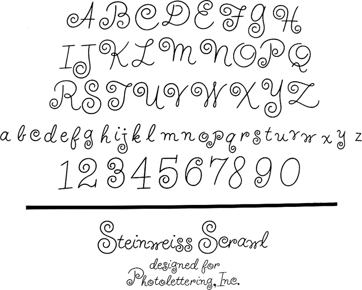
Part of my solution was to create the typeface with a ton of alternates, lowercase ligatures, and caps/lowerase ligatures. Creating this as an OpenType font would be the only way to wrangle these thousands of pieces together into a coherent typeface design. Luckily I was able to count on the expert programming help of Patrick Griffin of Canada Type. Also, I was fortunate enough to be able to contact the Steinweiss family through Taschen, and get the official Steinweiss approval for this font design.

At this point until the fonts are released (very soon!), for those interested in seeing more, you may download "The Steinweiss Script User's Guide" that I've just completed (about 1.2 MB).

In a nutshell, here's how the fonts are organized: "Steinweiss Script" is a family of fonts in three weights: "Steinweiss Script Light", "Steinweiss Script Medium", and "Steinweiss Script Bold". Additionally, within each weight there are three variations: Simple, Fancy, and Titling. These relate to the size/ratio of the caps to the lowercase, the complexity of those caps, and the size of the ascenders/descenders on the lowercase characters. The reason for all this is to add usefulness to the font, making it accessible not just for headlines, but for longer passages of text as well.

I am going to try to release these fonts within the next week or so. Please stay tuned for more information! I will announce here as soon as they go live.

The Return of . . . KISS (#2)

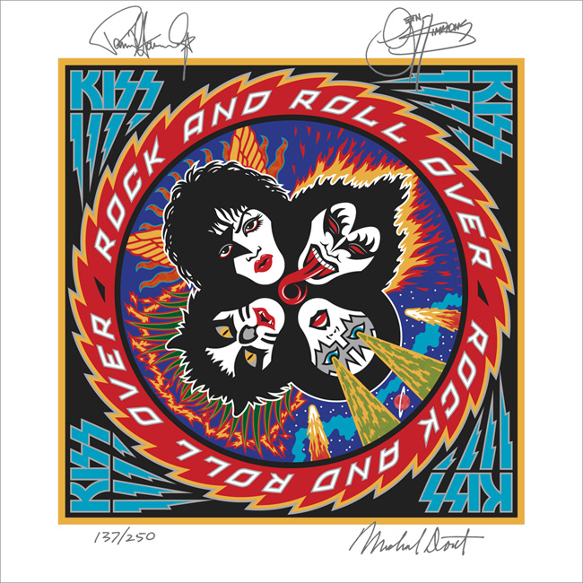
When Paul Stanley came by my studio to discuss how to proceed on the art for the cover of their upcoming CD/DVD package "Sonic Boom", I had no idea what to expect. I hadn't met with him since working on Rock and Roll Over, and had very little memory of what that had been like. Any anxiety I had melted away when we started talking. Paul is a "gentlemen's gentleman" and I immediately felt at ease talking with him—as if all those years had not intervened since the last time we had spoken. After some small talk he explained what he was after with the new cover art. His vision for this album was to make it as vital and raw as it had been when they did RaRO. He felt that that had been some of the best work that they had ever done, and wanted the new album to recreate that energy both musically and visually. While he didn't want me to reprise what I had done with my art for the earlier cover, he did want me to try to capture some of the same spirit, attitude, energy, and look that I had instilled in that piece. Also one of his stipulations was that unlike RaRO (where I had created abstract, graphic versions of the KISS personas) this time he wanted photographic representations of the four group members in full makeup. When I did RaRO I had a 12" canvas to work on. Now with CD covers and digital booklets that canvas had been reduced to less than 40% of its original size. Designing in a 4¾" space poses some very different problems from what I faced while working on covers for vinyl releases. In fact the older cover design would not have worked at that size, it's many elements would have felt crowded into a small space. So the elements of Sonic Boom had to be bigger, bolder—and fewer. I made the decision to make the title the main focus of the graphics, moving the other elements (faces, KISS logo) into prominent—but subordinate—roles.

So I set about putting pencil to paper and trying to solve this the way I solve any other design problem. I did not want to get psyched-out by thinking too much about how the new design would compare with RaRO. That cover had taken on a life of its own and had become a pop culture icon. Creating an iconic cover could not have been one of my goals. All I was capable of doing was to try to create the most compelling graphics possible within the parameters and limitations that had been set out for me. So I started out at the core of this design by creating what I call a "word constellation" out of the title. I tried to make it communicate its meaning visually by not only making it angular and "explosive", but also by creating a shape that was somewhat suggestive of flight—a "flying wing", if you will. Bearing in mind the symmetrical, mandala-like layout of RaRO I started designing the new piece as a field growing out of the center of the square, with the four members faces moving outwards from the center, and capped with my version of the ubiquitous KISS logo.

It took about a week for me to develop my sketch to the point where I felt confident in what I had come up with. As I had done with RaRO, I felt so strongly about this cover design that I decided to not present any other options—I wanted this to be the ONE.

This is the rough pencil I first presented to Paul. I held my breath as he first took it in, and then was able to exhale when I saw a big smile appear on his face.

Next: A few changes and the final art.

The Return of . . . KISS (#1)

I've been waiting a few months to be able to talk about this—and I have talked about it to some degree in a few online interviews, but not really in any detail. Back in April of this year I received a telephone call from out of the blue—from somewhere in South America. At the other end of the line was KISS' Paul Stanley. It'd been more years than I cared to remember since we last spoke. That was when I had done the cover art for "Rock and Roll Over"—KISS' 5th album and their 2nd to go Platinum. So you can understand my surprise when Paul asked if I'd be interested in designing the cover art for KISS' first studio album in 11 years—which Paul himself was producing.

That's when I started remembering how exciting it was the first time around, to have been involved in that fast-paced world of entertainment and music. For me it had been a far cry from doing the corporate logos, magazine and book covers I had been working on at the time. An "edgy" job for me then was doing a spread for High Times (yep, they've been around for a while)! I've always enjoyed the fact that doing what I do has enabled me to straddle many different design worlds, from the fairly straight to the totally off-the-wall. I always tried to say "yes" to just about anyone who was adventurous enough, and had the vision to see how having me design for them could work to their advantage. At any rate I had said "yes"to KISS the first time around (even though I had no idea what I was doing), so of course I again said yes to Paul. We agreed to meet when he returned at the conclusion of their South American tour.

Much to my surprise the "Rock and Roll Over" cover had in recent years become one of the most—if not the most—talked about piece of art in my portfolio. It was a little bewildering to me how over the years that cover had become an icon for this iconic group. I've been contacted by more people about my KISS artwork in the past 6 or 7 years than in all the years prior, and more than any other piece I've ever done including the New York Knicks logo. So the expectations for this new art I was to work on were quite high.

Next: the new cover design revealed.