A Stellar Poster for Simon & Garfunkel
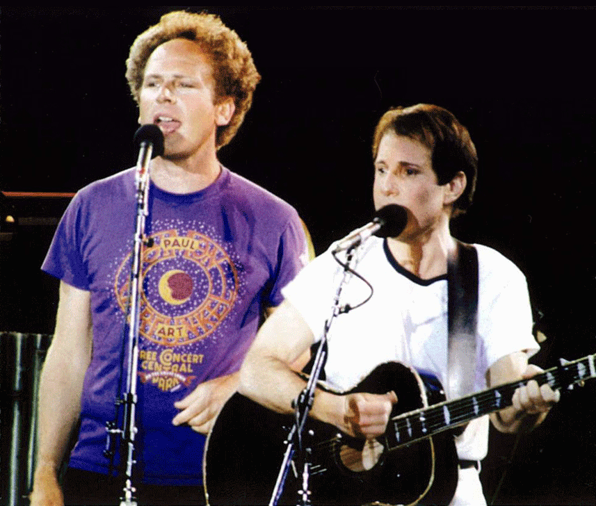
Back when I was doing fairly regular work for Time Magazine, one of their ADs—Irene Ramp—asked me if I wanted to do a poster for a reunion benefit concert for Paul Simon & Art Garfunkel that was to be held in Central Park. Irene was a friend of Paul Simon, and so putting Mr. Simon and myself together was fairly easy. Because of the many intervening years, I don’t anymore have my preliminary drawings or sketches for this piece, so here I would like to talk about my inspiration and how my ideas for the poster came to be.
Even as a young boy growing up in Brooklyn one of my passions was star-gazing. I remember saving up my meager allowance for months until I had enough saved ($42.15) to buy my own telescope. With my trusty “Jupiter” telescope (Made in Japan) I charted sunspots, gazed upon the craters and mountains of the moon, and saw the rings of Saturn. To help me find and recognize the constellations in the night sky I used a wheel chart I bought at the Planetarium called the “Star Explorer”. Apparently I was a young nerd in the making!

In addition to its usefulness I was fascinated by the graphics and the design—the representaion of the various star magnitudes by differently sized circles, and the seeming randomness of the star map in contrast with the beautiful geometry and design of the mechanism that made it all work. This strange beauty, born of utility, would stay with me for many years.
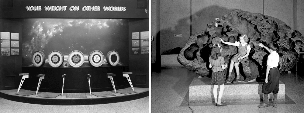
I had purchased the Star Explorer during one of my visits to the Hayden Planetarium. At my insistence, my parents took me there many times. The Planetarium was attached to Manhattan’s American Museum of Natural History (dinosaurs!), and I just couldn’t get enough of it. Whether it was seeing how much I weighed on Jupiter, or being able to touch an actual meteorite—or even just admiring the wonderful black light murals—I loved it all! But the best part (of course) was the sky show under the Planetarium dome.
Since 2000 the Hayden Planetarium has been housed inside the new Rose Center for Earth and Space, and has been completely revamped and brought up to date.

While the changes were needed, reflecting all the new technology and discoveries made since I was a kid, much has been lost, and I greatly miss all those things that had initially attracted and charmed me.
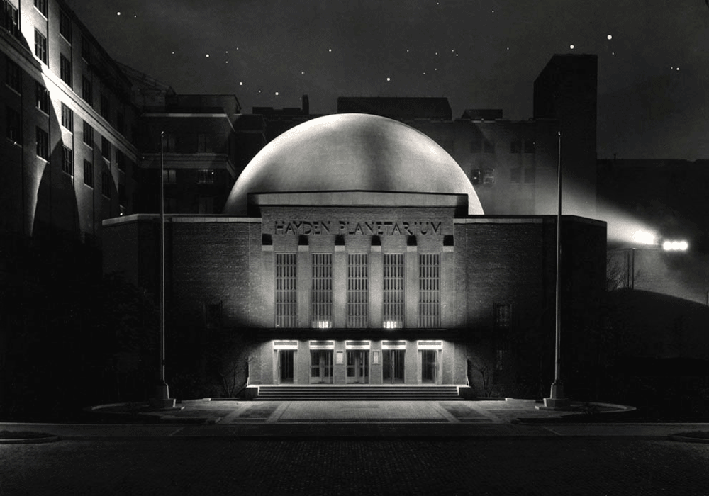
One of those things was the incredible look of the Zeiss Mark II projector. To me it looked like an alien spaceship or some sort of insect/monster. The new projector is a bit more high-tech and to my mind a little more visually nondescript. The other is that the projection dome is lacking one feature which I thought was great—and that is the wonderful silhouetted NYC skyline that surrounced you as the lights went down, simulating dusk.

I’m not the only one who thought the interior and projector were beautiful—it was the subject of a Fortune Magazine cover by John Cook.

Note the prominent role played by that skyline silhouette in his art. When you settled into your seat for the sky show, having that skyline surround you really made you feel connected to both the sky and to the city—it was as if you were laying down in the middle of Central Park (which is right across the street) at night, and were gazing up at the stars surrounded by the city. For me that was really magical. Actually adding the local environment to star charts and such was nothing new as is clearly shown in vintage charts such as this:

All these things were in the back of my mind when I met with Paul Simon to discuss the direction the poster would take. Just the fact that the concert would take place in Central Park on a warm Fall evening led me to start thinking about what it might be like to be at the concert, listening to music under the stars. That led me to thinking about how much I loved the Planetarium (just minutes away from the concert site) and how it felt to be there, about my telescope, about star charts, but most of all about that magical NYC skyline. I knew that I had to incorporate them all into my poster. Luckily all parties agreed! The concert was a great success, attended by half a million, but the best thing was that despite the fact that it had rained all that day, the clouds parted and the stars came out.

The posters had been sniped up all over NYC before the concert. If you were lucky, you were able to snatch one off a wall without destroying it. Despite the fact that T-shirts were produced and were for sale at the concert, there actually were never any officially sanctioned posters for sale anywhere. Over the years I’ve had many, many people write to me wondering where they could find a poster. I never had that many myself, having given away to friends and acquaintences what few I had. But luckily I kept one. Now I am very happy to be able to say that I am producing a limited edition of the poster myself, which I am making available through my Illogator site.
These posters will be 18” x 24”—the original size the poster was produced at, and will be signed by yours truly. I scanned the original poster myself, and spent days retouching the scan until it was absolutely perfect. These digital prints (or giclées) actually look better than the original. The original printing was done on fairly inexpensive paper, but the edition I produced is on a much better stock—which allows much more depth of color. If you’d like to find out more about the new edition, just click HERE, and you’ll be taken to my store—where you can also see other items I have for sale.
"And in the naked light I saw ten thousand people maybe more"


![BlogOpener[600px]](http://static1.squarespace.com/static/56785ba269a91a9ca5808c79/56c4a736fe5f74a520cec7f4/56c4a73afe5f74a520cecc51/1455728442769/BlogOpener600px.png?format=original)


![BlogOpener[600]](http://static1.squarespace.com/static/56785ba269a91a9ca5808c79/56c4a736fe5f74a520cec7f4/56c4a73afe5f74a520cecc33/1455728442722/BlogOpener600.png?format=original)