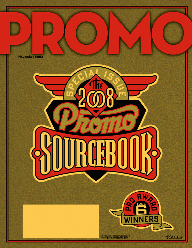
I've always loved the graphics found on vintage office machines (you know, the ones with industrial hammered metal finishes), which are often comprised of 2 or 3 color decals. They have a lot in common with decals that were used on gum and candy vending machines back in the '40s and '50s. I've managed to collect a few of those, and have always admired the naive, bold and simplistic graphics and design sense they share. I recently found a way to pay homage to them when my friend Jed Davis, Senior AD at both Promo and Direct magazines (and who also runs the indie record label "Eschatone Records") called me with another cover assignment for Promo Magazine.
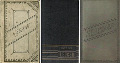
The November issue of Promo is a special issue called "The 2008 Promo Sourcebook" and they needed a cover design that was non-specific, yet eye-catching enough so that people wouldn't mind having it around for several months. My first inclination was to give it a sort of ledger-like look:
But after consideration, I thought that idea might be a little too sedate and staid for what Jed was looking for. Then it occurred to me that perhaps this might be an opportunity to do something along the lines of the decals I had been collecting. I could get color and excitement into a cover that had the feeling of a ledger by also referencing the graphics and decals found on old office and gumball machines. To further the feeling I gave the gold color a subtle "decal" texture, and the background feeling of metal with an industrial machine-like finish.


