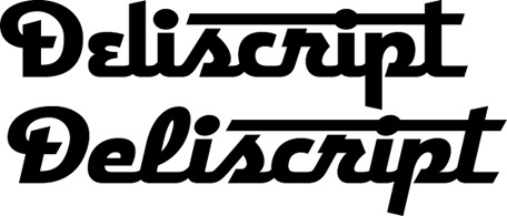
A huge Thank You to those who took the time to take a look at my preliminary ideas for "Deliscript". A few of you confirmed some thoughts that had already entered my mind about how to approach this font:

The biggest stumbling block for me was that with the large caps that I initially conceived this font as having, there was a problem if one chose not to set an underscore (such as when setting more than one word): the caps would then appear too large. José and Marcus both suggested reducing the cap size to align with the baseline. Initially I thought that might make the caps too small. But when I tried it out it seemed to work fine—admittedly it took some getting used to after seeing the cap so grandiose at the beginning of the word:
And it seems to work fine if one chooses not to set the underscore:
Or even without the extended crossbars on the "t":
I think that doing it this way will give the font more flexibility. Perhaps I could still include a set of the larger caps as an extra for more dramatic effect. I haven't yet figured out what I'll do about the lighter weight. I'm not that crazy about it, so I was kinda surprised to see both Norman and Marcus commenting that they were partial to it. I'll have to think on that, but any more comments on any of this would really be welcome!


